7 Ways To Add Appealing Contrast To Your Retail Website

Feature Image Source: iStock/krugli
With more and more people opting to shop online, building a website for your retail business is not only a smart move but also a necessity. How can we be so certain? As per the industry stats, there will be 1.92 billion people shopping online before this year ends. And by 2021, this number is expected to reach 2.14 billion.
That’s a lot of people. And if your digital presence is not effective, isn’t bringing in the traffic or converting that traffic into real sales, then you’ve got to worry. Because 38% of the people flat out refused to engage with a website if its design wasn’t attractive.
And one of the guaranteed ways to design an eye-catching website and aesthetically pleasing (which, by the way, gives you credibility as a business, as per the same research) is to introduce contrast when designing a website.
So, what is contrast?
Contrast is when we use two dissimilar shapes, forms, colors, fonts, and sizes, etc. to make certain pieces of information stand out and to give dimension and depth to the otherwise flat design.
For instance, the classic contrast of black on white, or vice versa.
Image: Unsplash
Or two objects in different sizes.
Image: unsplash.com
So what are the different ways we can use contrast and apply it to our online retail store?
There are multiple ways, but for this post, we are going to focus on the 7 major applications of contrast that add great appeal and functionality to the web page design.
- Colors
- Typography
- Size
- Shapes
- Grids
- White Space
- Be Creative!
Let’s discuss colors first.
1. Contrasting Through Colors
Most people, when they think of contrast, they think of combinations like black and white, or black and white with red in websites. Colors are the most popular and easiest way to add contrast in a retail web design. They aid in our memory recall, as striking, bright colors catch our attention, enable us to focus, and stay in our mind longer. Similarly, stark white in a sea of colors also looks prominent, and so we remember that.
Since colors are the go-to contrasting tool for many artists and designers, we are going to start our post with that and show you a few websites that have achieved color contrast perfectly, using a variety of color combinations.
While we can use white background as the neutral canvas on which products of differing colors can shine, it’s popularity makes it too common. So let’s focus on examples that have done it differently and brilliantly. What will help you understand these examples is a quick recap on the psychology of colors.
Skull Candy’s bold color choices. Their website has produced contrast using a dark background where shades of orange, bright blue, and red are leaping out from the screen.
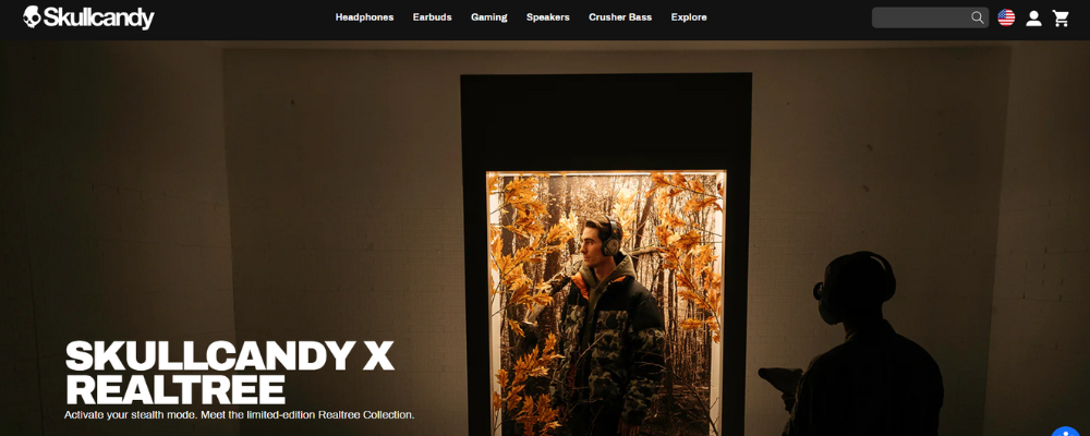
Image Source: skullcandy.com
Jackie Smith uses subtler shades of colors to add contrast. The bright orange and bold message of the text stands out in the pale pink background and immediately draws your attention. The yellow Call-to-Action button is smaller, and the text faded, which still looks bright enough in the muted background but doesn’t take the attention away from the header message.

Image Source: jackiesmith.com
Let’s view another example.

Image Source: lush.com
So much is going on here on Lush’s web page, but none of it overwhelms you. Everything is placed and organized in a way that your attention moves smoothly from one section to the next. The white type on a bright background beckons you on instantly. Then the black-and-white contrasts going on with the product tile catch your attention. The black and white menu bar provides consistency and contrast at the same time. And the overall effect is inviting, cohesive, and very much on-point with the brand.
There is science in selecting colors, yes but the process of choosing the right color palette for your website requires you to research and take inspiration.
2. Contrasting Through Typography:
When you are trying to establish contrast using typography, there are quite a few different ways to do it. You have different colors of fonts as tools, or different sizes, or different styles, and an endless mix of these to create the contrast that works best according to your retail brand.
Since you’re a retail website, your text will be sparse, meaning it will only be used when absolutely necessary, so make sure you don’t mess it up. The classic example of contrast in text is black ink on white background, so let’s start with that.
The basic purpose of contrasting fonts on a product page is to make text readable in a way that facilitates purchase. So, the most important information on a page should be the most prominent. Keus, uses product headline in an oversized text, and the description in contrast is not only lighter in color but lighter in weight too.

Image Source: keus-store.com
AZ Restaurant uses different styles of fonts to show contrast. The meal names are all in one style and size, while the timings for each are in a separate, script style and sharing a similar size.
Another way to add contrast to your type is by using colored font. Melanie borrows the orange-pink from the product image background and uses it to give color to the product name, size info, and the CTA – the most important elements on a product page.
Not only that, all three match each other in font style too, making a clean distinction from the product description area. While the big, bold, and centered B (the product initial) helps you remember the product family you’re currently browsing.
3. Contrasting through Size
While on the subject of big and bold things, let’s talk about size. Similar to color, size is a highly visible and prominent way to introduce contrast to the design. It is instantly noticeable and very effective as a recall device. You may have noticed how websites are leaning more and more towards big, single images on their website landing page headers. That’s them trying to use size for their impact and recall advantage.
In addition to images, size can also be applied to typography to make information pieces stand out, and direct user’s eye to the most important areas of the page.
Let’s take a look at few of the websites that have used size as the contrasting tool for their online business stores.
Power On Power Off. Their site is filled with large product images singled out into the center of the page so you can do nothing but look at them. Everything that surrounds it, all the text, the icons, even the headings, are smaller in size than what is on the bottle.

Image Source: poweronpoweroff.com
This is a very intentional use of size, where the designer hasn’t shied away from declaring how powerful they consider their product to be. If you’ve also got a product that you’re proud of, use size to demonstrate it.
Next in our list is a contrast that looks more organized and aligned.

Image Source: matruecannabis.com/en/
Two different sizes and shapes of product containers are used side-by-side to throw each other’s differences in clear contrast. But all are displayed in a way that organizations looks really smooth and harmonious.
While these examples of contrast are really powerful and distinct, nothing takes the cake like the design of The Owl’s website.
This is a business that deals in prescription eyewear primarily. Since visibility is all about size (how large or small or invisible something looks), take a look at the genius way they’ve used size to their advantage.

Image Source: owloptics.com/en/shop
If you use reading glasses or have visibility issues, you can appreciate how starkly different the same image can look just by taking off and putting back on your glasses. And The Owl deals in this difference every day. So what did they do? They went and splashed it on their product page!
You can see that it’s the same set of glasses, plus both images have the same size and style of font. It’s only the difference in the size of both images that’s so sharply in contrast with each other that you can just marvel at it, especially from a design point of view. It’s nothing too artistic but you can see how creative and effective it is.
4. Contrasting Through Shapes
Another interesting way you can apply contrast to your retail website is by using shapes that can show off each other’s differences. There are a couple of different ways it can be done. For example you can use organic shapes instead of geometric, or make the corners in your site design sharper instead of rounded.
You can also use the concept of shapes in your font choice. Pair a strong font with a softer one to achieve a more contrasting complement.
Let’s see this principle in work in real-life designs.
It’s an organization that works for relief and good. So of course it had to look for color palette and design choices that are warm and inviting. To add contrast for greater visibility and character, the hand-drawn beacon on the poster is paired with sleeker and cleaner looking font that still looks professional.
Next on our list is Pack Wire.

Image Source: packwire.com
Since Pack Wire’s boxes will always have sharpened corners, it made sense to produce contrast by using a font that’s anything but sharp. The rounded corners, thicker curves, and a very happy orange website background make this landing page a treat to look at.
But to make something a visual treat, orange is not the champion of the cause. With the Two Chimps Coffee website, the feat has been achieved with the winnable duo, black and white.

Image Source: twochimpscoffee.com
For all the geometric shapes going on here, the designers could’ve considered the contrast taken care of with all the black and white on this page. But they went a step further and as a result achieved this design brilliance.
The starkness of the sharp lines and definite curves has been offset with a very comfortable looking font design, a friendly content copy and italicized letters. There is even contrast going on within the font. The size of the heading is disproportionately large to the body. And while the heading looks casual with no capitals, you can see them in the description.
What’s more interesting is, the geometric shapes are laden in a way that they tell a story, requiring the visitor to stay on the page a bit longer.
5. Contrasting Through Grids
Sectioning your web page into sub-sections is another way to add contrast to the website. Where everything is just scrolling down in motion, a sudden appearance of a three-grid structure adds character and interest in the design.
Like most others contrasting tools in this list, adding grids can also be quite functional for your website. Grids allow us to add symmetry in website design. Right underneath your header, you can add features or special characteristics about products or your company. Tell the visitor right off why they should buy from you.
Myro’s website has done this exact same thing with their web design.

Image Source: mymyro.com
The header displays a bright and bold image of the product, and right off the bat, even when you don’t scroll, there’s a list of benefits that come with buying their product. It has great scents, has good quality, and serves the planet too. Don’t need to scroll down further, just put it in your cart and head to check-out.
Another way to ensure the visitors’ eyes don’t start glazing over your products, use the grids to introduce other features of your website, like your blog or news section. Show your potential buyers that you have more to offer besides great products.

Image Source: nativeunion.com
Native Union’s minimalist grids achieve this design contrast perfectly.
But nowhere the contrast has been as aesthetically appealing as with Via Copenhagen.

Image Source: viacph.dk
Not only Via’s scrolling is smoother and provides absolutely seamless customer experience, the grids are sharper but nowhere rough. Instead, they add more contrast and more depth to the design. An inspirational contrast example if you were looking for one.
6. Contrasting Through White Space
White space is that stable friend in the otherwise wild gang who’s always there when you need him.
As you become more and more experienced in designing, you can start noticing how working with white space is so incredibly creative. You have an endless choice of options to use all that space. The four websites we’ve picked today for this section are some of the most appealing examples of using white space, also called negative space, as a tool of contrast.
First off, Lief.

Image Source: leifshop.com
Leif’s website, very much like majority of other retailer sites, uses heaps of white space to highlight its products. All the bright in the product is standing out so beautifully against the pastel white background.
Cappellos uses black to contrast against white, and injects a certain appeal by accentuating colors of different pastas and pizzas.

Image Source: cappellos.com
With Cappello’s you can also appreciate the contrasting shapes, fonts, and sizes used in the design.
Depending on your brand theme, you can also use a solid brick of one color as your background.
Here, the negative space has been characterized by this beautiful shade of green. The white text is visible and the contrast is soothing to the eyes.
7. Be Creative!
One very distinct way to strengthen the contrast in your website is to get creative. Do the unexpected. Bend the rules. Since contrast is all about standing out and getting the uniqueness registered, it directly encourages creativity. All the above ways that we’ve laid out to add contrast in websites can be mixed and matched with each other to design a stunning website that’ll make your visitors go wow.
Some wow-worthy contrast examples applied to web pages are shared here for your viewing pleasure and design inspiration. Enjoy.

Image Source: nike.com
Big font? Check. Bold photography? Check. Pop of Color? Check. White Space? Check. Contrast? Delivered.

Image Source: eattheordinary.com
A black and white, textured, and typed contrast.

Image Source: The Femme Fatale
Contrast in its purest form.

Image Source: lavishsalon.ca
A violet contrast!
Just One Last Thought…
As we said in the beginning, contrast in website design serve dual purposes:
- It makes the design stand out.
- It optimizes website functionality aiding in sales growth.
Since both these factors play a huge role in website conversion numbers, make sure you are paying enough attention to this design technique to gain maximum benefits. Also, don’t forget to be playful and creative, contrast will follow.