Illustrator, Inkscape, Corel Draw: Which Software Makes A Winning Logo?
Featured Image: iStock/Undefined
A lot of mental labor goes into creating the perfect logo. After all the planning, pondering, and sketching before you sit down at the computer, you want to start off in the best software possible to bring your vision to life.
Vector programs like Illustrator, CorelDraw, and Inkscape all offer similar base-level experiences. Each program uses points and shapes to render vector images that can be infinitely scaled from large to small without any distortion.
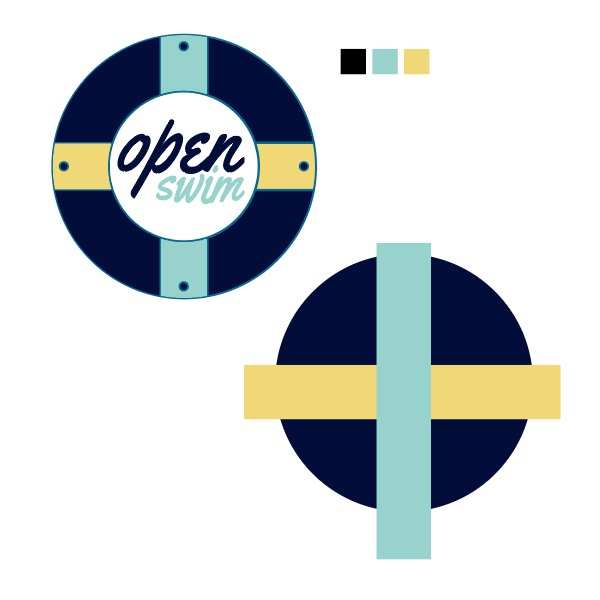
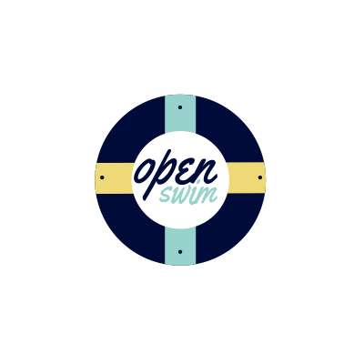
Which software is the best is up to personal preference. So, let’s take a deeper look at the pros and cons of each of these programs to see whose interface reigns supreme. To do so, we’ll recreate this simple logo in each program and discuss the user experience.
![]()
Adobe Illustrator: The Industry Standard
Adobe Illustrator is the current industry standard for vector graphics. It is included in the Adobe Creative Cloud suite or can be subscribed to on its own. Illustrator is only available through subscription; it cannot be bought.
Since Illustrator is widely used at design firms, marketing agencies, and print shops, its proprietary file type .ai is widely accepted in the industry.
But, does it make a good logo?
Of course.
To build a quick, simple logo in Illustrator only takes a few minutes. Logos are normally comprised of simple shapes, easy-to-read typography, and contain little to no gradients or meshes.
Illustrator features a simple shape tool, which allows the user to quickly build their logo base shapes. xc
In Illustrator, the Pathfinder Tool cuts through shapes to build new combinations in seconds. This tool is simple to use, and the icons make each option easy to understand. The Pathfinder Tool can combine two or more shapes, subtract one shape from another, create outlines of the selected shapes, exclude a portion of a shape, divide shapes from each other and more. It is probably Illustrator’s most versatile feature.
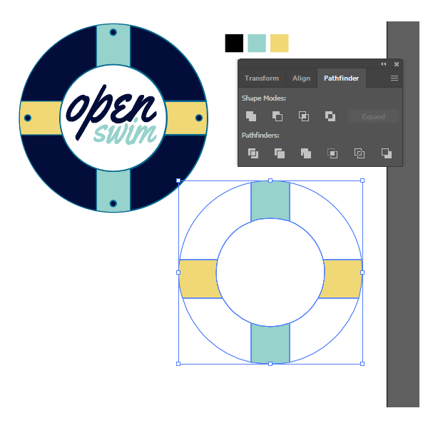
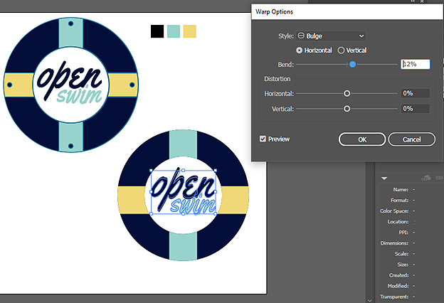
Finally, after reassembling the logo shapes, we can use the type tool to create the typography. Illustrator makes typography simple, as text can be easily warped, scaled, and written on a path. For this type treatment, we need to stack the text, change the colors, and warp it slightly.
Verdict: Illustrator is the industry standard and is simple to use for anyone familiar with both vector graphics and Adobe software. It has many additional features like gradient meshes, blends, and puppet warp. However, these options aren’t always common in logo design workflows.
Illustrator is the first program most graphic designers learn, and its simplicity, ease of use, and quality definitely earns it a place in the top-runners for logo and vector design.
CorelDraw: The Friendly Underdog
CorelDraw was once the industry standard for vectors until Illustrator zoomed into the spotlight. CorelDraw doesn’t have a wide acceptance like Illustrator does. One reason for this is because until recently, CorelDraw wasn’t available on Mac. Luckily, they have finally ported a usable version to Mac for designers to try out.
CorelDraw has a simple interface and a very snappy grid. When you move your cursor from point-to-point, it feels less fluid than Illustrator. If you’re trying to make precise curves without a tablet, this could be great for you. It is a little jarring coming from Illustrator.
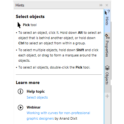
Another nice feature of CorelDraw is how beginner-friendly it is. By default, a hints panel appears on the left side of the screen for new users, which gives you very solid tips on how to use the software.
Ok, let’s build that logo again.
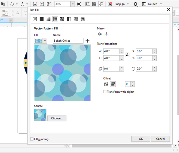
When you lay down shapes in CorelDraw, they start out as just line art by default, unlike Illustrator.
To change this, you have to go into the Edit Fill settings. This menu has quite a few options and effects all in one place. If you’re just wanting to start with the shape filled, it is rather cumbersome to use. If you want to add effects, it’s nice to have them all in one place.
One feature that is cool about CorelDraw is, surprisingly enough, the copy and paste. When you paste an object in CorelDraw, it automatically pastes in place, unlike in Illustrator where you must specify it with a keyboard command. This makes pasting, rotating, and rearranging objects quick in CorelDraw.
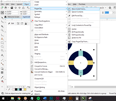
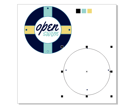
Another feature that is impressive in CorelDraw is the PowerClip. While in Illustrator, you must use the Pathfinder and Compound Paths in order to place objects inside another object, PowerClip is incredibly easy to use. All you have to do is activate PowerClip with the object you’d like to put inside selected, then click the object you’d like to act as the frame.
Unfortunately, the time savings from PowerClip don’t make up for how awkward it is to warp text. Warping text only takes a few clicks, but text warping in CorelDraw is quite awkward and not obvious to beginners.
Verdict: The final recreated logo looks pretty much the same as Illustrator. CorelDraw explains its features well and has some awesome features, like the PowerClip tool. The majority of its functions and tools are extremely similar to Illustrator. Users that transition from Illustrator to CorelDraw may struggle with it, as it is laid out very differently, but new users could benefit from its simple interface.
Inkscape: The Accessible Open-Source Alternative
Inkscape is an open-source vector graphics program. Open-source projects are collaborative efforts to create a single software and are often free. Luckily, Inkscape falls into that category. Now, most open-source software tends to be on the simpler side, and Inkscape is no exception. This program offers very basic shape and point tools in a no-frills layout.
Now, these tools are perfectly suitable to create a logo, but with one caveat. Inkscape is unable to create files in the CMYK colorspace natively. That means if your logo is going to be used in print design, the colors could skew during the transition from RGB to CMYK.
While testing Inkspace, the software seemed pretty buggy. After laying down the shapes, it was time to clip them together.
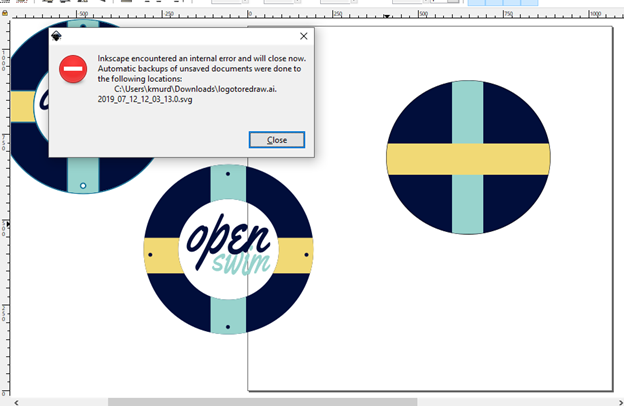
Well, on more than one occasion, the software errored out and closed.
Editing vector text in Inkscape is quite nice though. The text panel that pops out when you select the text tool gives you easy access to your font and text options. You can also resize text using the arrows that appear around the word on the artboard quickly and smoothly.
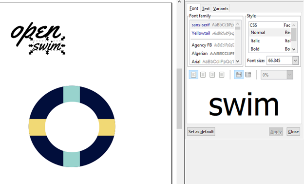
While warping the text is easy in theory—just convert the paths to points and apply a path effect, the execution is somewhat difficult. The pointer in Inkscape is small and precise, which means a simple misclick while adjusting your points leads to unintended movement. Undo doesn’t work while you’re making these small adjustments, so every mistake means you have to readjust or start over.
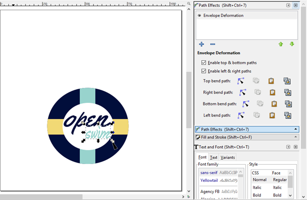
Verdict: The final logo ended up not being as precise as the other two programs. Inkspace is a great option for users on a budget, starting out for the first time, or who are just a design enthusiast. The interface is quite different for users coming from Illustrator or CorelDraw, and that leads to some frustration. Also, its artboard grid is so loose that it is difficult to place items precisely.
The logo we ended up with after using Inkscape is the poorest of the three, but only by a bit.
![]()
Illustrator, Coreldraw, Or Inkscape: The Winner
There’s no clear winner in this fight. Illustrator and CorelDraw both offer polished user interfaces, a ton of online support, and benefit from years of development that lead to refined usability. Both programs can be found in the graphic design world, and both support RGB and CMYK color spaces. The resulting logos from both programs looked nearly identical.
If your budget allows for a subscription, either CorelDraw or Illustrator will suit you well. If you are familiar with Adobe products, Illustrator is the way to go because the layout is so similar. If you are new to vector graphics, try CorelDraw or Inkscape.
Inkscape has a higher learning curve and is a little buggy. However, it’s also free to use and available on Windows, Mac, and Linux. If you don’t want to put money into design just yet, try Inkscape.
To truly find what works best for you, you’ll just have to try them out. Luckily, all are available to try for free to get your feet wet.
In the end, the winner is simply graphic design skill. A designer that understands the principles of design and has experience in any of these programs should be able to translate it into a great logo. No software can put in that legwork for you.
So, what are you waiting for? Pick a program and start experimenting.
Arts Company Logos
Audio Visual Logos
Media Service Logos
Painter Logos
Software Development Logos
Communication Company Logos
Blog Logos