Can Your Packaging Design Kill? A Case Of Cadbury Cookies

Feature Image Source: Freepik
A nine year old girl passed away due to an allergic reaction to a Cadbury cookie that had a similar packaging as the eggless one she was allowed to eat. Time and again, there are people who say design isn’t as important as the product itself or the marketing but it is only when such incidents take place that brands realize the importance of design.
Murderous Packaging Design
It’s come to everyone’s attention that a young girl named Isabel Marrero, from Australia, suffered an anaphylactic reaction when her mother gave her the wrong biscuit. Of course, people can blame the mom for not being cautious enough. But it’s critical that brands realize how crucial it is to invest in not just a ‘good’ packaging design but one that assists buyers in making the right choice.
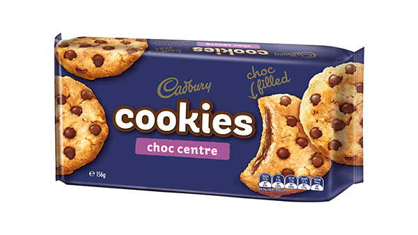
Image Source: Cadbury
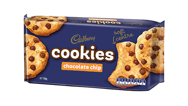
Image Source: Cadbury
Bad Versus Good Packaging Design
When you look through an aisle of food items and drinks, you see hundreds of products shelved on the racks ready to be picked. Some you can’t resist and some you pass. So there is a difference between a bad and good packaging designand here is it.
Bad Packaging
In the case of Cadbury, the problem was that the brand didn’t use design to clearly distinguish the different types of cookie packs. Brands often make the mistake of imposing their intelligence quotient and emotional quotient on their target audience, instead of truly understanding their respective markets.
A bad packaging is a result of ignorance on the part of brands and designers. A bad packaging is evidently the type that doesn’t recognize the needs and habits of the consumers online and offline. So let me list down the bad qualities of a bad design:
- Packaging that is hard to recognize and remembers
- Design that has indecipherable information on it
- Label that is misleading in terms of what is inside
- External wrapper that is difficult to tear open
- Colors that ignores factors like gender, culture, flavor etc.
- Language that is challenging to comprehend
- Font that lacks legibility and miscommunicates
- Material that’s rickety and doesn’t hold the product
While all these factors affect a brand’s image, these can also be injurious be someone’s health.
Good Packaging
On the other hand, there are some great examples of packaging out there. Their greatness isn’t limited to the fact that they’ve used trending packaging designs, but exceeds to the extent of making a design that is outstanding and user-friendly.
- Design that differentiates products of a single brand
- A unique façade from competitors – an original execution
- Clear branding (logo design, key information) sans ambiguity
- Credible packaging and labeling: what’s outside is what’s inside
- A functional packaging with easy-to-use engineering
- Follows federal regulations and comply with industry
- Acknowledges market preferences and solves problems
Vector Source: Freepik
What Matters Most In Packaging Design?
An estimated 60 to 70 percent of in-store purchases are influenced by the packaging of a product. Considering this, we can’t ignore the extent to which design plays a role in wrapping a branded product. So here are five things that are the fundamental blocks of a packaging design:
Color Palette
The iconic purple shade confused Marrero’s mother to pick the wrong flavored cookie. Although the popular sweet and confectionary brand has vowed to change the color scheme in order to differentiate packaging between its products, we have to make sure that packaging design doesn’t harm anyone. It’s better to be safe than sorry.
A research concluded that over 80% of total purchases are based on the color of them item or its packaging. So it’s necessary that designers and brands invest resources in understanding the psychology of color for specific industries and to exactly know how to create a color palette.
Typography
Typography isn’t just about selecting the perfect typeface style or font, in fact it is about how text is placed on a canvas. In packaging design, you’ll see text in the shape of information about the product. You have to make sure that there is originality and clarity in all that is written on the packaging. Believe it or not, there is an entire science of typography in packaging. Professional designers meticulously compose type on a given packaging and its label, to make sure that your customers find it easy to use your product.
Visual Hierarchy
You can’t simply toss text and images into a delicious salad. In visual hierarchy, you need to structure the cake with layers of elements that all come together to make it heavenly. When creating a hierarchy, the following aspects matter the most:
- Size of individual elements of design
- Position of each text, image, icon
- Negative space in parts of design
- Color harmony and contrast
- Alignment of visual objects
Imagery
Humans grasp visual 6000 times faster than a dreary text, so the imagery on your packaging design is a vital part of the overall design. Whether it is a vector illustration, symbol and icon, or digital photography – any imagery on a packaging design should do three things:
- Shows the true picture of the product
- Clearly distinguishes one product from another
- Doesn’t deviate customers in any way
Imagery on any given packaging design can be shown in a number of ways. In the paper The Use of Images in Graphic Design on Packaging of Food and Beverages, design professional and lecturer Watcharatorn Pensasitorn shares eleven things a visual can present on packaging. It can show:
- Only the product
- Benefits of the product
- Product usage guide
- Emotional appeal
- End result of product use
- Brand personality
- Product trademarks
- Mascot or ambassador
- Decorative pattern
- Inside of the product
Labelling
Labels in packaging of food items and beverages is a salient aspect of the overall design. Perhaps not in the case of Cadbury cookies, but many products have a naked packaging design such as a glass bottle or plastic wrapper accompanied with a label that contains everything about the brand and the product.
When you create product packaging labels, make sure to keep these tips in mind:
- Select a befitting size and shape
- Pick a material that adheres to the surface
- Compose elements in a well-defined structure
- Don’t settle for cheap labels with fuzzy printing
- Include all the valuable information on the label
Conclusion
It’s distressing to hear such news that suggests design killed someone, because the purpose of design is to save the world right? Although Cadbury has promised to bring changes in the design, it will take at least a year to see it all coming together.
It’s disgraceful to even imagine that design can be a cause of something as grave as death. I hope brands and designers around the world take a lesson from this incident and design packaging that is a savior not a murderer.
Healthcare Logos
Bakery Logos
Kids Services Logos
Health Logos
Medical Service Logos
Wellness Center Logos
Food Logos
