Color Psychology Of Orange Logos: Guide For Branding Noobs

Feature Image Source: Freepik
Remember the era when we laughed our heads off watching Charlie Chaplin? Well, there were some people who questioned what this monochromatic world would look like in color. We imagined the shade of literally every graphic element that at the time appeared black, white and gray. Similarly, when it comes to logos, there are those inquisitive individuals who don’t settle for a design without colors. For I always wondered why Gucci is black and not orange, for example. Then I shift my mind to professional brand logos that embrace colors whole-heartedly because their designers know that the power and beauty of colors is unimaginable and the effect a hue can have on an audience is invaluable.
Anatomy Of The Color Orange
As a logo designer it is important to truly understand each color, orange in this case. There are three things you must know about this color. We will only touch their peek because on their own they are extensive topics.
#1 Orange Is A Visible Light
You can see orange on the visible spectrum which is positioned between the ultraviolet and the infrared wavelengths on the electromagnetic spectrum. However, you must know that color displays on screens of monitors, televisions and smart phones can’t reproduce all these colors distinguishable by the human eye. It depends on the gamut of the device. Photographer David Harradine tells us that smaller color gamut restrict designers from using a variety of saturated colors.
Image Source: Vinteja charts of Electromagnetic Spectrum
#2 Orange Is A Secondary Color
It is a secondary color made from mixing two of the three primary colors (red, yellow and blue). The formula is simple: yellow + red = orange. The result heavily depends on the variables. To be honest, this is the fun part because you can experiment with the quantities, and you can also see the effect black and white (separately) have on this equation. While artists use a brush to blend colors, you need to use a professional design programs such as Adobe Illustrator by changing the values on the Color Picker window.

#3 Orange Looks Different On Print And Web
If you may have noticed, this same color will look different when printed on paper and when used on the web. Graphic Designer, Susan Sullivan shares that “monitors emit light and papers absorb light” – and this is why it is often a challenge for designers to make sure the orange they use for a logo (to be placed on a website) should match the orange they use for a logo on a letterhead. In fact orange in the CMYK mode will appear much different than in the RGB mode.
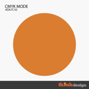
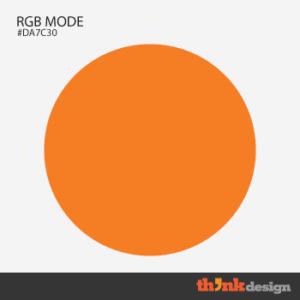
Orange Color Variations
One color can have several variations depending on properties like tint, shade, tone, saturation and chroma. In her color thesaurus, Ingrid Sundberg has described a variety of orange colors you can pick to create your logo design. These include carrot, honey, fire and marigold my favorite. This however is just a kickstarter as the writer points, there are of course many more types of orange color.
If you still can’t find the perfect tone of orange, browser extensions like ColorPick Eyedropper can help you when you like the color of a photograph, vector or painting.
Color Psychology Of Orange
When clients start a project, usually they mention the color they want for the logo in the brief. In this scenario, if someone fancies orange to be the face of the brand then your task as a designer is to truly study the color – that is to brainstorm all the possible clauses before-hand. You don’t want the ideation and prototyping stage to suffer simply because you were too lazy to empathize and define. Following are the questions and answers that need your attention.
How Does Orange Stimulate Humans Emotionally And Psychologically?
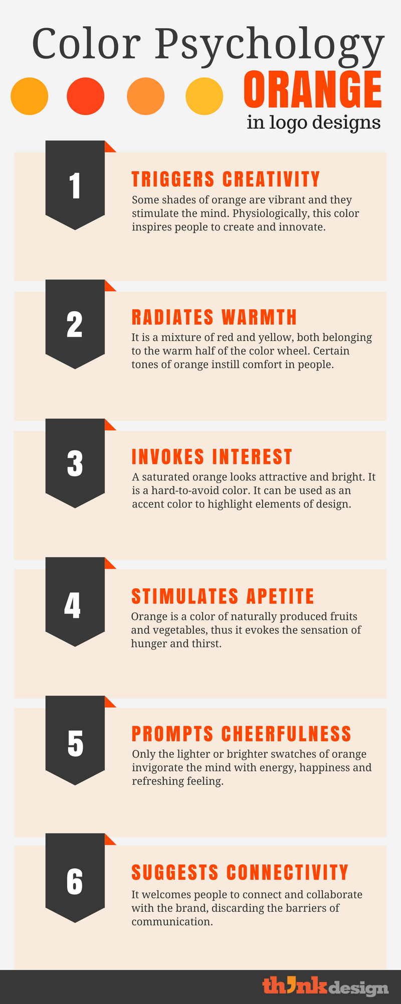
A color isn’t something you add to make a dull logo pop out. It impacts people on emotional levels so much so that it can trigger a certain action. This is why some food and beverage companies like to use orange for their sub brands. For instance, Fanta makes you drool and that bright orange propels you to grab the bottle and quench your thirst. A paper Responding to Color by the University of Kentucky Cooperative Extension reveals that as light emitted from the (visible) color (like orange) falls on human eye, it affects the hypothalamus and the pituitary gland that is responsible for controlling mood hormones.
Do Countries And Cultures Influence The Connotation Of Orange?
Yes! People have different preferences that are often driven by their geographic location and cultural setup such as orange in Japan and China signifies courage and happiness while in Egypt it represents something as depressing as mourning. In Colombia it implies to fertility and sexuality. On the other hand, in India the color is treated as sacred and highly-revered. In the Buddhist culture orange symbolizes love, peace and humility; and in Ireland it has a religious implication. One color, such as this, can have countless symbolic meanings across the globe.
Sometimes, there may not be a logical explanation for this apart from taboos that dominate social ethos. As a designer you mustn’t ignore any aspect of color that can influence the meaning people make from a brand image. It is always a good idea to first do your research on where clients come from and where they want to start their business. It will be unwise to use orange in a logo for a contraceptive brand in a Colombian state.
Does The Connotation Of The Color Change With Its Shades And Tints?
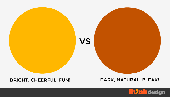
Yes of course! Examine the colors below and think whether or not you feel the same for every single one of them. These are shades and tints of orange that are made by increasing or reducing the percentage of red + black and yellow + white, respectively.
If I am right, when you see a pastel orange you feel happy or refreshed and probably link the color to a brand for babies. But when you see a dark brown orange, you either feel the aura of nature or you feel depressing.
What Will Happen If Orange Is Paired With Other Colors?
In one of his interviews, graphic designer Massimo Vignelli clarified that “no color can be preferred or not preferred in isolation. Every color is in context to another color.” In fact psychologist Angela Wright confirms that people respond to colors when they’re placed in combination. Even if you use only orange in your logo, the surroundings will affect how this color is perceived by the audience.
Online tools you can use to pair colors and make a palette for your logo:
Does The Choice Of Orange Change When Working With Different Industries?
Colors and color palettes change by the industry, but it is possible that one color occurs on the brand identity of diverse businesses. For instance orange is used by food and beverage companies, e-commerce businesses, vehicle manufacturers, television channels, tech firms, design programs, universities, courier services and several more.
Orange Logo Inspirations
