Decoding the Typography Choices of 12 Famous Logo Designs
Featured Image: Freepik.com/freepik
Typographic logos show that wordmarks can be made effectively and distinctively without additional graphic design elements in logo design. It is also likely that many brands would appreciate a logomark, or at the very least, an abbreviated design. Still, some brands may prefer a logotype or wordmark, which conveys their brand identity more effectively.
Typography can be elegant and modern; it can be used alone or combined with pictorials or illustrations to express an idea about the brand. The negative space within a type logo may even contain hidden traits.
Here are 15 typographic logos that excelled, sometimes through inventive lettering or ligatures, sometimes through color or typeface placement. If you are looking to create a logo that is simple and versatile, you can find inspiration with these font styles too!
12 of the Best Typographic Logos and What They Mean
Here are some of the best typography choices in popular logos and the meaning behind them.
1. American Eagle Outfitters
American Eagle Outfitters (AEO), a popular American clothing brand, uses a distinctive typography for its logo and branding purposes. The font used by American Eagle Outfitters is a custom-designed typeface. This typeface features a clean and modern design that looks very stylish.
American Eagle’s primary logo is displayed with bold uppercase letters in a classy serif font with sharp serifs and thick contours. Two fonts will likely produce the same result as the one used in this logo: Walbaum Pro 06pt Regular and Carot Text Medium, though their contours may have been slightly altered.
The clean and modern design suggests a stylish and up-to-date brand, while the bold, uppercase letters convey confidence and strength. Using a classy serif font with sharp serifs and thick contours adds an element of elegance and quality to the brand’s image.

2. Black and Decker
Black & Decker, a well-known American manufacturer of power tools, home improvement products, and appliances, has a simple typographic logo. A redesign was introduced in 2014, featuring two levels of orange sans-serif lettering and an ampersand replaced by the symbol “+.”
All letters in the inscription are capitalized and placed with balanced spacing between them. Featuring the same shade of orange, the logotype is enclosed within a rectangular frame stretched horizontally. If you are looking for inspiration, you can find quite a few examples of free fonts for typography lovers.
P The Black & Decker logo’s typography shows clean and capitalized sans-serif letters with uniform spacing, which conveys simplicity and professionalism. Using an orange color in a rectangular frame promotes a reliable brand image and a friendly and cheerful look if we consider color psychology in logo design.

3. V&A logo
Pentagram is best known in another London museum for its most recognizable mark. Designed by the late Alan Fletcher, the V&A Museum’s identity is stunningly simple and effective. As a mirror image of one another, the V and A are formed by merging, and the ampersand serves as the crossbar of the A, thereby eliminating the need for further detail.
Despite being originally designed in 1989, the logo remains as relevant today as it was then. The clever integration of the V @ A letter and the ampersand symbol creates a memorable and instantly recognizable logo. It reflects the museum’s dedication to creativity and innovation in art and design.
The enduring use of the same logo since its creation in 1989, even through rebranding, demonstrates the museum’s commitment to tradition and heritage.
4. NME logo
NME’s simplicity contributes to its success in scaling. NME (New Musical Express) is an institution in British music, and its new logo – updated in October 2013 – simplifies a simple typographic logo that was already straightforward. This illustrates how much simplicity can still be achieved while maintaining its distinct look. Using a simplified, all-caps typeset in Lucas Sharp Sans, a sans-serif font, this title demonstrates authority.
The NME logo has evolved over the years but has always reflected the relevance and connection to the music industry. It shows how icons and typography in music logos can lead to a winning design. Using bold and dynamic typography along with sharp and angular letters on a red background shows excitement, passion, and a sense of youthfulness, which aligns with a target audience of music enthusiasts, especially the younger demographic.
5. Action on Hearing Loss logo
By using strikethrough, the point is made clearly and loudly. There are numerous types of typographic logos; sometimes, underlining or striking through letters can convey enormous amounts of information.
Underlining and strikethroughs in this logotype for a hearing loss charity highlight the positive aims of the organization – specifically the aim of improving hearing and communication – giving the wordmark an inspirational call to action.
6. FedEx logo
It would be impossible to compile a list of typographic logos without FedEx. The FedEx logo was designed in 1994 by Lindon Leader, a senior designer at Landor at that time; it is a classic example of a simple, clever type-based logo that has remained relevant and modern over the past 20 years.
This FedEx logo illustrates that the best types of logos are also very clever and capable of containing more information than initially appears on the surface. In addition, it features a very appropriate arrow indicating FedEx’s dedication to speedy delivery of parcels. As soon as you see it, you cannot ignore it. Additionally, colors distinguish between different divisions within FedEx’s logotype.
You can also get inspiration from clever typography and create one for your business. You can consider using any of the amazing typography tools in Illustrator for wordmarks that impact the viewer.
7. MailChimp logo
MailChimp’s logotype conveys an informal, friendly appearance. The best wordmarks can convey a great deal of personality. The small-case wordmark is integral to the brand’s informal, friendly appeal, reflected in its monkey mascot. With a memorable brand mascot, it’s easier to stand out from the competitors in a crowded industry.
A new branding strategy reflecting the email marketing service’s growth strategy led to the current logo. Mailchimp’s mascot and name had to be combined to become one. Freddie, the chimpanzee head, was never associated directly with the platform, as the word trademark and mascot were incompatible.
The developers began by changing the font and making all the letters lowercase. Small businesses no longer needed to split the name into two words since the service provided more than email.
There is more to Freddie than just being a chimpanzee. The characteristic cap of a newspaper peddler indicates that this is a postman monkey. Presented in this way, email marketing can be compared to a letter delivery service, with the monkey acting as the cheerful and friendly courier.
8. Amazon
The Amazon logo features the company name, typically in lowercase letters, along with a curved arrow that starts its tail at ‘a and ends at ‘z’. It highlights the company mission that offers everything on its platform, from A to Z.
Amazon uses a clean and modern sans-serif typeface for its logo. The typeface is known as “Amazon Ember. It’s designed to be approachable and friendly, reflecting the company’s customer-centric approach. The typography shows the company’s commitment to innovation and user-friendliness in its vast online store.
9. Etsy Logo
A typography logo primarily comprises text, but using color can help you create a unique design that grabs your audience’s attention.
Using a regular serif font, Etsy uses an orange color scheme that is not overpowering but still lighthearted. A logo that uses a color other than the commonly used red, blue, or yellow will stand out from the crowd.
For brands with a reputation for reliability and established values, serif fonts are a good choice. To create a logo that is unique to your brand, you can combine bold colors with different typefaces.
Image Source: commons.wikimedia
10. Mercedes-Benz
The Mercedes-Benz logo has a silver star enclosed in a circle, with the company n written below or around the silver star.
Mercedes-Benz uses a serif font known as “Mercedes-Benz Corpo” for the company name. This typography choice displays luxury, which aligns with the brand’s reputation in the automobile industry. Further, the silver star in the logo symbolizes excellence and achievement, while the serif typography adds a touch of elegance and timelessness.
11. Flickr Logo
It is also possible to use color effectively by changing the color of a single letter or word within your logo. If you are trying to emphasize a particular letter, change its color for the best results. The ‘r’ in Flickr’s logo has been changed to a bright pink color. In contrast to the rest of their logo, this letter stands out immediately.
This unique use of color, where one letter stands out, draws attention to the “r” and creates a memorable and playful element in the logo. The remaining letters in the logo are typically in blue, making a visually appealing and distinctive brand identity for the Flicker platform.
Further, the blue color symbolizes the sky or a clear day, which reflects the idea of capturing beautiful daytime photos and sharing them on the platform. The color is quite popular across industries today. For instance, AI companies can use blue logos to connect with their audience effectively.

12. Visa logo
Although Visa has undergone several iterations, the logo has always remained recognizable. Throughout the years, Visa has redesigned its logo several times, often changing the colors to create a more contemporary aesthetic.
The latest update has changed the color scheme to a more electric blue. As well as this, it possesses a logomark composed of the company’s famous blue and yellow rectangles. Yet, the iconic typography is still instantly recognizable due to its strong embedding in the public consciousness. The blue color shows loyalty, confidence, security, speed, and reliable authority for the customers gets easily engraved in one’s memory.
Best Methods for Designing and Printing Logos Using Typography?
Using typography in logos is an effective way to establish an outstanding brand identity, as you have seen in the above examples of how most popular brands have used their logos. Well, let’s learn how to use typography to create unique and memorable logos.
1. Choose the Right Font
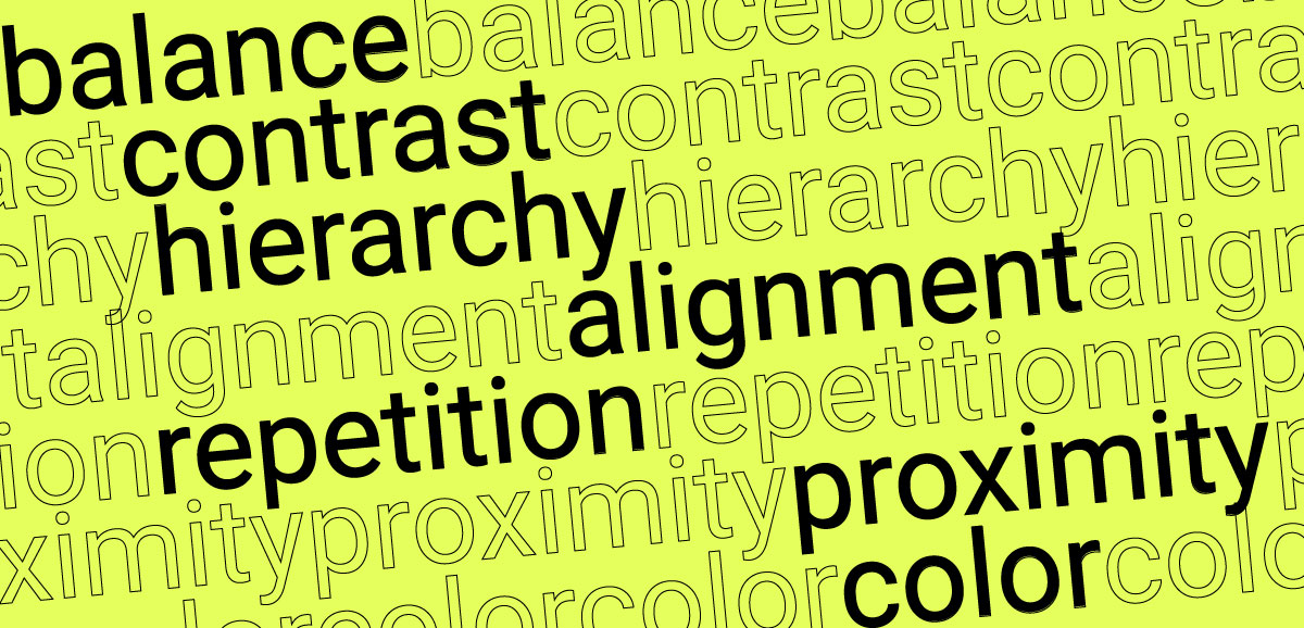
A typography logo’s font is an important consideration. In addition to being legible and scalable, your logo should reflect the personality and values of your company. You should use only a few fonts, which could be confusing and distracting. Choose one or two complementary fonts and use different sizes, weights, and styles to establish a hierarchy and contrast. You may add shapes, curves, or effects to your fonts for a more personalized look.
Understand the associations and feelings associated with each typeface. Serif fonts are generally regarded as classical, authoritative, and assertive. However, a sans-serif font is modern, clean, and technologically advanced. You should also pay attention to your typography logo’s weight, size, and kerning. It would be best to use one typeface, adding a second typeface for emphasis or a stylized effect.
In the end, you need to understand how the logo will appear on promotional materials in digital and print. For example, it’s a good idea to understand the science of typography in packaging designs when choosing fonts and styles so you can draw attention to your wordmark on product packaging.
2. Use Negative Space to Your Advantage
It is possible to enhance your typographic logo by creatively utilizing negative space. A negative space is any space around a subject or between them.
The FedEx logo is the most famous example of how this technique is utilized in logo design, as explained above.
3. Create a Letterform by Combining Two Letters
Combining individual letterforms with your typographic logos is another very creative way to customize your typographic logos. A unique experience can be created when you combine individual letterforms to produce an entirely new creation.
4. Make the Right Color Choices
You can greatly influence the look and feel of your typography logo by choosing the right colors. Your brand identity should be reflected in your chosen colors, which should blend well with your background. You can create color schemes using Adobe Illustrator’s Color panel or find complementary colors using the Color Guide panel.
There are various emotions and associations associated with colors. Colors should be chosen according to the tone you wish to convey to the audience and what is relevant to the industry and the product you are promoting.
5. Change the Letterforms
Changing your letterforms’ shapes, sizes, and orientations is an excellent method of customizing typographic logos. A look like this can be distinctive and hard to forget.
Dell’s logo is the most well-known example of this in logo design. The letter ‘E’ has been changed to give the logo a unique look.
6. Make Variations in Color
To make your typographic logo unique, you don’t only need to change the typography but also other aspects of the logo. Playful color variations can also help make the logo stand out from the crowd and make it distinctive.
The ‘Flickr logo’ is one of the most famous examples of this being used in logo design.
7. Create an Image or Icon from a Letterform
Changing your lettering into images, icons, or graphics can be a fun way to customize your typographic logo. LG’s logo is most famous for using this in its logo design.
Conclusion
Our collection of typographic logos featuring creatively incorporated images is intended to inspire you when designing your logo. An effective typography logo attracts attention and is remembered for a long period. Take a moment to consider the creative typography logo designs of any company. Most likely, its name incorporates some form of wordplay or a famous quotation.