How To Use Special Type Effects In Photoshop For A Kickass Logo Design
Want to learn how to make a type-based logo that stands out from the crowd?
Of course you do! Who wouldn’t?
Type-based logos, including wordmarks, lettermarks, and monograms, are incredibly popular, and they’re also effective. A quick look at some of the most famous logos of all time makes it clear: according to this blog, ten out of thirteen of the top logos of all time involve typeface to some degree.
Whether the logo is a wordmark, like Coca-Cola, or a lettermark or like McDonald’s unmistakable golden arches, the choice and usage of fonts contributes to the recognizability and enduring popularity of these logos.
But it isn’t enough just to append some type to your iconic logo, and it definitely isn’t enough just to type out your monogram in Times New Roman and expect it to automatically become a memorable logo.
There are plenty of tips and tricks for awesome type effects. Let’s take a look at some of the most epic choices for creating a kickass logo that puts you head and shoulders above the rest of the crowd, using special type effects in Photoshop.
Comic Book Effect
This is a single-layer text effect, which makes it a fairly easy text trick for Photoshop beginners.
Set up your background to begin with, and then select your font. This tutorial uses a font called Brady Bunch Remastered, which is a heavy, thick sans serif font which works well with this effect.
Type the letters or words you want to apply the effect to, and use the Warp Text choice from the menu. You can adapt the settings as you like by adjusting the style, bend, and horizontal distortion by percentage.
Once the layout of the text is to your liking, add an outside stroke with a gradient fill, then an inner shadow. Adjust the color palette as you go.
Next, add in a color overlay of your base color to the rest of the text, followed by a “red dots” pattern overlay. You can adjust the position of the dots overlay by clicking and dragging the layer.
A final step is to add a drop shadow to the entire layer.

Image Source: Screenshot From YouTube
Displacement Map
Suppose you’re using a logo background and you want your type to look as though it’s printed directly on the background. That can be easy if the background is flat, but it might take a few extra steps to make the text fit if the background has, say, wrinkles or water ripples on it.
But that’s what this tip is for!
To make your logo text conform to the background you choose, you’ll use a displacement map. First of all, start with the background you’re going to work with. Create a displacement map by turning it black and white. If there is fine detailing in the image, you may want to use a Gaussian blur to make it a little easier to work with.
Save a copy of the image as your displacement map, and go back to the original background.
Place your text on the original image in the area and angle that you want the finished product to be in. For maximum editability, convert the whole thing to a smart object, so you don’t have to rasterize your text.

Image Source: Screenshot From YouTube
Go to filter, distort, and select displace. Open your saved displacement map.
The text will conform to that displacement map, using the color values in the black and white image to tell it where to go. Once the text is basically in place, you can select that layer and alter the color and opacity, as well as adjusting finer details like embossing to make the effect more realistic.

Image Source: Screenshot From YouTube
Letterpress Type Effect
This is an easy, classy effect that really adds depth and interest to a text based logo.
“Hand made” logos and type of all kinds are definitely on trend right now, too, so this might be the perfect way to dress up your lettermark.
And since it really doesn’t take many steps to create this look, it’s a fun effect to play around with.
Start with your background in place, and use a vignette effect. This type of “created” lighting sets letterpress style effects off really well. Add your text content in the typeface you’ve chosen for your logo.

Image Source: Screenshot From YouTube
Working with the text layer, open up the dialogue box and create a bevel effect on the text, with the direction up. These effects will make the font look as though it is coming up and out towards the viewer.
Add a drop shadow to the text.
Finally, set up a gradient overlay, in normal mode and at between 70% and 80% opacity. You can use different colors for the gradient, depending on the tones of your background text, but black to dark gray gives it a solid feel.
To create the opposite effect, giving the text a true “letterpress” print feel, start from the beginning and use the emboss effect to press the text downward.
Add an inner shadow to the text to create the “pressed” feel, then add in the gradient overlay at the same levels as the embossed variation.

Image Source: Screenshot From YouTube
For a more detailed walkthrough of the letterpress effect and how to create it, take a look at this tutorial.
Gold Text Effect
There’s nothing we want more, as designers, than to create a logo design that’s as good as gold. And if you’re a literal-minded person, you can actually do that with this type effect.
Open your new canvas and put your background in place. With this effect, a black background is highly recommended to get the most “pop” out of the gold.
Type your content in white, and size it as you want. Then add a layer to the type.

Image Source: Screenshot From YouTube
Next, click on Layer Styles and select a gradient overlay. Click on the color swatch and change it to a light, warm yellow, with a slightly darker yellow on the other side of the gradient. Save the gradient and apply it to the duplicate text layer.

Image Source: Screenshot From YouTube
Change the style of the gradient to “reflected” to match top and bottom, with the lighter color running through the middle. Add a bevel and emboss effect to outline the edges, with an inner bevel that is set to the “chisel hard” technique. You can also adjust the shading and shadowing as you go, testing the effect out to get what you want.
Next, adjust the size of the bevel and emboss to give that “peaked” look to the text. You can do this by clicking the up arrow for that text effect. Watch it as it changes on the text, and continue until the effects merge to fill the text.
The overall effect is complete, but you can add other effects such as glows and sparkles to give your gold effect a true shine. The Gold effects looks beautiful on jewelry logos.

Image Source: Screenshot From YouTube
Glowing Text Effect
This fifth effect is a great one because of its versatility: the glow can be extremely obvious, or it could be done in an understated way, depending on the tone you want for your logo. It’s an easy effect, too, with only a handful of steps to follow. The glow text works perfectly on game logos.
This effect also starts with a black background and white type.

Image Source: Screenshot From YouTube
Next, rasterize the type and apply a gradient. You can edit the gradient to whichever color you want to use, just make sure that the colors go from a deeper shade to a lighter shade, rather than to black or white.
Create a duplicate layer, and click on the filter drop down menu. Go to Render, then Clouds. Change the blending mode to color dodge. Next, click on the original type layer, and apply a gaussian blur. You can adjust the size and radius of the blur depending on how large you want the glow to be. For those looking to sharpen their design or entrepreneurial skills, consider exploring the cloud certification dumps.
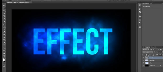
Image Source Screenshot From YouTube
The Wide World Of Photoshop
These five special type effects are definitely popular choices in graphic design, though relatively rare in logo design. Which is good news, because they’re even more of a leg up in creating a stand-out logo!
At the same time, these type effects are evocative of the graphic trends we see today, with influence from handmade goods, 3D design, and comic books, placing them firmly in line with the cutting edge.
Of course, there are plenty more special type effects out there for your logo designing edification. Photoshop comes with a plethora of options that verges on the overwhelming. And, venturing outside the software itself, you can also find other artists who have put together alternative brushes and effects packages to give your Photoshop design a little extra unique oomph.
Photoshop is a fantastic tool that equips designers of all levels to create unique pieces of art, including logos. With all the options available to you, don’t settle for a run of the mill lettermark. You’ve got everything you need to create a type based logo design that is a surefire hit.