3 Ways Logo Designers Can Break The “Red & Green Should Never Be Seen” Rule
Feature Image Source: iStock/PeterSnow
There are many “rules” out there about color combinations. Whether it is about wearing colors or using colors in the design, these rules make their way to us often. One such rule states “red and green should never be seen” together. We aren’t sure why this rule exists….it may be that these colors are associated with a “holiday” spirit, and this fixed association makes it difficult to imagine them into something else. Or it may be that these colors represent two entirely different and opposite ideas. When Green is “Go”, Red is “Stop!”. When green is “yes”, red is “no!”. However, the design world vastly makes use of this color combination. Today we are going to see how red and green can be a great color combination that makes the design all the stronger. In company logo designs, this significant combination can work wonders, whether you’re opting to hire a graphic designer, or make use of an AI logo generator.
Green And Red Are Complementary Colors
When it comes to the color wheel, green and red are housed opposite each other. These colors are also called complementary colors. Complementary colors are those colors which are “opposites” of each other on the color wheel. This means that the one color they don’t have in their shade is the one that sits opposite to them. Because of this, complementary colors provide a very significant visual tension. They pull the design in a different direction. Yes and No. Go and Stop. Accept and Decline.
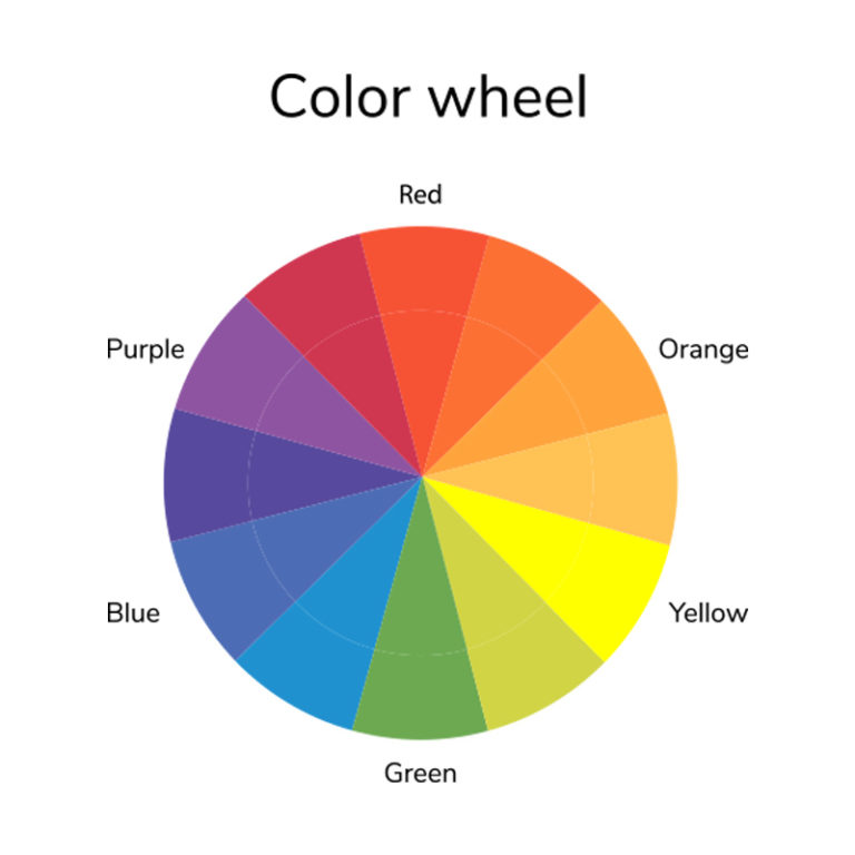
Image Source: istock/ Irina Kuznetsova
Because of this, it is also safe to say that opposites attract and designers can use this to their advantage. What we mean by attracting is that in a logo full of green, a slight red outline is going to catch your eye. Because it is an opposite color. This is why if you want to make something really stand out, you should use complementary colors. And the use of green and red in logos make the logo stand out along with its individual, defining elements.
1. TAP Logo: Using Red And Green For Opposite Meanings

TAP uses two green and red to emphasis opposites on multiple levels. It can mean how it takes you from one end of the world to another. It can signify the “holidays”, or it can even mean be for the sake of the visual attraction because red and green can easily stand out from a distance. The TAP logo is cleverly made with different tones of green and red. The designer cleverly disguises the letter “A” inside the T and the P to make the logo look more integrated and less heavy.
Explore: 5 Essential Things Designers Should Know About Colors
2. Mountain Dew Logo: Red And Green For Energy & Rejuvenation
Red and Green are also used to represent energy and rejuvenation. Red is a color of vigor and energy. It represents passion, urgency and grabs instant attention. It can also cause you to feel hunger, which is why it is used in food and beverage logos. Green, on the other hand, is a color of peace, rejuvenation, nature, cleanliness, and fertility. It represents the vital, growing energy of life. This is why the red and green combination is often used by beverages that claim to give you energy and vigor, along with calm and rejuvenation at the same time.
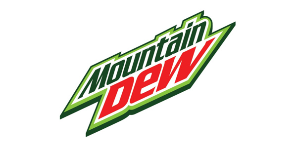
The Mountain Dew Logo makes use of different shades of green to create depth in the logo. This keeps the logo from becoming flat and boring.
3. Heineken Logo: Using White To Maintain Harmony
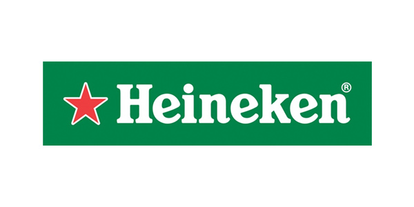
White space is the breathing space. However, sometimes, you can use this white space in a different way. Instead of the usual white background, the Heineken logo uses white as its font color. This is used to maintain harmony in the logo. The Heineken logo comes with a forceful green background that is encrusted with a red star. The visual tension between these two colors is great, and the splash of white breaks is beautiful while drawing attention to the text.
You can also use other colors, such as orange, to balance this tension created by the play of red and green. Notice how the 7 Eleven logo uses just a hint of orange to break that tension.
