Typography in Graphic Design: Guide to Principles, Systems, Hierarchy, and Readability
This guide explores the essentials of typography in graphic design, helping you understand how to choose and pair fonts for impressive logos, across websites, and for marketing collateral.
Typography is about shaping how a brand communicates visually and emotionally with its audience. The style of lettering you select can instantly convey professionalism, creativity, elegance, or playfulness. This makes typography in graphic design a key element for building a strong brand identity.
It can set a business apart and make it instantly recognizable. And this works for websites, marketing collateral, and anywhere else to maintain consistency. The right typography can become associated with a brand for a long time and help tell its story at first glance.
What is Typography in Graphic Design?
It is one of the core elements, along with colors, shapes, and imagery. This is the simplest explanation for the term and some of you may already be quite familiar with it too. Since we are going to be discussing this in detail, it’s a good idea to refresh your understanding of typography or even learn something new. In graphic design, the art of arranging text to make it readable, clear, and visually appealing is known as typography.
The process involves selecting typefaces, adjusting spacing, organizing the layout, and creating a hierarchy so that the content is both visually impactful and engaging.
Typography vs Fonts vs Typefaces
These three may be used interchangeably sometimes, but are actually quite different. Understanding how the terms vary is important since it prevents confusion when working with brand systems. You’ll also find it easier to communicate more clearly with professional designers, and make more intentional decisions as you are selecting and using text across digital or print environments.
• Typeface
A typeface is the design style of a complete set of characters that share the same visual look, such as letters, numbers, and symbols.

Georgia Typeface in letters, numbers and symbols
For example, Georgia is a typeface.
• Font
A font is a specific variation within a typeface, defined by weight, size, or style.

Font variations in Georgia
For instance, Georgia has different font styles, including regular, bold, and italic. It also comes in different sizes. Each variation, such as Georgia Bold 16px or Georgia Regular 28px, is a different font.
• Typography
Typography is the overall system and practice of designing and arranging text to communicate meaning and tone. It includes how text is structured, spaced, and styled across different mediums.

Homepage of Anthropic that shows Georgia in display text
How Anthropic uses Georgia across its website, combining size, spacing, and structure to create a consistent reading experience shows the way typography works.
Breaking Down Letterforms: The Anatomy of Fonts
Font anatomy is about the visual structure of letterforms. It covers how each part of a letter is shaped and positioned in the overall design. These structural details influence how a typeface functions in design like the way it looks or feels. Even minor differences in height, spacing, curves, and stroke endings can affect a font’s readability as well as perception. This also extends to the anatomy of typography. So it’s important to become familiar with the elements to make more informed decisions when selecting or pairing typefaces.

Font anatomy breakdown
• Baseline
This is the invisible horizontal line on which most letters rest.
• X-height
It’s the height of the main body of lowercase letters that defines how they will appear before adding ascenders and descenders.
• Cap Height
The height of uppercase letters from the baseline is known as cap height.
• Ascender
These are the parts of lowercase letters that go above the x-height, like the upwards direction of b, d and h.
• Descender
They extend below the baseline in letters like g,p or y.
• Serif
The small strokes or extensions at the ends of letters are serifs.
• Counter
It is the internal space within a letter, either fully enclosed, like o, or slightly open, such as e or c.
• Bowl
This is the rounded, enclosed curve of a letter, as seen in b, d and o.
• Stem
The primary vertical or diagonal stroke of a letter is a stem. In characters like H, I, l, and k, a stem is considered the backbone, with other parts connecting to it.
• Shoulder
It’s the curved stroke that extends from a stem, commonly seen in letters like ‘n’ and ‘h’.
• Terminal
It is the finishing point of a letterform in characters like a, c, f, and r.
Typeface Classification
Each type of typefaces have distinct visual characteristics and emotional associations. From the authority and tradition conveyed by serif fonts to the clean, modern feel of sans-serif typefaces, every trait plays a key role in visual communication. Once you know the differences in each category, it becomes a lot simpler to choose fonts that are relevant to the industry and send the right message.
Let’s take a look at the major classifications that impact typography for branding and design.
1. Serif Fonts

Serif font styles
These are defined by small decorative strokes (serifs) that extend from the ends of letterforms. The fonts are associated with trust, authority, and tradition, making them a popular choice for industries like education, law, and finance. You’ll commonly see serif styles used in real estate logos, editorial design, branding, and formal communication.
- Old Style: Low contrast, organic forms, and a warm, handwritten feel.
- Transitional: Moderate contrast with refined shapes, balancing tradition and clarity.
- Didone (Modern): High contrast, sharp serifs, and a sleek, elegant appearance.
- Slab Serif: Thick, block-like serifs with minimal contrast and a bold presence.
2. Sans Serif Fonts

Sans Serif font styles
They don’t have any decorative strokes at the ends of letters. This gives them a clean, modern, and minimal appearance. And for a visually appealing typographic logo, such fonts are a great choice. They are associated with modernity, simplicity, and functionality, so you’ll find them across many different industries.
- Grotesque: Slightly irregular forms with subtle contrast and a classic industrial feel.
- Neo-Grotesque: Uniform strokes with balanced proportions and a clean, neutral style.
- Geometric: Based on simple shapes, creating a structured and modern appearance.
- Humanist: Organic forms with varied strokes, improving readability and warmth.
3. Script Fonts

Script font styles
The fonts bring an elegant, decorative, and sometimes personal feel to designs, making them ideal for conveying emotion, creativity, or sophistication. Script styles resemble handwriting and can also work well in a typography logo for instance.
- Casual Script: Loose, informal strokes with a relaxed and friendly appearance.
- Brush Script: Bold, textured strokes with a dynamic and energetic feel.
- Calligraphic Script: Fluid, precise strokes with an elegant and decorative style.
- Handwritten Script: Natural, unrefined forms with a personal and authentic look.
4. Display Fonts

Display font styles
Such fonts are highly decorative typefaces designed to grab attention. They are not intended for body text but are instead used for headlines across website designs, titles, or key visual elements where impact is the priority. Display fonts have unique shapes, exaggerated features, or specific variations.
- Decorative Display: Stylized forms with artistic details and expressive shapes.
- Futuristic Display: Clean lines with geometric structure and a forward-looking feel.
- Bold / Impact Display: Heavy strokes with strong presence and high visual emphasis.
- Hand-Drawn Display: Irregular forms with organic detail and a crafted appearance.
5. Monospaced

Monospaced font styles
These typefaces are made up of characters that take the same amount of horizontal space. This leads to a uniform, grid-like appearance, making the letterforms highly structured. Monospaced fonts work well for digital platforms, like app designs, where clarity and alignment are key.
- Typewriter Monospace: Mechanical forms with slight irregularity and a vintage feel.
- Modern Monospace: Clean, optimized shapes designed for digital readability.
- Humanist Monospace: Balanced structure with subtle variation and natural proportions.
- Geometric Monospace: Precise shapes with minimal variation and a structured look.
6. Blackletter (Gothic) Fonts

Blackletter font styles
Typefaces based on medieval manuscript writing are known as Blackletter. They feature dense, angular, and highly decorative letterforms. The font styles are associated with tradition, history, and formal publications, and used in newspaper nameplates, certificates, and designs with a historical aesthetic.
- Textura: Dense, angular strokes with tight spacing and a formal appearance.
- Fraktur: Decorative forms with mixed curves and a traditional Gothic style.
- Rotunda: Rounded shapes with softer strokes and improved readability.
- Schwabacher: Flowing forms with combined curves and a distinctive character.
7. Symbol / Dingbat Fonts

Symbol and dingbat font styles
The fonts consist of icons, shapes, or pictorial elements instead of traditional letterforms. They are used for interface design, visual communication, and decorative purposes rather than readable text.
- Pictorial Symbols: Icon-based glyphs used for visual communication and navigation.
- UI Icons: Functional symbols designed for interfaces and digital systems.
- Decorative Dingbats: Stylized shapes used for embellishment and visual accents.
- Brand Icon Sets: Consistent symbols used to represent identity and systems.
| Font Classification | Key Characteristics | Common Use Cases | Example Fonts |
| Serif | Small decorative strokes (serifs), traditional, readable in print | Books, newspapers, formal branding, finance, education | Times New Roman, Garamond, Georgia, Baskerville, Didot |
| Sans Serif | Clean, no decorative strokes, modern and minimal | Websites, apps, branding, UI design, tech companies | Arial, Helvetica, Roboto, Open Sans, Futura |
| Slab Serif | Thick block-like serifs, bold and sturdy appearance | Posters, advertising, logos, headlines | Rockwell, Clarendon, Roboto Slab, Archer |
| Script | Handwriting or calligraphy-style, decorative and expressive | Invitations, logos, branding, creative design | Pacifico, Lobster, Brush Script, Dancing Script |
| Display (Decorative) | Highly stylized, attention-grabbing, unique shapes | Headlines, posters, packaging, branding | Impact, Bebas Neue, Abril Fatface, Bangers |
| Monospaced | Equal spacing for all characters, grid-like structure | Coding, terminals, data tables, technical documents | Courier New, Consolas, Fira Code, JetBrains Mono |
| Blackletter (Gothic) | Dense, angular, medieval-style letterforms | Certificates, newspapers, historical or formal designs | Fraktur, Old English Text, Textura, Cloister Black |
| Symbol / Dingbat | Icons, shapes, or pictorial glyphs instead of letters | UI icons, decorations, visual communication | Wingdings, Webdings, Font Awesome, Material Icons |
The Fundamentals of Font Pairing
Font pairing is one of the most important aspects of typography. It involves combining different typefaces in a way that creates clarity, balance, and visual interest. Strong pairings, such as serif with sans serif or display with sans serif, help guide the reader’s attention and improve readability. When done poorly in typography design, font or typeface combinations can make a design feel cluttered or confusing. Effective font pairing helps maintain harmony in design and strengthens brand identity.
• Create Contrast for Strong Visual Impact
Contrast is the foundation of all typeface pairings, helping distinguish elements and improve readability. It makes designs feel structured and visually engaging instead of flat or repetitive.
Good contrast can be created through:
• Font Weight:

Bold and light font pairing for contrast
Differences in thickness (bold vs. light) create emphasis and separate key and supporting text.
• Font Size:

Fonts from bold to medium to small and micro to show thickness
Varying sizes establish importance and guide reading flow.
• Font Style:

Font sizes in Serif and Sans Serif to show variation
Mixing styles, such as serif and sans serif, in font types clearly separates different levels of information.
• Font Structure:

Stylized fonts to show differentiation
Contrasting shapes and structures, such as geometric shapes with organic forms, add variety and visual balance.
Takeaway: Strong contrast helps make sure every typographic element has a clear and purposeful role.
• Build Visual Hierarchy for Clear Reading Flow
Visual hierarchy organizes content in typography design so readers can easily understand what to focus on first. It creates structure and improves readability.
• Font size hierarchy:

Large to medium and small text for visual font hierarchy
Larger text highlights importance and can be used for a typography logo while smaller text supports detail so it could work well for a tagline.
• Font weight hierarchy:

Bold and thin text for weight hierarchy
Bold text emphasizes key points and lighter text supports content.
• Typeface hierarchy:

Varying fonts from elegant to clean for typeface hierarchy
Different fonts separate headings, subheadings, and body text.
Takeaway: Hierarchy makes sure that content is easy to scan and logically structured.
• Match Fonts to Tone and Purpose
Typography carries personality, so modern fonts should reflect the message, mood, and intent of the design. The right combination or typography pairings need to strengthen communication and feel appropriate for its context.
• Serif + Sans Serif:

Serif font styles and their associations
Balances tradition with modern clarity, mostly used for professional and editorial designs.
• Sans Serif + Display:

Display font styles and their use
Combines clean readability with strong visual impact for headlines and branding.
• Serif + Script:

Serif and script font pairing
Blends structure with elegance, commonly used in luxury, wedding, or premium branding.
• Sans Serif + Script:

Script and sans serif font pairing
Mixes modern simplicity with expressive detail, commonly used in lifestyle or creative brands.
• Sans Serif + Monospace:

Monospace and sans serif font pairing
Creates typography with clean design and technical precision, ideal for tech and digital products.
• Display + Serif:

Display and serif font pairing
Merges decorative impact with a traditional base, found in editorial headlines or posters.
Takeaway: Font pairings should match the message’s tone to keep the design intentional, cohesive, and emotionally consistent.
• Avoid Similar Fonts for Clear Distinction
Fonts that look too similar reduce clarity and can feel unintentional. Clear differences allow each typeface to have a defined role.
• Clear differentiation:

Different fonts to show distinction in text
Choose easily readable fonts with noticeable differences in structure, weight, or style so each one stands out clearly in the layout.
• Avoid near matches:

Similar font styles to avoid confusing viewers
Fonts that are almost identical can look like a mistake rather than a deliberate choice, creating visual inconsistency.
• Intentional contrast:

Contrasting fonts to show clarity and readability
Use fonts with purpose-driven differences so each typeface clearly supports a specific role, such as headings or body text.
Takeaway: Professional fonts improve organization and readability.
• Limit Fonts for Cleaner Design
Too many typefaces or fonts for branding create clutter and reduce clarity. A controlled selection keeps the design focused and readable.
• Two-font system:

Two-font system for heading and body text
Use one typeface for headings and another for body text to create a simple, clear, and highly readable structure.
• Three-font system:

Three-fonts for heading, sub heading and body text
Add a third accent font only when needed to highlight key elements or create emphasis without disrupting balance.
• Controlled variety:

Three varying font styles for heading, body text and sub heading
Limiting font choices reduces distraction and allows for a more unified, structured, and professional design layout.
Takeaway: Limiting fonts strengthens clarity and visual balance.
• Ensure Readability in All Formats

Clear typography for heading and body text
Typography must remain clear and functional across all sizes and platforms. Readability is essential for effective communication.
• Letter clarity:

Clarity of letters for readability
Use well-defined letterforms with simple shapes to improve recognition as well as make text easier to read.
• Spacing balance:

Spacing between text to guide the eye
Maintain proper spacing between letters, words, and lines to improve flow and reading comfort.
• Keep Typography Consistent Across Design
Consistency in logo typography for instance helps create a unified design system. It improves readability and strengthens brand identity.
• Font consistency:
Use a fixed set of typefaces throughout the design to avoid unnecessary variation.
• Style consistency:
Apply the same rules for headings, subheadings, and body text so formatting remains predictable and visually balanced.
• Usage consistency:
Keep font roles the same across all layouts so each typeface always serves a clear and defined purpose.
Takeaway: Consistency creates a cohesive and professional visual experience.
Mastering Hierarchy in Typography
Typography hierarchy is the system that organizes text to show what is most important, helping readers quickly understand and navigate content. It allows users to scan information easily by creating clear entry points and a visual structure. This is achieved through variations in size, weight, and spacing to establish different levels of importance within the text.

Fundamentals of hierarchy in typography
When applied correctly, typographic hierarchy improves readability, enhances the user experience, and communicated information clearly across both print and digital formats.
• Headings Define Structure and Key Topics
Headings are the most prominent text elements in a layout and define the overall structure of content. They help users quickly identify main ideas and navigate sections efficiently.
They are typically larger and bolder than other text, making them visually dominant and easy to scan.

Status AI home page with the heading in Suez One serif style
Status AI uses a bold serif “Suez One” heading, “Post like you’re the main character,” set in a light color against a dark blue-purple background. The strong contrast and large size make the heading the focal point and instantly communicate the platform’s tone.

Guild’s home page with Arizona Flare for the main heading
On the other hand, Guild uses a subtle serif, “Arizona Flare," for its headings in black on a soft cream background, creating a minimal, editorial feel. The restrained contrast keeps the design calm while maintaining a clear visual hierarchy.
• Subheadings Break Content into Readable Sections
Subheadings sit between headings and body text and help divide content into smaller, more digestible parts. They improve readability by creating a clear separation between ideas.
They are distinct enough to guide the eye but subtle enough to support, not overpower, main headings.

Marketing flyer for Kelleher Real Estate with bold heading in serif
Kelleher Real Estate’s marketing flyer uses blue-accent subheadings alongside a bold serif heading to create clear visual separation. The color contrast improves scanability, helping users quickly distinguish sections and navigate information with ease.

ChowCentral uses Gramatika Medium and Gramatika Regular
ChowCentral uses card-based layouts with subheadings in Gramatika Medium and body text in Gramatika Regular. The consistent styling and weight contrast create a clear hierarchy while maintaining a clean, cohesive, and on-brand visual system.
• Body Text Delivers Core Information Clearly
Body text carries the main content, so readability and comfort are the top priorities. It should be consistent, balanced, and easy to read over longer sections.
Clear typefaces, proper spacing, and moderate sizes ensure smooth reading flow and reduce visual fatigue.

Home page of ElevenLabs with sans serif typeface for body text
ElevenLabs uses the Inter sans serif typeface for body text, ensuring strong readability and balance with headings. With a medium, comfortable size and generous spacing, the text remains easy to scan, reducing fatigue while maintaining a clean, modern interface across pages.

Helonic has font styles in contrast for headings and body text
Helonic contrasts serif subheadings with clean sans serif body text, supported by generous spacing for clarity and flow. The body text remains highly readable, creating a balanced, modern layout that feels structured, maintains strong visual hierarchy and ease of scanning.
• Captions Add Context to Visual Elements
Captions provide supporting information for images, graphics, or visual content. They are usually smaller and lighter in style, so they don’t compete with the main content.
Despite their subtlety, they must remain clear and readable to effectively support understanding.

Captions on National Geographic are high-contrast sans-serif
National Geographic pairs captions with a thin vertical yellow bar aligned to the left, echoing its iconic branding. Captions are set in a compact, high-contrast sans-serif, often reversed in white over imagery, with tight spacing and concise wording to maintain readability without competing visually.

James Clear’s blog has captions in Minion Pro for contrast
On James Clear’s blog, captions use Minion Pro serif in a lighter gray than body text, creating a subtle hierarchy. Positioned directly beneath visuals with ample spacing, they contrast with bold sans-serif headings above, making the caption feel structured, intentional, and gently emphasized.
• Callouts Highlight Important Information
Callouts are used to emphasize key points such as quotes, statistics, or important insights. They stand out through contrast in size, weight, color, or placement.
Their role is to break the reading flow and draw attention to critical information.

Both Sides of the Table features oversized quotes for emphasis
Both Sides of the Table emphasizes key insights through oversized pull quotes set in clean sans-serif typography, contrasting with the serif body text. These callouts are often centered and spaced apart, making statements like funding milestones or strategic lessons immediately noticeable and easy to scan.

Seedcamp highlights text in boxes for important takeaways
Seedcamp uses soft light-blue highlight boxes to frame important takeaways within the article. The callout text appears slightly larger with generous padding, separating it from the main content. This subtle color contrast and spacing help readers quickly identify key insights without disrupting the overall reading experience.
• Overlines Provide Context Before Headings
Overlines are small text elements placed above headings that give context or categorization. They help frame the main heading and improve scanning in structured layouts.
They are useful for adding clarity and hierarchy before the primary message.

Tech in Asia blog has the overline in a sans serif font
On the Tech in Asia blog, the overline appears as a small, uppercase category label (such as “STARTUPS” or “AI”) placed directly above the headline. Styled in a clean sans-serif with a thin underline, it sits above both the title and author lines and links to related category pages for easy navigation.

Typeform uses bold, uppercase overlines in a distinct purple accent above major H1 and H2 headings to signal product categories like AI features. The sans-serif overline contrasts sharply with the large serif headlines below, helping users quickly identify sections and maintain a clear visual hierarchy.
• Supporting Text Explains Key Ideas Briefly
Supporting text appears below headings to provide short explanations or summaries before the main body content. It helps bridge the gap between titles and detailed information.
It improves clarity by giving readers quick context without requiring full paragraph reading.

Startup Daily uses concise supporting text directly beneath article headings to give readers instant context. The subtext is slightly bold and shorter than body copy, positioned close to the headline, helping users quickly understand the article’s theme before committing to read further.

Weave places supporting text under headings on service pages to explain product value instantly. The short descriptions use light-weight sans-serif typography and sit directly below bold headings, clarifying features like patient communication tools and AI workflows while improving readability and quick scanning of key offerings.
How Visual Hierarchy Works in Typography
Since its one of the typography basics, you need to get an idea of how this works. A typography designer uses differences in size, weight, spacing, and placement to create a clear reading flow from headings to subheadings to body text. A strong hierarchy is the foundation of typography principles, improving readability and making designs feel professional.
1. Font Size
Font size is one of the most direct ways to show importance in typography. Larger text draws attention first, and smaller text supports secondary information.

- Large size: Signals primary information like headlines or key messages.
- Medium size: Used for subheadings or supporting sections.
- Small size: Reserved for detailed or descriptive body content.
Size variation creates a clear visual path for the reader.
2. Font Weight
Font weight in typography for web design for instance, helps differentiate content without changing the typeface. It strengthens hierarchy through visual contrast.

- Bold: Highlights key information and headings.
- Regular: Used for standard body content.
- Light: Often used for subtle or supporting details.
Weight variation improves clarity and makes content easier to distinguish.
3. Font Spacing
Spacing defines how content is grouped and separated, making layouts easier to scan and understand. It prevents visual clutter and improves flow.

- Line spacing: Enhances readability within paragraphs.

- Section spacing: Separates different content blocks clearly.

- Margin spacing: Creates breathing room around elements.
Proper spacing creates a clean and organized layout.
4. Reading Patterns
Users do not read every word; they scan content in predictable patterns. Typography hierarchy aligns with these behaviors to improve usability.

- F-pattern: Common in text-heavy layouts like articles.

- Z-pattern: Used in layouts with headings and visual elements.

- Focused scanning: Users jump to highlighted or bold elements first.
A good hierarchy allows important content to be noticed quickly.
How Spacing Shapes Typography in Graphic Design?
Spacing is one of the most important factors in typography as it directly affects readability, clarity, and visual comfort. Even the best fonts can feel awkward if spacing is poorly handled, while good spacing maintains readability in design.
1. Kerning

Kerning adjusts the space between individual letter pairs. Proper kerning creates a visually even rhythm, while poor kerning can make words feel uneven or disconnected, especially in logos and large headlines.
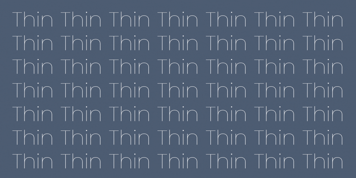
2. Tracking
Tracking controls the overall spacing across a range of letters. Wider tracking creates a lighter, more elegant feel, while tighter tracking makes text feel compact and dense.
3. Leading

Leading refers to the vertical space between lines of text. It guides how easily the eye moves from one line to the next—too tight feels crowded, while balanced leading improves flow and readability.
4. Word Spacing

Word spacing controls the gap between individual words. Balanced spacing helps text flow naturally, while too much space breaks reading rhythm and too little makes content feel cramped and hard to follow.
How Spacing Improves Design Clarity and Structure?
Good use of spacing creates balance, improves clarity, and emphasizes important elements without adding extra visual clutter. More space can make a design feel clean and modern. To create urgency or density, you can go with a tighter appearance, too. Spacing shapes the overall structure of a design, making it easier for users to process information and stay engaged.
• Tight vs Loose Spacing
Tight spacing creates a compact, dense layout that works well for headlines or limited space designs. However, if overused, it reduces readability and can feel overwhelming or cramped.

Loose spacing creates a more open and breathable layout, improving clarity and comfort. But excessive spacing can weaken connections between elements and disrupt reading flow.
• Readability and Text Flow

Spacing directly affects how easily text can be read and scanned. Proper kerning, tracking, and leading guide the eye smoothly across lines, improving comprehension and user experience. Poor spacing breaks this flow and makes the content harder to follow.
• Visual Balance and Structure
Well-managed spacing creates a clear, structured layout that feels natural and intentional. Inconsistent spacing, however, can make even good typography feel unpolished. Strong spacing systems improve both readability and overall visual harmony.
Choosing Fonts for Different Purposes
Typography changes based on where it is used. Branding, web, print, and UI/UX all require different levels of readability, flexibility, and performance. So, when choosing a font, remember that a font that works in a logo may not work in long-form reading or mobile interfaces.
1. Branding & Identity
Typography defines how a brand looks, feels, and is remembered. It shapes personality and builds recognition across all touchpoints, from logos to packaging typography. Strong brand typography ensures consistency and communicates tone instantly before any content is read.
- Match font style with brand personality
- Ensure strong memorability and distinctiveness
- Maintain logo readability at all sizes
- Keep consistency across platforms
- Reflect brand tone visually (luxury, modern, playful, etc.)

Help Scout uses a clean sans-serif wordmark with balanced spacing and slightly softened letterforms. The moderate weight and open structure create a friendly yet professional tone, reinforcing clarity, approachability, and trust in a customer-focused software brand.
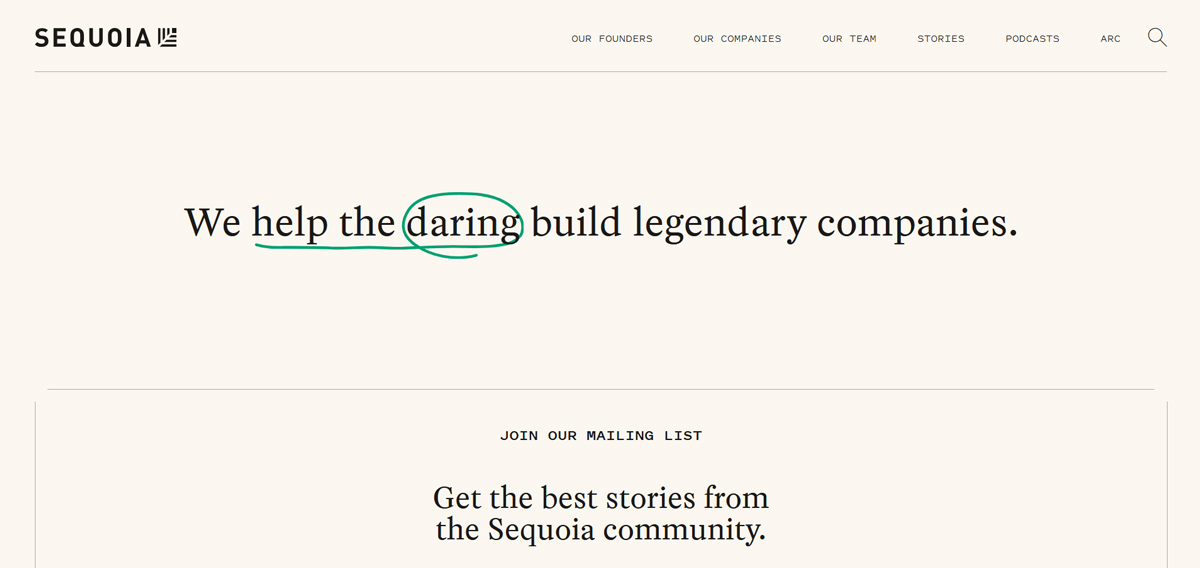
Sequoia Capital’s logo uses a tightly spaced, geometric sans-serif wordmark in uppercase, paired with a minimal tree icon. The structured, compact typography conveys stability, precision, and authority, aligning with its identity as a disciplined, high-impact investment firm.
2. Web Design & Digital Content
Web typography focuses on clarity, responsiveness, and performance across devices. Fonts must remain readable on screens of all sizes while maintaining hierarchy and fast loading speed for a smooth user experience.
- Readable font size (16px+ for body text)
- Responsive scaling across devices
- Optimal line length (45–75 characters)
- Strong contrast for accessibility
- Optimized font loading for performance

Mind the Product uses a clean sans-serif type system with bold, high-contrast headlines and lighter body text from the same family. This consistency improves readability and hierarchy while reducing font load complexity, supporting faster performance and a cohesive reading experience.

GoPuff uses bold, slightly condensed headline typography with strong weight and contrast, making key messages instantly scannable. This is paired with a softer, rounded sans-serif body font, creating a clear hierarchy while maintaining readability and a friendly, modern digital tone.
3. Print Design
Print typography is designed for a physical reading experience. It focuses on long-form readability, ink clarity, and layout control in fixed formats like books, brochures, and magazines.
- High readability for long reading sessions
- Suitable serif or print-optimized fonts
- Ink and paper compatibility
- Proper spacing for physical formats
- Avoid overly thin or decorative type

The Leap Magazine wordmark uses contrasting sans-serif weights and sizes to create a clear hierarchy, with “LEAP” emphasized in larger, bolder type. This variation improves visibility on covers while maintaining readability across different print layouts and formats.

The Hope Home Care brochure combines bold serif typography for headings with clean sans-serif body text, creating strong contrast and hierarchy. Large headline placement and color blocks improve readability, while lighter body text ensures comfortable reading in a printed format.
4. UI/UX Design
Typography improves UX/UI design, supports navigation, usability, and accessibility in digital interfaces. It structures information clearly so users can scan, understand, and interact with content effortlessly.
- Strong visual hierarchy (H1, H2, body, captions)
- High legibility across devices
- Accessible contrast and sizing
- Consistent spacing and alignment
- Optimized for quick scanning

Deel uses a clean sans-serif system with bold, slightly condensed headings and lighter-weight body text from the same family. This consistent type scale creates a strong hierarchy, making interfaces easy to scan while maintaining clarity across dense product and service information.

Matterport uses a modern sans-serif type system with clear weight contrast between headings and body text to guide attention. Bold headlines highlight key messaging, while uppercase overlines and structured spacing reinforce hierarchy and improve navigation across complex product pages.
5. Advertising & Marketing
Typography in advertising is designed to capture attention instantly and deliver messages in seconds. It uses bold, expressive type to create emotional impact with font psychology and drive engagement.
- High-impact, attention-grabbing fonts
- Clear message hierarchy
- Emotional tone alignment
- Strong readability at a glance
- Works well in fast-scrolling environments
PagerDuty uses bold sans-serif typography with clear weight variation to establish a strong visual hierarchy. The combination of a high-contrast green background and structured text makes key messages instantly scannable, reinforcing urgency, clarity, and a confident enterprise brand tone.
Daydream.ing uses large, bold sans-serif typography directly on imagery to create a strong visual impact. The heavy black text stands out against varied backgrounds, delivering a minimalist yet expressive advertising style designed to capture attention instantly in fast-scrolling feeds.
6. Editorial & Publishing
Editorial typography enhances readability in long-form content like magazines, books, and articles. It balances structure and aesthetics to ensure comfortable reading over extended periods.
- Smooth reading flow for long text
- Proper column and grid structure
- Comfortable spacing and line length
- Consistent typographic hierarchy
- Print and digital adaptability

Source: wikimedia.org
The Ballantine covers use highly expressive, illustrative typography combined with stylised serif lettering. The decorative type supports a fantasy aesthetic, but readability remains secondary, creating a visually rich yet unconventional editorial cover experience for mass-market paperback publishing.

Silicon Republic uses a clean editorial hierarchy with bold sans-serif headlines and readable serif-style body text. Author details and metadata are visually separated using color and weight contrast, improving scanning flow and supporting a structured, modern digital publishing experience.
7. Motion Graphics & Animation
Motion typography adds movement and timing to text, improving storytelling and engagement. It must remain readable while supporting rhythm, pacing, and visual emphasis.
- Readability during motion
- Timing and animation rhythm
- Clear emphasis on key words
- Synchronization with audio/visuals
- Strong contrast for visibility
The short film, Blowing off the Steam, uses kinetic typography in its title sequence, where bold sans-serif lettering is animated with a flowing steam-like distortion. The motion enhances mood and storytelling, making the title feel alive, atmospheric, and visually integrated with the narrative.
Burger King’s rebrand video uses kinetic typography to express its refreshed identity, featuring bold sans-serif text animated with smooth transitions and rhythmic timing. The typography aligns with the playful brand tone while ensuring clarity, hierarchy, and strong visual impact across motion scenes.
8. Environmental & Signage Design
Typography in physical spaces ensures clear communication in real-world environments like signage, wayfinding, and architecture. It must be readable from a distance and in different lighting conditions.
- High legibility at distance
- Scalable and durable type choices
- Clear directional hierarchy
- Strong contrast in environments
- Quick recognition and scanning

The restaurant signage for Twisted Pasty uses a circular composition with a stylized serif wordmark placed centrally for strong visibility. The curved layout naturally draws attention, while the refined serif typography adds a premium, welcoming feel suitable for restaurant branding and physical storefront recognition.

This storefront signage uses strong typographic contrast with bold yellow brand lettering supported by lighter white secondary text. The centered “@” symbol acts as a focal point, while weight and color hierarchy improve visibility, readability, and instant brand recognition in real-world environments.
Typography Accessibility
Typography accessibility ensures that text is easy to read and usable for everyone—including people with visual impairments, cognitive differences, or reading difficulties. Thoughtful typography improves user experience, boosts engagement, and makes content more inclusive.
• Readable Font Choices
Clear, simple fonts are essential. Typefaces with distinct letter shapes, open spacing, and balanced proportions improve legibility. Sans-serif and humanist fonts are often best for digital use.

Stripe uses the Inter typeface, a clean sans-serif font that maintains clarity across screen sizes. It’s simple, well-spaced letterforms reduce strain and make reading easier for users with visual or cognitive challenges.
• Contrast Ratios
Strong contrast between text and background improves visibility. Low-contrast combinations (like light gray on white) can be difficult to read, especially for users with low vision. High contrast ensures readability across devices and lighting conditions.

500’s website uses high contrast with dark text on a light background, improving readability. The combination of serif headings and sans-serif body text creates a visual distinction, helping content stand out clearly and remain easy to read.
• Font Size Minimums
Text should be large enough to read comfortably without zooming. Very small fonts can strain the eyes and reduce comprehension. Maintaining a clear minimum size, especially for body text, is important.
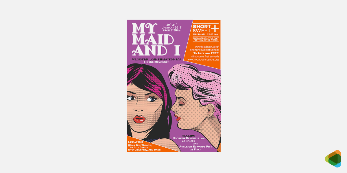
The My Maid and I poster maintains readable font sizes so key information remains clear even against a detailed background. Users can quickly understand names and roles without visual strain or confusion.
• Dyslexia-Friendly Fonts
Some fonts are designed to support readers with dyslexia by using clearer letter shapes and wider spacing. Even standard fonts can help if they clearly distinguish similar letters (like b and d).

Ayoa’s dyslexia-friendly mode uses the Lexend font, designed with wider spacing and clear letter shapes. This reduces visual stress, improves reading speed, and helps users with dyslexia process text more comfortably and accurately.
• Avoiding Decorative Overload
Highly decorative fonts may look appealing, but can reduce readability. Using too many styles or overly complex typefaces makes text harder to process. Keep typography simple and consistent for better accessibility.

Eco Touch UK’s Christmas campaign uses simple, clean fonts to keep content clear and focused. By avoiding overly decorative styles, the design ensures key messages stand out and remain easy to read for all audiences.
Modern Typography Trends in Digital Design
Typography is evolving from static styling into adaptive, system-driven communication. Modern type design focuses on responsiveness, performance, accessibility, and interaction rather than purely aesthetic choices. The shift is toward scalable typographic systems that behave intelligently across devices and contexts.
1. Adaptive Typography Systems (Variable Fonts + Fluid Scaling)
Modern typography combines variable fonts with fluid scaling to create fully responsive systems. Fluid typography adjusts font size based on screen or container size using techniques like clamp(), ensuring consistent readability across devices without rigid breakpoints.
Variable fonts complement this by allowing weight, width, and optical variations within a single file. Together, they create typography that subtly adapts in form, improving performance and maintaining flexibility.

Bioweg uses fluid typography with clamp()-based scaling applied consistently across headings and body text, enabling smooth, continuous resizing that maintains hierarchy and readability without relying on breakpoint-driven jumps.

Treeline combines clamp()-based fluid typography with breakpoint adjustments, creating a hybrid system where key text scales smoothly while overall layout and some elements still adapt at defined screen widths.

Grin relies on responsive typography using breakpoint-based scaling. Font sizes adjust in discrete steps across devices, maintaining consistent hierarchy and readability without implementing continuous fluid typography techniques.
2. Performance-First System Typography
Typography is increasingly built around system fonts and optimized typefaces like Inter, SF Pro, and other UI-focused families. These fonts prioritize speed, legibility, and cross-platform consistency, making them ideal for modern SaaS and product interfaces.
Instead of heavy custom font loading, designers now favor lightweight, scalable systems that reduce performance overhead. Even when variable fonts are available, many products implement simplified static weights for reliability and predictable rendering across environments.

Forter uses a clean, system-oriented typography approach with minimal font variation. The site prioritizes fast loading, legibility, and consistency, reflecting performance-focused design common in modern SaaS interfaces.

Actively employs a lightweight typographic system with restrained font use and limited weight options. The approach supports fast performance and clear readability, aligning with product-focused interfaces that prioritize efficiency over stylistic expression.

Auctor adopts a simple, system-style typography approach with minimal variation. The focus remains on clarity, speed, and predictable rendering, supporting a performance-first design strategy typical of modern web products.
3. Bold and Hierarchy-Driven Typography
Bold typography remains a dominant visual strategy, especially in landing pages and digital branding. Large-scale type is used to establish hierarchy quickly, guiding users through content in fast-scrolling environments where attention is limited.
But modern usage is more structured than just expressive. Designers now rely on contrast, spacing, and typographic rhythm rather than just size or weight alone. This creates clearer visual systems that balance impact with readability.

Apeel uses bold, large-scale typography to establish clear hierarchy on landing sections. Strong type contrast and spacing guide attention effectively, supporting fast content scanning and structured visual communication.

Yubo employs bold typography with high visual contrast to create immediate hierarchy in its interface and marketing pages. Large headings and controlled spacing support quick comprehension in fast-scrolling layouts.

Upside Foods applies bold, editorial-style typography to emphasize innovation messaging. Large, expressive headlines are balanced with clean spacing, creating a strong narrative flow across science and product storytelling sections.
4. Functional Minimalist Typography
This focuses on clarity, restraint, and usability. It uses limited type families, neutral sans serif fonts, and strong spacing systems to reduce cognitive load and improve comprehension across interfaces.
In 2026, minimalism is about functional clarity as you can see across typography design examples. The styles support scanning, accessibility, and decision-making, particularly in product-led and data-heavy environments.

Rentspree uses clean, functional typography with neutral sans-serif styling to support rental workflows. Strong spacing and restrained hierarchy improve scanning across forms, dashboards, and tenant application interfaces.

Aleph Farms uses restrained typography with editorial simplicity to support storytelling around food innovation. Clear hierarchy and spacing guide users through product science, sustainability messaging, and corporate information.

Cala Health employs functional minimalist typography with strong emphasis on clarity and accessibility. Simple sans-serif fonts and structured spacing help users navigate medical device information and patient-focused content efficiently.
5. Accessible and Inclusive Typography Design
Accessibility is now a core requirement in typography systems. Designers prioritize contrast ratios, readable font sizes, clear letter differentiation, and spacing optimized for cognitive ease and dyslexia-friendly reading.
Inclusive typography makes sure that content is usable across diverse audiences and conditions. Rather than being a final adjustment, accessibility is embedded into typographic decisions from the beginning of the design process.

Netradyne uses highly legible, accessibility-conscious typography suited for enterprise AI dashboards. Clear hierarchy, strong spacing, and readable sans-serif fonts support comprehension across dense safety and fleet analytics interfaces.

The Bulletin applies accessible editorial typography with generous line spacing and clear contrast. The system prioritizes readability across newsletter-style content, supporting scanning, comprehension, and ease of reading across long-form articles.

Coterie uses inclusive, highly readable typography with soft contrast and well-spaced text blocks. The design supports parental audiences by ensuring clarity across product information, guidance content, and e-commerce experiences.
6. Motion and Interactive Typography
Typography is becoming increasingly dynamic, responding to user interaction, scroll behavior, and contextual changes. Weight, spacing, and hierarchy can shift subtly to enhance engagement without compromising readability.
Motion is used with restraint, focusing on improving comprehension and guiding attention rather than decorative animation. This trend is closely tied to advancements in CSS and modern design systems that treat typography motion graphics as an interactive layer.

Neurable uses clean, structured typography within a modern product narrative, where subtle layout transitions and visual hierarchy shifts support engagement across scrolling sections without distracting from content clarity.

Euclid Power applies restrained, system-driven typography within a structured layout. While visually clean and progressive, interaction is primarily layout-based rather than typographic motion, supporting clarity across informational sections.

Mosey features a refined typographic system with smooth page transitions and light motion in UI elements. Typography remains stable, while interaction and scroll behavior guide attention through structured content flows.
7. Experimental and Generative Typography
Experimental typography explores unconventional layouts, layering, and asymmetry to create expressive visual identities. Increasingly, this trend is evolving into generative typography, where type responds to data, rules, or computational systems.
This approach is commonly used in branding, campaigns, and creative digital experiences. It represents the boundary between design and computation, where typography becomes dynamic and system-driven rather than fixed.

Plum Goodness uses playful, expressive typography within a structured e-commerce system. While visually vibrant, its type remains fixed and brand-led, focusing on clarity and hierarchy rather than generative behavior.

Ju.st explores experimental digital branding with expressive layouts and unconventional typographic presentation. Its identity-driven design uses strong visual hierarchy and composition, though typography itself is not generatively computed.

Blacksmith uses a modern, tech-focused typographic system within a developer-oriented interface. The design emphasizes structured hierarchy and clarity, with subtle expressive styling rather than true generative or data-driven typography.
Common Typography Mistakes to Avoid
These errors affect readability, consistency, and overall user experience, making content harder to understand and associate with good design.
• Using Too Many Fonts
It weakens brand consistency and makes the design feel unstructured. Limiting your selection to two or three well-paired fonts keeps the layout clean and easy to navigate.
• Poor Spacing
Not following the rule-book of kerning, tracking, or leading can make text feel cramped or disconnected. Balanced spacing ensures smooth reading and a polished appearance.
• Inconsistent Hierarchy
When headings, subheadings, and body text lack clear distinctions, users struggle to navigate the content. Inconsistent sizes, weights, or styles disrupt the flow and confuse the viewers.
• Overuse of Decorative Fonts
Complex or stylized typefaces are harder to read, especially in longer text. They should be used mostly for emphasis rather than body content.
• Incorrect Alignment
Misaligned text can make a design feel disorganized and difficult to scan. Left alignment is considered the most readable for body text.
• Low-Contrast Text
Text that doesn’t stand out from its background is difficult to read and strains the eyes. Low contrast reduces accessibility and user engagement.
Typography Glossary
Understanding typography starts with learning the core language designers use. These terms help describe letterforms, spacing, and structure more clearly, making it easier to create balanced, readable, and professional designs.
• Alignment
Alignment refers to how text is positioned within a layout—left, right, center, or justified. Proper alignment creates structure, improves readability, and helps establish visual order across designs.
• Ascender
An ascender is the part of a lowercase letter that extends above the x-height. Letters like “b,” “d,” and “h” use ascenders, adding vertical variation and improving word recognition.
• Baseline
A baseline is the invisible line on which most letters sit. It acts as a structural foundation for typography, ensuring consistent alignment across words and sentences.
• Bowl
A bowl is the curved enclosed part of a letterform. It appears in letters like “b,” “d,” “o,” and “p,” helping define the structure and softness of a typeface.
• Counter
A counter is the enclosed or partially enclosed space inside a letter. Closed counters appear in letters like “o” and “d,” while open counters appear in letters like “c” and “e,” improving readability.
• Contrast
Contrast refers to differences in size, weight, or color between typographic elements. Strong contrast improves hierarchy and helps users quickly scan and understand content.
• Descender
A descender is the part of a lowercase letter that extends below the baseline. Letters like “g,” “p,” “q,” and “y” include descenders, adding visual rhythm and balance to text.
• Display Fonts
Display fonts are designed for large-scale use, such as headlines, posters, and packaging. They are highly stylized and expressive, prioritizing impact over small-size readability.
• Font
A font is a specific variation of a typeface defined by weight, style, and size. For example, Helvetica Bold 14pt is a font, while Helvetica is the typeface family.
• Hierarchy
Hierarchy is the structured arrangement of text based on importance. It is created using size, weight, spacing, and contrast to guide the reader’s attention through content.
• Kerning
Kerning adjusts the space between individual letter pairs to create visual balance. It improves readability by fixing uneven spacing in combinations like “A” and “V.”
• Leading
Leading is the vertical spacing between lines of text. Proper leading improves readability by controlling how comfortably the eye moves from one line to the next.
• Ligature
A ligature is a combined character formed by merging two or more letters, such as “fi” or “fl.” It improves visual flow and reduces awkward spacing between characters.
• Measure (Line Length)
Measure refers to the length of a line of text. Proper line length improves readability by ensuring text is neither too wide nor too narrow for comfortable reading.
• Optical Size
Optical size refers to how a typeface adapts to different sizes. Smaller text is optimized for clarity, while larger sizes include finer details for balance and refinement.
• Orphan & Widow
An orphan is a single word or short line at the top of a page, while a widow appears at the end of a paragraph. Both disrupt reading flow and are avoided in professional typography.
• Sans Serif
A sans-serif typeface does not include decorative strokes at the ends of letters. It appears clean and modern, commonly used in digital interfaces for clarity and readability.
• Serif
A serif typeface includes small decorative strokes at the ends of letters. It often feels traditional and is widely used in long-form reading for its structured appearance.
• Script
A script typeface mimics handwriting or calligraphy with flowing, connected strokes. It can feel elegant, expressive, or casual depending on its design style.
• Spine
A spine is the main curved stroke in letters like “S.” It defines the movement and flow of the letterform, contributing to the typeface’s rhythm and personality.
• Stroke
A stroke is the main structural line that forms a letter. Stroke variation in thickness and shape defines the overall character and style of a typeface.
• Tracking
Tracking is the uniform spacing adjustment across a word or block of text. It affects all letters equally and helps control density and visual rhythm.
• Typeface
A typeface is the overall design family of letters. It defines the visual identity of characters across all styles and weights within a unified system.
• Typography Scale
A typography scale is a structured system of font sizes used consistently across a design. It defines relationships between headings and body text for a clear hierarchy.
• Typography System
A typography system is a structured framework that defines how typography is used across a brand or product. It ensures consistency in hierarchy, spacing, and font usage.
• Weight
Weight refers to the thickness of a typeface, such as Light, Regular, or Bold. It is essential for creating hierarchy and emphasis in modern typography systems.
• X-height
X-height refers to the height of lowercase letters without ascenders or descenders. A larger x-height improves readability, especially on digital screens.
See more: Graphic Design Glossary
Frequently Asked Questions
How can I get custom typography for my brand on ZillionDesigns?
Launch a design contest on ZillionDesigns by sharing your brand details, style preferences, and requirements. Designers submit multiple concepts, allowing you to explore different typography styles before selecting the one that best fits your brand.
How many fonts should I use in my brand design?
It’s recommended to use two to three fonts for consistency and clarity. Designers can create balanced font pairings that maintain hierarchy and also keep your branding clean and professional.
Can I get help with font pairing and typography hierarchy?
Yes, designers on our platform consider hierarchy, spacing, and pairing when creating designs. This helps them make sure your typography works effectively across logos, websites, and marketing materials.
Why is custom typography better than using templates?
Template-based fonts can feel generic and limit brand differentiation. Custom typography means you get multiple unique concepts that are just for your brand. This makes you stand out with more original and strategic font styles.
Will I get full rights to the typography used in my design?
Yes, once you finalize your design on ZillionDesigns, you receive full ownership rights. This allows you to use your typography across all branding, marketing, and digital platforms without restrictions.