SALES / SUPPORT : +1-877-525-5646 |
Login
Darla Aniline Photography
|
Contest Holder
DarlaA
?
Last Logged in : 4257days16hrs ago |
Concepts Submitted
127 |
Guaranteed Prize
200
|
Winner(s) | A Logo, Monogram, or Icon |
|
Live Project
Deciding
Project Finalized

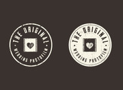
Logo for a photography business
Darla Aniline Photography
Yes
i would like something to reflect my artistic and creative style of photography. modern, catchy, upbeat that would look great on business card, web, letterhead, tshirt/jacket. (i know, probably asking for a lot here..) the type of photos i take include: equine, and equestrian sport events (dressage, cross-country and stadium jumping), family, portraits, high school senior photos and fine art photography. for basic photo style reference you can see my website at www.riverwalkartstudio.com (which domain is being switched to darlaanilinephotography.com)
Photography
Logo Type
![]()
Abstract Mark
![]()
Illustrative
![]()
Modern
Sophisticated
Professional
White, red, black
3
Not sure about this one. Some ideas i had were: a) 1st and last name in cursive writing style font with 'photography' as a type font; b) incorporating initials into an emblem or something. I'm not set on either one and would like a variety of ideas thrown out there.


Comments
Project Holder
Project Holder
Project Holder
Project Holder
Project Holder
Project Holder
Project Holder
Project Holder
Project Holder
Project Holder
Project Holder
Project Holder
Project Holder
Project Holder
Project Holder
Project Holder
Project Holder
Project Holder
Project Holder
Project Holder