Spelling Out Semiotics For You To Create A Successful Brand Identity Design
The study of semiotics is extensive and can take years to master how to (successfully) use signs and symbols in visual communication but here I am, yet again, with an easy-to-grasp guide on the why and how of it with a toss of some neat inspirations.
Sign Versus Symbols – Same Or Different?
Before we dig deeper into the topic, let me describe the difference between a sign and a symbol. And this is important because many times people use these two words interchangeably without thinking for a second that they’re not the same thing. It is a case similar to that of font and typeface – only a few know when to use which.
While signs are something that stand for something else; new, ancient, or famous symbols have a complex and deeper meaning. For example, a stop sign means just that action while a swastika has a number of historical and cultural associations.
Let us take another example to get a better grip on the difference between the two. Road signs are often literal and they instantly help you understand what you should do and shouldn’t. In contrast, a symbol like that of a heart is not a true representation of the organ and can suggest anything like love, passion, and care.
Practice Exercise: Are you getting the hang of it? Take a piece of paper and divide it into two columns of signs and symbols. Go one by one and write down your examples for the two. When done, share your examples in the comments below.
While you ponder on that, let me carry on and help you understand why signs and symbols matter in branding.
Semiotics In Action: Understanding People’s Interpretations
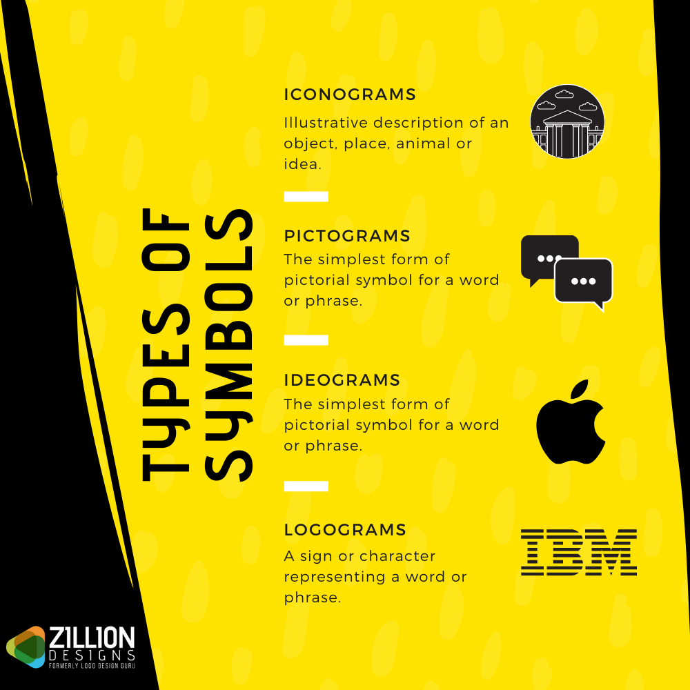
In the book, Signs and Symbols – Their Design and Meaning, author Adrian Frutiger enlightens us with the truth that humans have “deep-seated concepts” that help them understand the archetypal shape of an object or action when they see graphic elements arranged in a certain order.
To better understand Frutiger’s suggestion, let us take the example of one of the most famous logos of the brand Nike that resembles a tick and it means “just do it” or to “correct it” or that “it’s done”. However, if this symbol is drawn upside down, then the preconceived notion of something being “right” would conflict with the viewer’s thoughts and they will do the mental math to figure out what a flipped tick means.
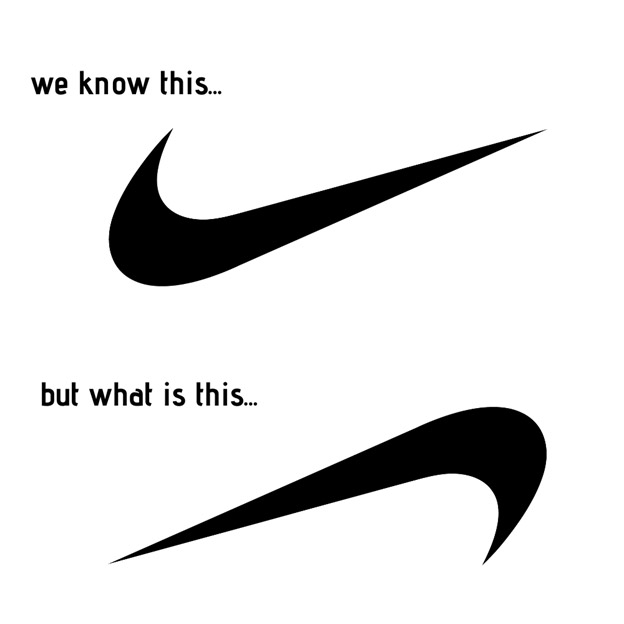
Why is this? It is because humans are innately designed to understand patterns and connections. For years, the face up tick has been used to represent everything is okay or complete or that one must begin the journey as the brand suggests, and even the slightest change to the shape derails the viewer into assuming what the meaning is or changed into.
This is why most logo designs and website designs use icons, signs, and symbols people already consciously or subconsciously know.
Practice Exercise: Observe some of the signs and symbols you see every day. List them down and write all that comes to your mind – what they mean, what they ‘can’ mean, and what objects, actions, or ideas they are signifying.
Why Do You Think This Is Important For Brands?
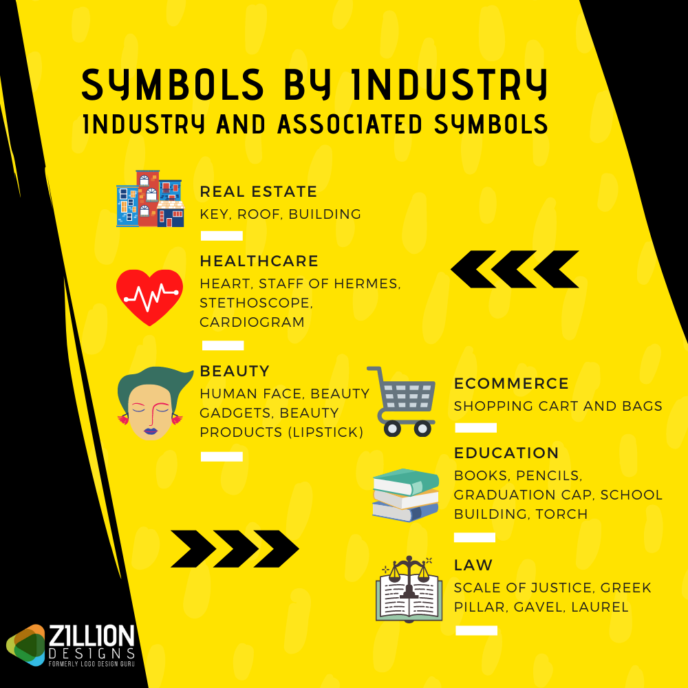
The answer isn’t as complicated as you might think. The deal is that although brands need to stand out with their professional logo design or customized website, they have to make sure that whatever they are delivering to their target audience is clearly identified and memorized. For this to happen, different businesses have their dedicated industry symbols and signs to choose from when creating their brand identity.
For example, a set of symbols and signs of the healthcare industry include the Caduceus, Rod of Asclepius, Red Cross, Red Crescent, serpents, and heart. Now, you need to watch out that the industry of healthcare is vast and in it there are a variety of fields such as dentistry, rehabilitation, medical insurance, or charity. With the type of healthcare business, the symbols change. For dentists, designers mostly use a tooth in custom logos because people can immediately understand what the clinic is for.
One more example is of the recurrent symbols in construction logos, such as trees, homes, excavators, and cranes. Within any type of logo, whether a wordmark or a combination mark, these shapes, in positive or negative spaces, help brands connect with their audiences much easily because the visual vocabulary is already built.
All the stakeholders have been trained to consider these signs and symbols as representatives of the construction industry. And so, for businesses, brands, and organizations using an icon, sign, symbol that is relatable and memorable is key to being identified. Of course, brand identity designers can use the latest logo design trends to make the usual unusual.
Practice Exercise: Pick at least 5 symbols and ask your family, friends, and colleagues to share their thoughts: what each symbol means and represents.
The “Why” Of Studying About Semiotics In Branding
In the research paper, Semiotics and Strategic Brand Management, the Associate Professor, the University of Illinois, Laura R. Oswald concluded, “Semiotics has important applications to strategic brand management by helping researchers clarify brand identity, personality, and associations the brand communicates concerning its history (in diachronic perspective) and about the current competitive environment (in synchronic perspective).” In short, semiotics can help each individual attached or working for a brand to streamline the brand’s image and position in the market. It can also help businesses and designers on how to create a brand style guide that keeps everyone on the same page.
Now that you know why brands use signs and symbols in branding, the tricky bit is how to use them.
- What are the tricks to put together a successful brand identity design?
- Is there a formula to using them, or is it all just haphazard?
- How do you decide which symbol to use for a brand?
- Are signs and symbols just shapes or more?
Time to indulge in the semiotics, finally!
Let us take it one by one.
What Are The Tricks To Put Together A Successful Brand Identity Design?
To design a visual identity, you need to have a few handy techniques up your sleeves. These techniques and processes are just like magic tricks that take time to practice, but when done seamlessly, they can woo your audience.
Trick One: Semiotic Analysis
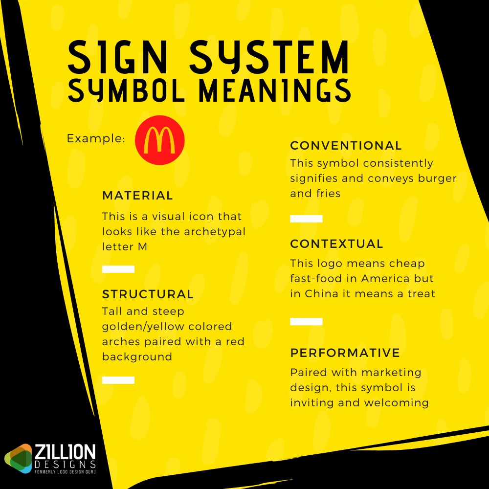
For each symbol you think of using for a particular brand or your brand, think about the signifier (the form it takes) and signified (the concept it represents). The idea is to select the symbol that says the most about your brand identity. For example, in the slogan “fight breast cancer”, the word “fight” expresses strength and power. Pair this with a pink ribbon: the pink color translates to love, care, and concern.
Image Source: ZillionDesigns
Trick Two: Question Series
For the supposedly selected symbol, ask a number of questions that will help you affirm your choice. For example, there is a purpose to using a mountain, sun, and waves visual in Aquafina bottle labels. When you pick a symbol or graphic for a brand, brainstorm – ask the following questions: What does it say? How does it manage to say it? Is there anything else that it is saying? What will different people think of it? Does it have a negative connotation?
Trick Three: Charting Brand Aspects
Once you have decided on a particular symbol, the next part is to create the “semiotic branding triangle” – that is, a process of defining the brand and plucking out its interpretations. In this diagram, mark each corner of the triangle with the three aspects: brand ethos, brand communication, and brand identity.
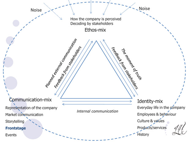
Image Source: CXL
Trick Three: Executing Symbol Connections
You can either take these tricks as a process or be part of one step. It is up to you, but the key is how to connect the dots. The technique requires you to take the meanings of the symbol and the brand, and try to match them or patch them if there are any loopholes. For example, the target symbol is a good visual for the retail company Target not because it reinforces the word but the retailer wants you to achieve your buying targets.
Is There A Formula To Using Them Or Is It All Just Haphazard?
Neither is the choice of the perfect symbol a result of a formula nor is it done randomly waiting for luck to kick in. The key here is to realize that each brand needs a different kind of attention because what they offer is unique and what they want to be is distinctive.
This said the formula you might want to use can be a defined process. For example, when it comes to deciding a sign or symbol for a brand identity, you can have a few ordered steps. This is better than throwing shapes, colors, lines, and texts on the canvas expecting the, to magically do what you want it to do.
Sometimes the process also varies. It is not by chance or anything but the process of logo designing is different from the process of designing a website.
How Do You Decide Which Symbol To Use For A Brand?
Well, by now you should have a slight idea about how to reach this decision but then again, when learning to design, nothing is ever enough because there is always something new or untapped.
Here are three amazing tips to choosing a symbol for your brand:
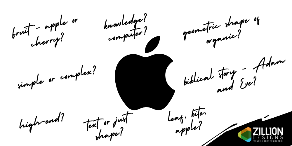
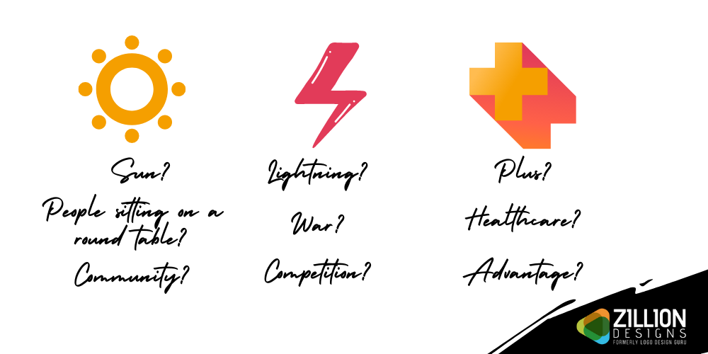
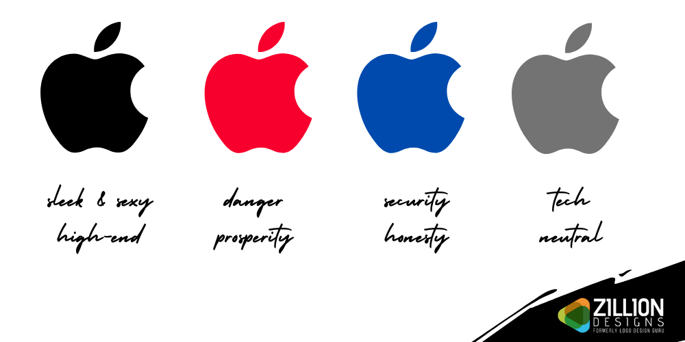
- Decide what you want to show in your brand identity design? What do you want your target market to see when they look at your logo or an icon on your website?
Famous example:
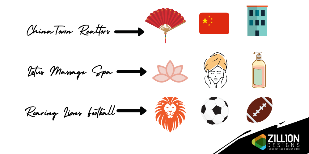
General example:
- Do the shortlisted symbols have a cultural, emotional, physical, social, or political context? List down what the color red means in America as compared to in China or India.
- Jot down words that have a link with the brand you are working on and attach symbols to it. This is the sketch or draft or brainstorm session where you research, collect, and allocate.
Are Signs And Symbols Just Shapes Or More?
You may have noticed that when talking about symbols, I mentioned visuals like colors and lines. This is because these graphic elements are all signs and symbols that embody parts of the brand to create a whole brand identity and brand image.
Line And Shape Meanings
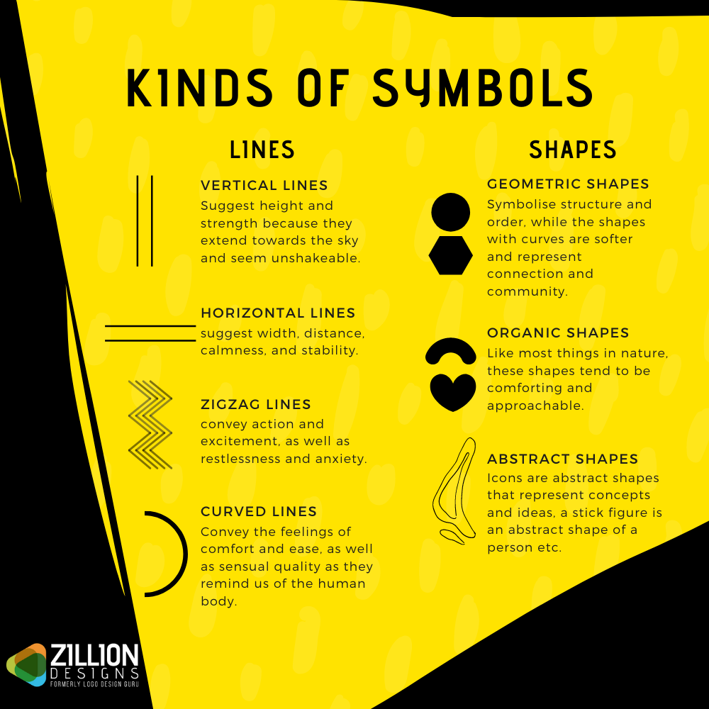
The thing with symbols is that logo designers, graphic designers, web designers need to be super careful. You want the visual to be understood by a bunch of people but you don’t want it to be misunderstood. Such goof-ups happen a lot in marketing and advertising designs. For example, the color black in fairness cream adverts can have serious implications that may lead to protests and apology.
And so, before designing a brand’s visual identity, designers and business owners have to work together to decide what they want to accomplish, what graphical elements will help them out, are they being able to meet their design goals.
Got more questions regarding semiotics in branding? Leave your questions in the comments section below and I’ll get back to you with an answer.
Business Logos
Ecommerce Company Logos
Advertising Firm Logos
Marketing Logos
Media Company Logos
Audio and Visual Logos
