How to Create Dynamite Graphic Design Style Guides for Your Brand
In the world of graphic design, and specifically corporate graphic design, there's a need for congruence and consistency.
The global market is saturated with businesses and brands, and the need for brand recognition has never been higher. And, with businesses branching out across the world, running ad campaigns and marketing schemes across dozens of platforms and media streams, there becomes an intrinsic need for consistency.
When you've got a team of designers and marketers working for you, a business needs to be sure that they'll all be using the same imagery, fonts, colors, and brand voice without managing every single thing they do.
This is where a Brand Style Guide comes in — a document that provides all the necessary information that any designer or marketer will need to make sure that their ad or image is consistent and on-brand.
But, how do you make one for your company? Let us go through it in detail.
Tone and Style
Dealing with tone and style is difficult for graphic designers because it's pretty subjective. What one person classes as stringent could be seen as approachable by another. One person's formal is another's boring. This is another reason why addressing it first is one of the most important things to do when building a Brand Style Guide.
Often, the Tone & Style of a brand isn’t conveyed by one element alone, but it needs to be conveyed by all of them individually. Every part of every design needs to have that same feel to resonate with the target audience.
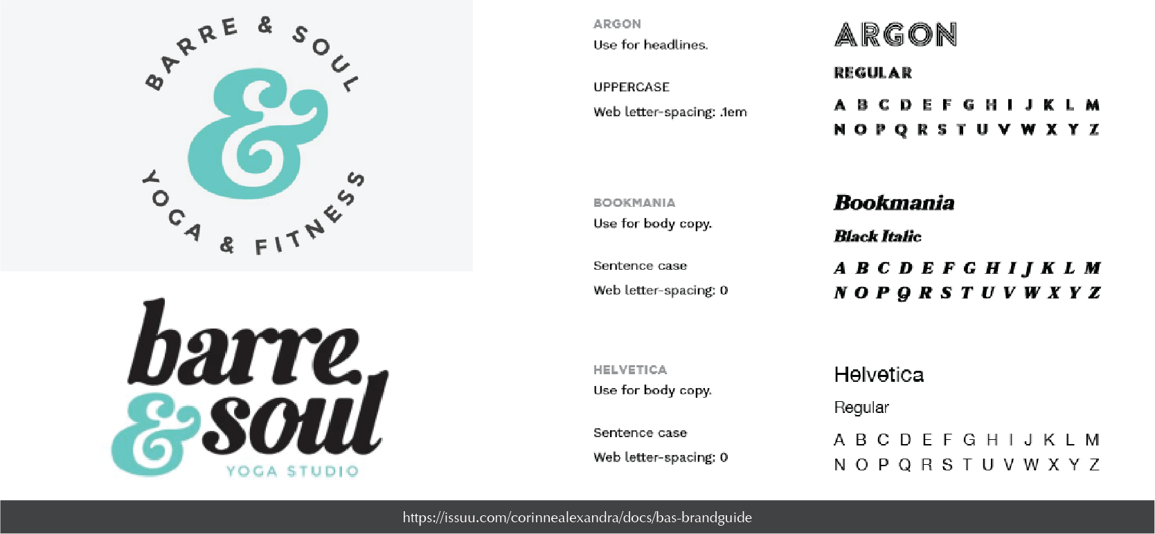
Barre & Soul, a company that offers classes on a specific type of yoga have a Brand Style Guide that identifies their Tone & Style efficiently. They use the rule of three to deliver their message. Retro. Energetic. Edgy.
Defining your company in three words like this - letting your graphic designers know how you want customers to perceive the brand at first glance - is an important part of a Branding Style Guide.
Beyond those three words, there's also a call for what's known as a 'Mood-board'. A mood-board consists of images that effectively capture the essence of those words. They're inspirational leaping off points for designers who have been tasked with coming up with an ad, image, or campaign. A mood-board can be useful for aligning new designers and marketers with the brand and letting them know exactly what sort of tone you’re trying to strike.
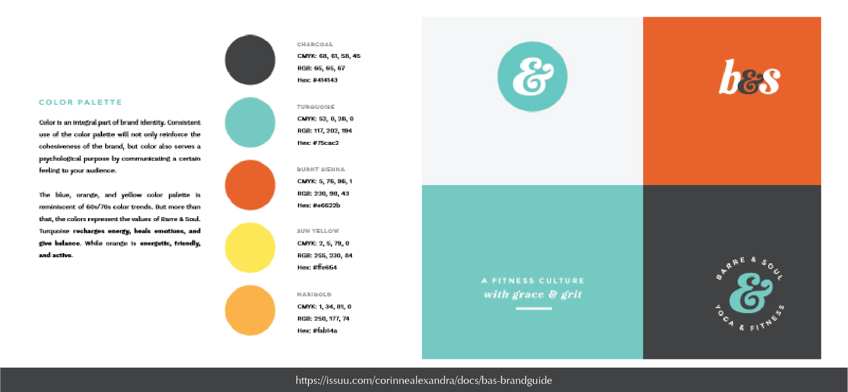
Color Palette
When it comes to Color Palette, you may not think that it's an important part of brand recognition. Especially not when so many companies freely change and adapt their color scheme to match whatever campaign their running. But, behind all that chopping and changing, there's always a core color set.
A series of predetermined codes that dictate what colors something can be and what colors it can't. Most companies keep their core colors to just three or four, and these three or four usually contain both black and white for highlighting purposes.
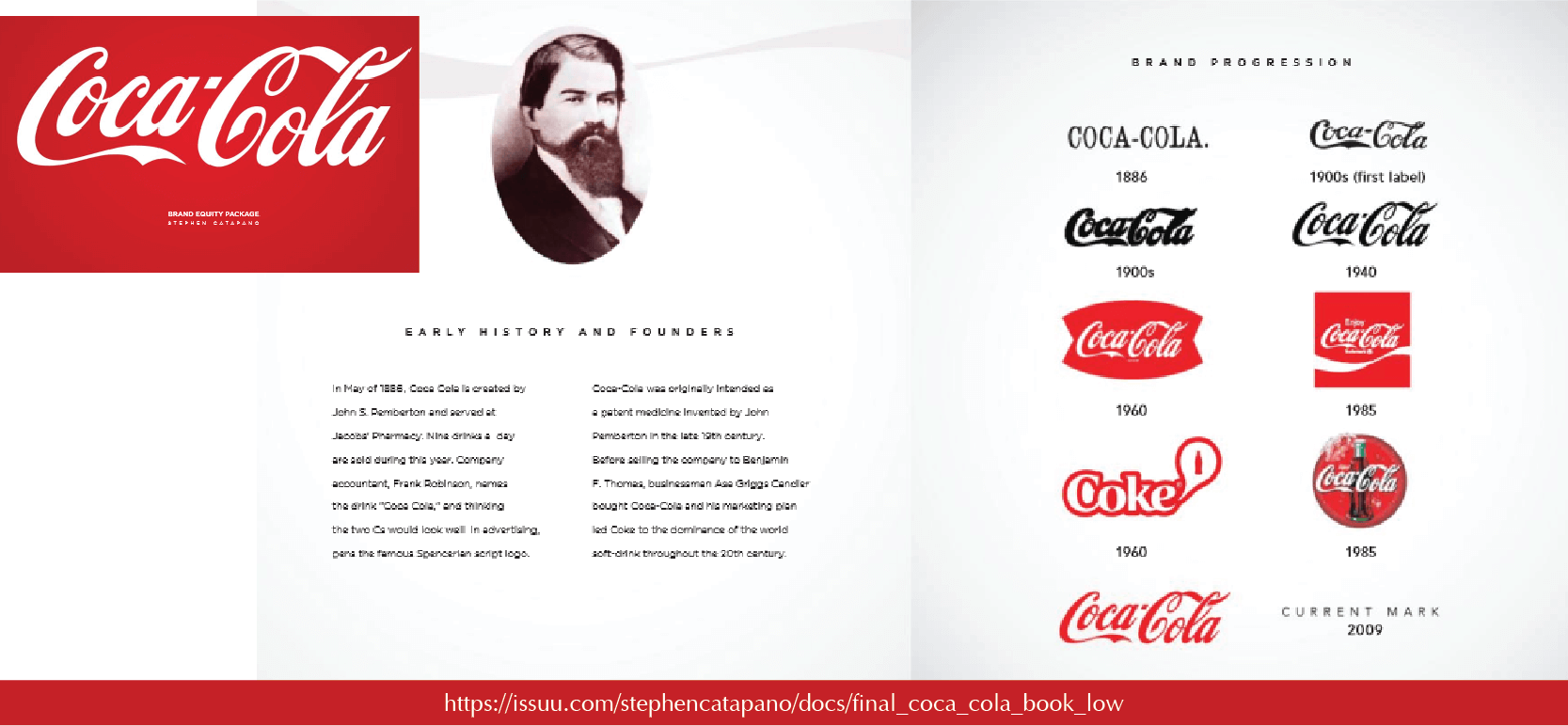
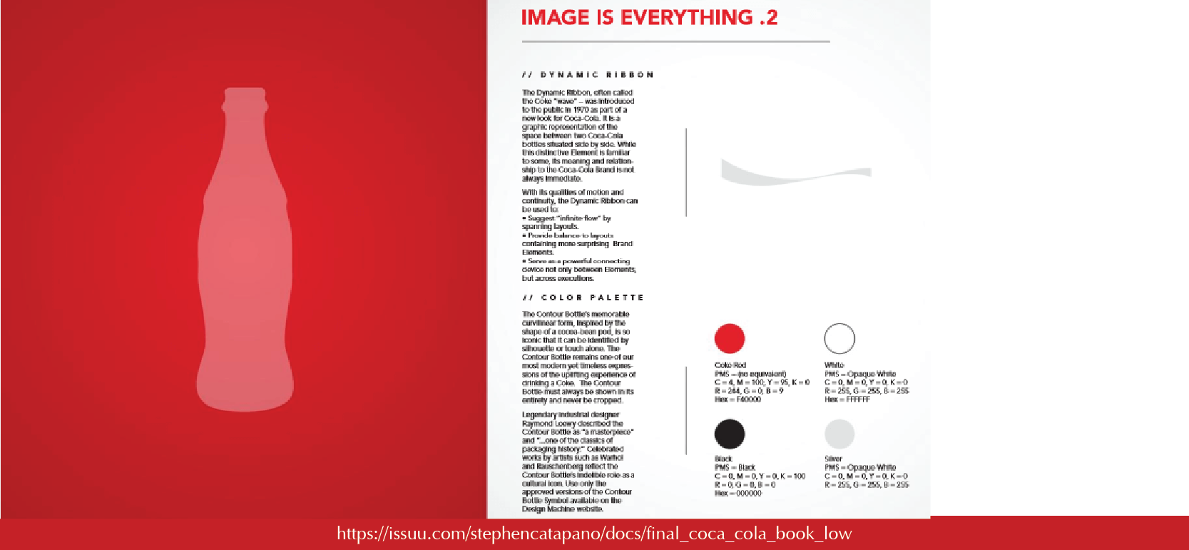
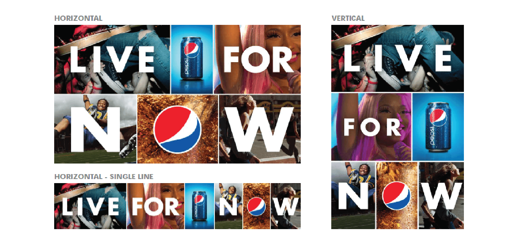
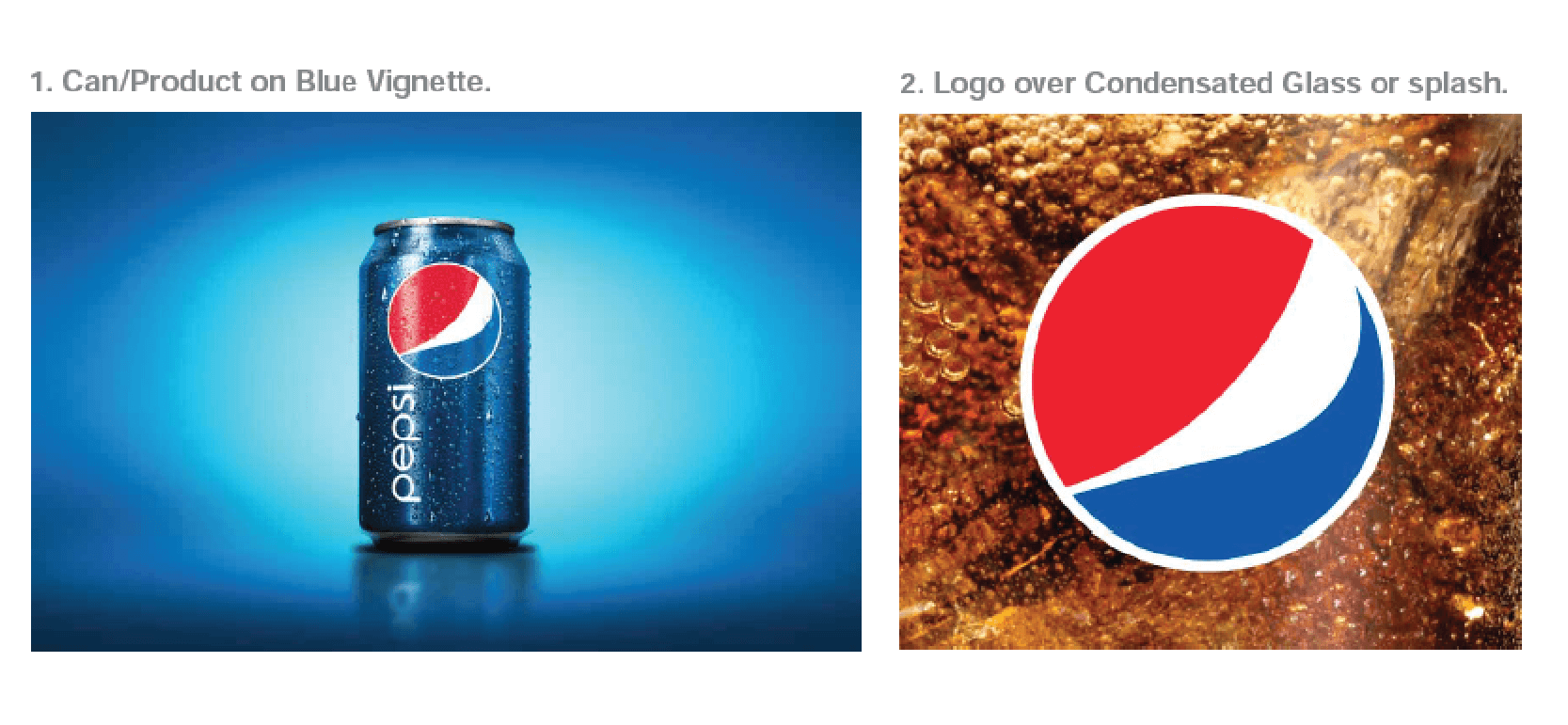
Having strong brand recognition relies on a strong color palette — and whether you realize it or not, colors stay with us. Think of some classic combinations — beverage logos like Coca Cola's white-on-red. Communication company logos like Skype's white-on-blue. Pepsi's white-red-blue combo. Media company logos similar to Netflix's white-black-red combo. WhatsApp’s white-on-green. You can picture them all easily, right? These are all punchy designs that rely on block colors and bright tones.
Logos and images that use a vague and large color palette are hard to remember. Humans have a great ability to recognize colors and connect them to strings of information. Because of that, having a strong color palette that runs through your entire brand identity is super-important
Choose a few select colors, utilize black and white if you want, and get them nailed down. Show how they’re displayed across the brand in various ways, keeping track of the Hex and RGB color codes. Then, set out the parameters for how and where they can be used. If your logo utilizes a specific red, you’ll likely put in place a rule that says that that red can only be used for your logo, and not for anything else.
Font & Type
When it comes to thinking about your fonts, you may have two, or three, or maybe more, depending on where and how your font is used. When working on a brand, how you need to choose the right font is an important technique to learn.
-Header. Sub Header. Body. Footer. Title. But, as well as font, you’ll also need to be thinking about size, character spacing, line spacing, and things like that. All of these elements contribute to brand recognition and consistency. Even knowing the anatomy of fonts a little helps with font pairing.
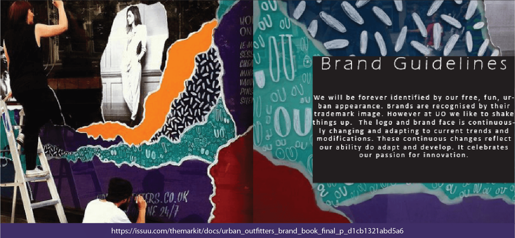
Urban Outfitters is one of those brands that has a strict set of rules that govern its font and type choices and options.
For example, they stipulate that their header can only appear in block capitals, on a single line, and can never be broken across two or more lines. They also tell designers how to layout the text — centered or right-aligned. They also say that any links must be underlined in the same font and color as the text and that all headers must always be capitalized too.
When we're talking about the font we're always asking not just what the words say, but what the size, the shape, the position, and the style say, too.
A brand can be recognized as much by its text as anything else, and a good Graphic Design Style Guide for Brand stipulates all the limitations and guidelines surrounding text that need to be enforced.
Ben and Jerry's has one of the most focused and in-depth style guides when it comes to fonts, and you can check it out here:
Lexicon
Now, the lexicon is a bit of a difficult one, as it often bleeds into Tone & Style, but the important thing to note is that when we talk about Lexicon, we're talking about the sort of language that can be used and the sort of language that can't. There'll be specific words that brands will repeat for various reasons - to bolster brand message, to hit SEO markers, or just to create a sense of something.
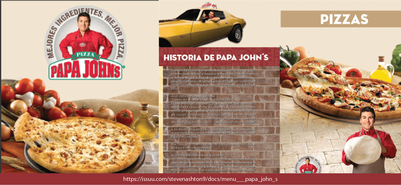
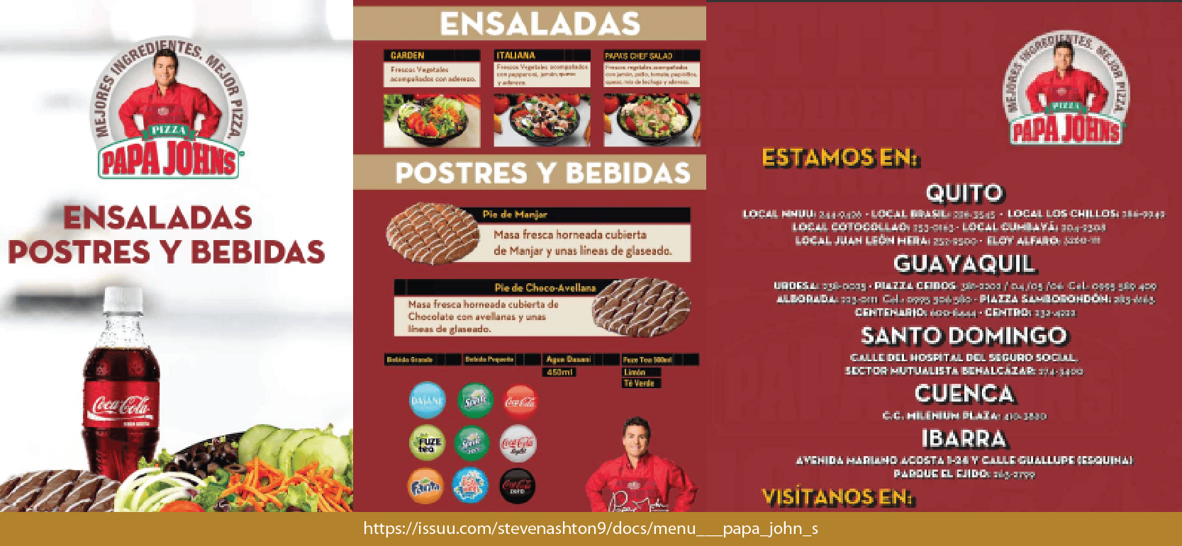
Whenever you're trying to get to grips with a Brand Lexicon, it's always better to look at companies with strong brand messages. Papa Johns, for example, the fast-food brand, has a well-defined lexicon that they use. Check out this 'About Us' excerpt from their website:
Bake a better pizza and the world will beat a path to your door." That maxim has been at the heart of our thinking at Papa John's since our founder, John Schnatter, baked his first pizzas back in 1972 for the customers in his father's tavern in Indiana
What's the secret of Papa John's success? Is it preparing a better dough? Using better ingredients? Employing better people? Being committed to delivering 'a better pizza experience'? Truth is, it's all of those elements. And together, they help us continue to make Papa John's a consistently and reliably 'better Pizza'.
We want the whole world to love our pizzas as much as we do. That's why we're all about the attention to detail, the focus on quality, the refusal to compromise on delivering the best pizza (and the best pizza experience) that we possibly can. And all around the world, the tens of thousands of great people who work with Papa John's share that same vision.
After all, there's an awful lot of hungry Papa John's lovers out there, counting on us to get it right, every time!"
When it's laid out with the words that appear in their company lexicon in bold, it's easy to see. Better. Great. Heart. Committed. Love. Experience. Share. Help. Together. These are all words that they use to create a memorable brand and it's a powerful way to get brand recognition to settle in. If you asked someone what the name of the pizza brand was, you know - the one with the family values. The friendly one. They'd say Papa Johns because of how on-point their brand lexicon and style is.
On the flip side, take Nike.
Our mission is what drives us to do everything possible to expand human potential. We do that by creating groundbreaking sport innovations, by making our products more sustainably, by building a creative and diverse global team and by making a positive impact in communities where we live and work.
When it comes to motivational language, Nike has it pinned down. They create a sense of purpose and ambition with their words. They want to make Nike customers feel like they’re pushing forward onto the non-tread ground. Nike targets athletes who want to push themselves, and their lexicon gives a great sense of that, communicating that they think the same way. This delves into the realm of what's known as neuro-linguistic programming, but for now, let’s just stick with terms like 'brand voice' and 'company lexicon'.
If you want to have a recognizable brand that feels a certain way, then note down some trigger words and map out a diagram with the sort of language you want your designers to be thinking about when they’re writing copy and putting together campaigns.
Company Imagery
Company imagery is a simple part of a Brand Style Guide yet very effective. Any imagery you have needs to be in this section - logos, iconography, shapes, dividers - anything that is an image that represents you.
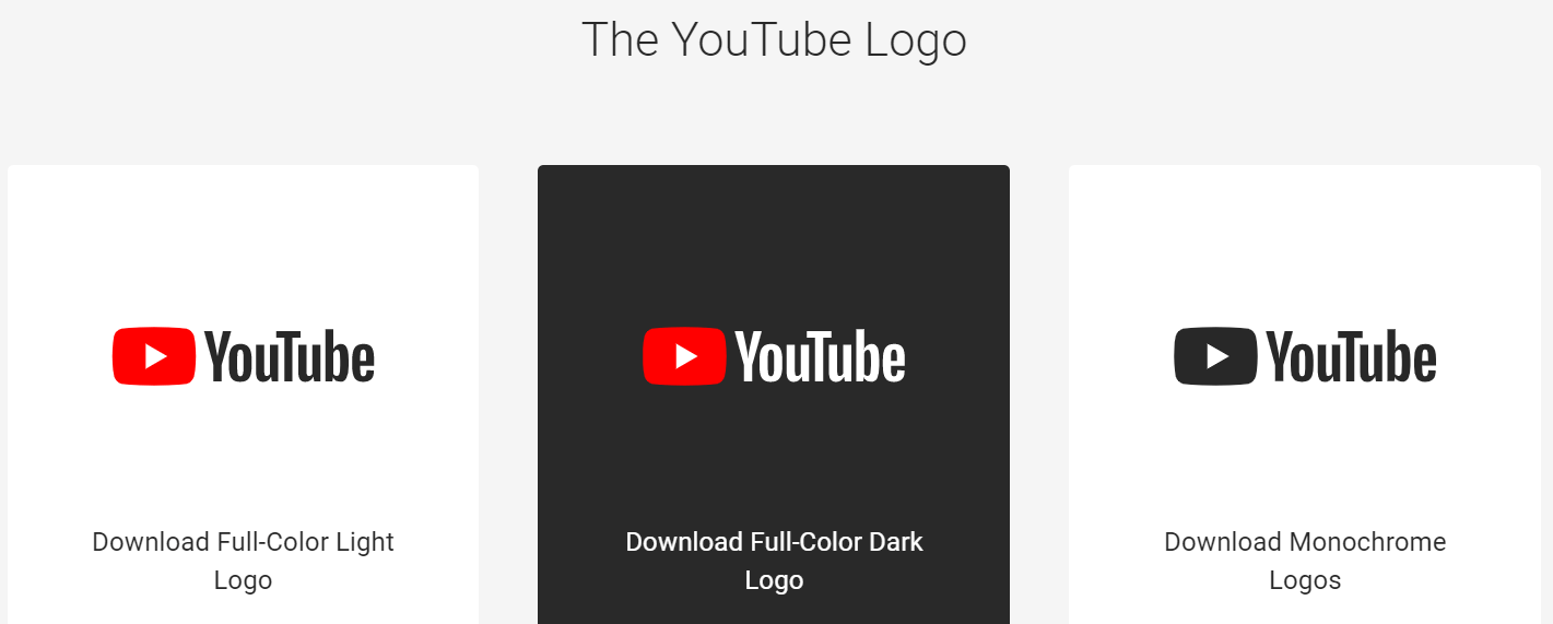
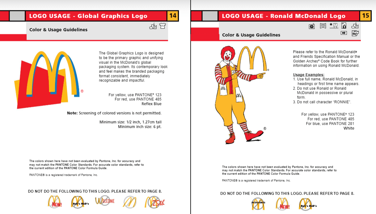
A lot of companies are strict about how and where their brand imagery can be used. Often, editing and appropriating brand imagery for yourself is a copyright breach. It's important to keep track of your imagery and set out ground rules for its use if you want to keep your ads and marketing on-message, and away from anything that could alter it or show it in a bad light. Check out YouTube and McDonald’s stipulations for some ideas on what sort of rules you want to put in place:
Letting your designers know which is the right logo or image to use for what purpose can be the difference between an ad that's flawless, and one that falls flat. Make sure that you're explicit not only about which logo or image is correct, but also about where each one can and can't be used, what it can be used in conjunction with, what colors are allowed and aren't, where it can be positioned, and anything else you may want to impose as a rule for its use.
When it comes to creating ads and campaigns, even if you have the right font and logo, the right colors, and everything else in place, the layout and sizes can throw everything off-kilter and ruin an otherwise beautiful image or ad.
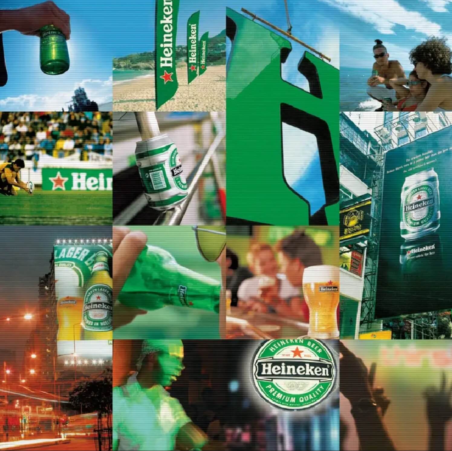
Heineken has a broad Brand Style Guide that covers a lot. And, what it covers in-depth is the Arrangement, Size, & Layout stipulations for its assets, covering everything from letter spacing to logo padding, sizes, and everything in between:
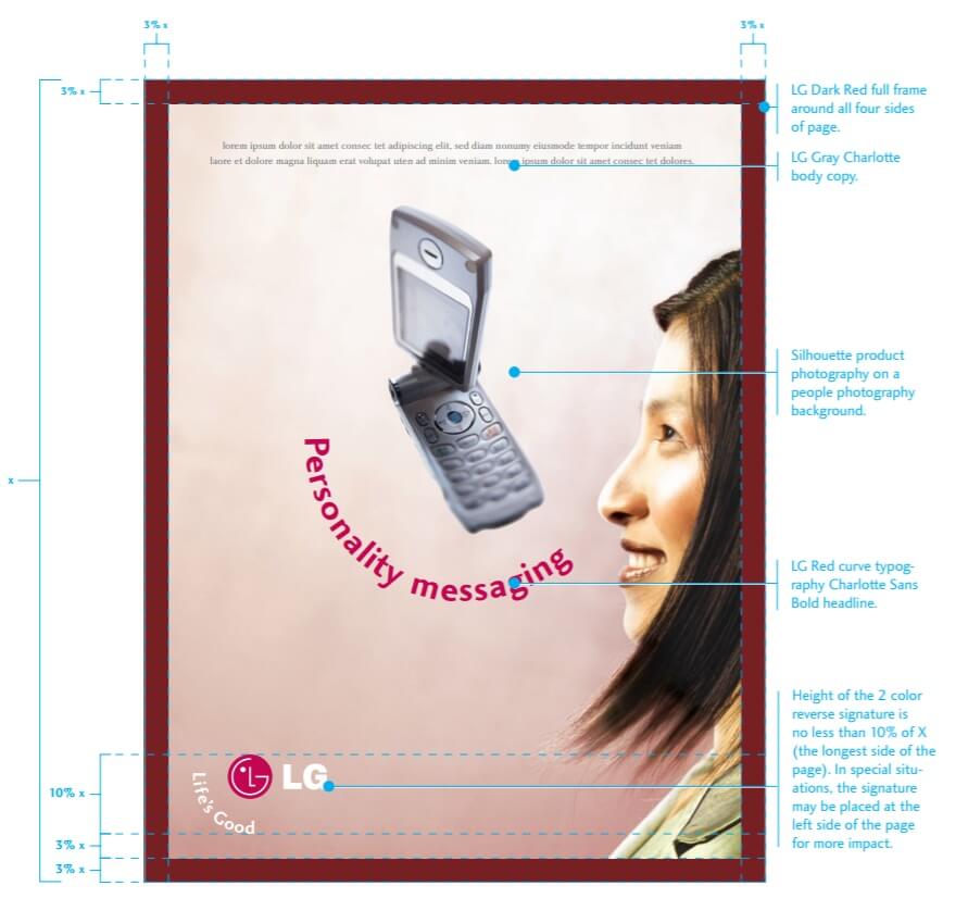
LG, too, has a strong Brand Style Guide that talks a lot about the arrangement. Because of the brand's rich history, it deals with a lot of permutations of its logo and assets, laying out specific rules for how things have to be sized comparatively, how text can be positioned and edited, and exactly how and where things need to be positioned on ads and marketing material:
When you're considering your guidelines when it comes to the Arrangement, Size, & Layout of your assets, put in place rules not only for the correct but incorrect use, too. Think about how you like your assets to interact with other elements, with space, and with the eye.
Building a great Style Brand Guide is imperative for any up and coming company that's looking to push into advertising, bring onboard new team members, or just generally grow brand recognition, and hopefully, with this guide, you'll be able to create your style guide that'll serve your company for years to come.
*This post was originally published on Logo Design Guru.
Written by Raquel Addams


