Inspiring Visual Storytelling Animations For User-Interface Design

Feature Image Source: Freepik
In the modern digital age, just about every venture or brand has some sort of online presence. This is a convenient fact for customers, but it also means that any kind of business needs to have a unique aspect or something that makes them stand out. To this end, graphic designers and software experts have put their heads together in order to come up with a storytelling concept for their companies.
Fortunately for many vendors, there are now some easy ways to use a compelling storytelling technique in order to draw a viewer in. This mission is probably best accomplished with certain animations. Simple images and text don’t cut it anymore, as internet users need some visual interactive elements, optimization, and other callouts to grab their attention. Some visual storytelling animations have been user for User-Interface Design in inspiring ways. Check out just a few such examples below:
1. Slimming Your Wallet

Image Source: bellroy.com
This website has a simple yet eye-catching interactive design that draws the user into a fun little game and intrigues them to go further. The animation itself comprises of an interactive experience that lets a site visitor make a wallet fill up with cash or get empty. They accomplish this by moving a button along a line at the top of the site page.
There are two wallets depicted underneath the line. One gets progressively filled with cash as you draw the button to the right. Drawing the button to the left would empty the wallet of cash, making it similar to the slim wallet on the right. This is not just a fun little game but actively makes the user wonder how their own wallet can get this compact. If not, they wonder why anyone would want to get their wallet slim.
Whichever the case, the slimming visual does create an intriguing animation of the difference between a bulky and compact wallet. The fat, stuffed version seems difficult to carry and handle, while the slim one creates a sleek effect. The user is then compelled to look downwards toward the text. This invites them to check out what the company has on offer. These are wallets with an innovative design, as the extra layers of leather have been removed to make the overall result slimmer.
2. The Hybrid Graphic Novel
This website is actually made by the automotive manufacturer Peugeot. Superhero movies and graphic novels are becoming a raging trend these days, and this website follows up on that interest. Once you click on any link for this site, it takes you into a 3-D-like sense of graphic novel action. With the amazing details, coloring, and action storyline, many customers would be drawn in before they know it.
Peugeot inserts its advertising in a very enjoyable yet subtle manner. It takes the four turbo modes offered with its latest hybrid car and makes them into the main character’s powers. With the panels scrolling and the turbo modes displayed every few seconds, the overall experience is lasting without being pushy.
The animation is accompanied by sound, which the visitor is encouraged to pump up high. This enhances the overall experience and makes the content all the more memorable. Overall, this innovative collaboration between Marvel illustrator Gérald Parel, BETC Digital, and interactive backend developer Sylvian Tran.
What’s more, this website is fully adaptable to all kinds of screens. It can provide the same experience on laptops, desktop computers, tablets, and smartphones. With this responsive and engaging interaction, a new strain of advertising campaigns might be in the making.
Explore: Storytelling Techniques for the Holiday Season
3. Bagigia

Image Source: bagigia.com
Once you scroll down for the first time, you can see a zip underneath the signature product of Bagigia. This is an orange bag with an innovative design that resembles a hot water bottle. Sliding the zip back and forth would show you different angles of the bag as well as some information about it. You can also see the inside of the bag as well as some very detailed close-ups further along. The same information and details can be viewed by scrolling down.
This website is designed to tell you a story about the bag, so the animations as well as the text count in this experience. The scrolling also leads to the backstory and information about the bag, its manufacturing, and the idea behind its design. There’s also a little story about how the creator came up with the idea in the first place.
Customers who have seen this bag for the first time would love the relatability of the story and the unique presentation. They would also be fascinated by the innovative storytelling, which would compel them to read up on the finer points of the bag itself. naturally, this would lead to higher chances of sales and sharing on social media.
4. Lottie In Airbnb
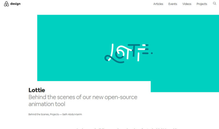
Image Source: airbnb.design
This tool is available for Android, iOS, and React Native operating systems. These render the After Effects animations in real time, allowing native apps to make use of this animation as well. The Lottie animations hence provide in-app notifications, animated illustrations in full frame, and also in a review flow.
As a result of this innovative technology, Airbnb is able to provide richer and more in-depth animations without the delays or cost generally associated with such updates. This would lead to more features being introduced more quickly than in the past. These would not just be entertaining but also useful for the Airbnb customer since they would include map-viewing and space-viewing as well. Overall, this promises to make a safer and more reliable interaction for customers and vendors alike.
Conclusion
When users go online these days, they aren’t necessarily looking to buy something. Most people, in fact, are looking for an experience while using the internet. The more engaging a story some brand tells us, the more likely we are to relate personally to its offerings and hence partake of them. This could be buying goods or services donating to a cause, or simply increasing awareness for a certain individual brand.
With these inspirational animations on hand, it should be easier for any company to make a story for their own user interfaces. This would make their online platforms easier to navigate, making it more fun for their audiences as well. The easier it is for users to navigate a site, the more willing they’d be to become customers or patrons of a company.
A storytelling animation would put a user in a learning mindset, making them empathize with a certain cause or product. Naturally, this would then mean that the product, service, or cause would receive more interaction and popularity, leading them towards success.