A Complete Guide to Web Design and Development
Learn the essentials of web design and development, from planning and design strategy to launch and optimization. This guide explains how businesses can create websites that support growth, improve user experience, and deliver measurable results.
A strong website starts with the right balance of design and functionality. While web design and development are often discussed together, they serve different purposes. Design shapes the look, feel, and user experience of a website, while development handles the technical side that keeps everything running smoothly. Whether you’re creating a business website, portfolio, blog, or online store, the goal is the same: a site that looks professional, works across devices, and supports future growth. You can launch a web design contest to review multiple creative directions, work one-on-one with a designer for a more tailored approach, or use web development services for CMS, Shopify, and custom website support
How Web Design Fits Into Overall Business Strategy
Many businesses think of a website as a marketing asset, but in practice it influences almost every part of the customer journey. It is often the first place people learn about a company, compare options, evaluate credibility, and decide whether to make contact. A well-planned website supports business goals by connecting brand messaging, customer needs, and conversion opportunities in one place.
Good web design is not just about appearance. The way information is organized, how easily visitors can navigate pages, and how quickly they can complete an action all affect business results. Whether the goal is generating leads, increasing sales, booking consultations, or building brand awareness, website decisions should support those outcomes from the start.
Here’s why web design matters to business growth:
- Creates a consistent experience that reflects your brand across every page
- Gives potential customers confidence in your business before they ever make contact
- Makes it easier for visitors to find information, compare options, and take the next step
- Supports lead generation, online sales, appointment bookings, and other conversion goals
- Strengthens SEO, content marketing, email campaigns, and paid advertising efforts
- Improves usability through responsive design, accessibility, and faster page performance
- Provides a foundation that can adapt as your business expands, adds services, or enters new markets

Website vs Brand vs Product Experience
Customers do not judge a business based on a single interaction. Their opinion is shaped by everything from the first website visit to the moment they use a product or service. A website may attract attention, but it is only one piece of the overall experience.
Think of it this way. Your website introduces people to your business and helps them decide whether to take the next step. Your brand identity shapes how they perceive your company, while the product or service determines whether those expectations are met. When all three work together, customers are more likely to trust your business, return in the future, and recommend it to others.
Although these experiences overlap, each plays a different role in the customer journey.
| Aspect | Website Experience | Brand Experience | Product Experience |
| What it is | How users interact with your website | How people perceive your brand overall | How users interact with your product or service |
| Primary focus | Layout, navigation, content, and usability | Identity, messaging, values, and emotions | Functionality, performance, and usability |
| Key touchpoints | Pages, forms, CTAs, speed, mobile experience | Visuals, tone of voice, reputation, trust | Features, onboarding, support, reliability |
| User goal | Find information and take action | Understand and trust the brand | Solve a problem or achieve a result |
| Business impact | Drives traffic, engagement, and conversions | Builds recognition, loyalty, and credibility | Drives satisfaction, retention, and advocacy |
| How it connects | Introduces the brand and sets expectations | Shapes perception before and after use | Delivers on the brand promise |
Web Design and Web Development: What’s the Difference?
People often use the terms web design and web development interchangeably, but they refer to two very different parts of building a website. One focuses on how a website looks and feels, while the other focuses on how it functions behind the scenes.
A designer is responsible for shaping the user experience. They determine how pages are structured, how information is presented, and how visitors move through the site. Developers then take those designs and turn them into a working website using code, content management systems, databases, and integrations.
In most successful projects, design and development work together from the beginning. A beautiful layout means very little if the website is slow or difficult to use, while a technically sound website can still struggle if the design fails to build trust or guide visitors toward action. That is why effective website design and development requires both creative thinking and technical execution.
Whether you’re planning a simple brochure website or a complex e-commerce platform, understanding the difference between design, web page development, and ongoing maintenance can help you make better decisions throughout the project.

| Web Design | Web Development |
| Focuses on visuals, layout, and overall user experience | Focuses on functionality, performance, and technical reliability |
| Creates intuitive, appealing, and brand-aligned interfaces | Turns designs into fully functional websites |
| Key elements include colors, typography, branding, and UI/UX flows | Key elements include code, databases, CMS, server logic, and APIs |
| Tools: Figma, Adobe XD, Photoshop, prototyping | Tools: HTML, CSS, JavaScript, PHP, frameworks, deployment |
| Shapes first impressions, navigation, and user engagement | Ensures smooth interactions, speed, and accessibility |
| Drives brand recognition, engagement, and conversions | Supports scalability, reliability, and long-term growth |
| Provides the visual vision and user-focused strategy | Implements the vision and maintains website functionality |
What Makes a High-Performing Website
Not every website that looks professional performs well. Some attract traffic but struggle to convert visitors into customers. Others offer valuable services but make it difficult for users to find information or take action. High-performing websites strike a balance between business goals, user expectations, and technical performance.
The strongest websites are built around a clear purpose. Every page, feature, and design decision should help visitors accomplish something, whether that’s making a purchase, booking a consultation, requesting a quote, or learning more about a company. At the same time, the website must be easy to navigate, accessible across devices, and capable of growing alongside the business.
Several factors consistently appear in successful website design and development projects.
- Clear business goals and measurable objectives
- Strong branding and visual design that support decision-making
- Intuitive navigation that helps visitors find information quickly
- Accessibility and clear communication across all pages
- Scalable architecture that supports future growth
- Analytics and performance tracking for continuous improvement
Clear Business Goals
Before a website is designed or developed, there should be a clear understanding of what success looks like. A local service provider may want more phone calls and form submissions, while an e-commerce company may focus on product sales and repeat purchases. Defining these goals early helps shape everything from site structure to calls-to-action.
Design That Supports Decision-Making
Good design is not just about aesthetics. Elements such as layout, typography, imagery, and content placement influence how visitors process information. A clear visual hierarchy helps guide attention toward important actions without overwhelming users with too many choices.
User-Centered Experiences
Visitors arrive with questions, expectations, and limited patience. A website should make it easy to find answers, compare options, and complete tasks. When users encounter confusing navigation, cluttered layouts, or unnecessary steps, engagement often drops and bounce rates increase.
Accessibility, Usability, and Clarity
The best websites work for as many people as possible. Readable typography for good UX, clear navigation labels, sufficient color contrast, and logical page structures all contribute to a better experience. Accessibility improvements often benefit every visitor, not just those using assistive technologies.
Scalable Structure and Technology
Businesses evolve over time. New services are introduced, product lines expand, and content libraries grow. A scalable website foundation makes those updates easier without requiring a complete redesign every few years.
Analytics and Continuous Improvement
Launching a website is only the beginning. Analytics tools help businesses understand how visitors interact with content, which pages drive conversions, and where users encounter friction. Those insights make it possible to refine and improve performance over time.

Types of Websites: Choosing the Right Approach for Your Business
Not every website is built to achieve the same goal. A local accounting firm has different needs than an online retailer, while a software company requires a very different user experience than a personal blog. Choosing the right website type early in the planning stage helps shape everything from content and navigation to features and functionality.
For businesses researching how to build a website for my business, understanding these categories can make the decision-making process much easier. The website structure, technology requirements, and long-term maintenance needs often depend on what you want the site to accomplish.

• Informational / Brochure Websites
These websites are designed to introduce a business, explain its services, and provide visitors with a clear way to get in touch. They are especially popular for local companies, consultants, tradespeople, and professional service providers. For many organizations exploring web development for small businesses, a brochure-style website is often the starting point because it is straightforward, cost-effective, and easy to manage
• Corporate and Enterprise Websites
Corporate websites serve a wider audience than most business websites. In addition to potential customers, they often need to support investors, partners, job applicants, media contacts, and existing clients. These projects usually require more planning, stronger content structures, and detailed website brand guidelines to maintain consistency across hundreds of pages.
• E-Commerce Websites
Selling online requires more than a product catalog. Customers need to browse products, compare options, read reviews, and complete purchases without friction. Successful e-commerce web development focuses on navigation, search functionality, checkout experiences, mobile usability, and trust-building features that encourage conversions.
• SaaS and Product Websites
Software companies use their websites to explain complex products in a simple way. Visitors often want to see features, pricing, demonstrations, and customer success stories before signing up. Effective SaaS web design guides users through the evaluation process while supporting trial registrations, demos, and onboarding journeys.
• Landing Pages and Campaign Sites
Unlike traditional websites, landing pages are built around a single objective. That objective might be collecting leads, promoting an event, launching a product, or supporting a paid advertising campaign. A good landing page guide starts with one clear message, one primary call to action, and as few distractions as possible.
• Content-Driven Websites (Blogs, Media, and Communities)
These websites are built around publishing valuable content on a regular basis. Whether it’s a blog, news publication, resource center, or community platform, the goal is to attract visitors, answer questions, and build long-term engagement. Content-driven websites often play a major role in SEO and audience growth strategies.
| Type of Website | Purpose / Focus | Key Features / Use Cases |
| Informational / Brochure | Share basic information about a business or service | Small businesses, portfolios, local services, static pages, contact info |
| Corporate & Enterprise | Build brand trust and showcase company story | Brand storytelling, credibility, scalability, multi-page structures |
| E-Commerce | Sell products online and drive conversions | Product listings, shopping carts, checkout flows, payment integration |
| SaaS/ Product-based | Showcase software or digital products and drive sign-ups | Feature communication, onboarding, demos, free trials, subscriptions |
| Landing Pages/ Campaign Sites | Support short-term marketing campaigns | Ads, funnels, single-purpose pages, lead generation |
| Content-Driven (Blogs, Media, Communities) | Inform, engage, and build audiences | Articles, videos, podcasts, community forums, resource hubs |
Core Principles of Effective Web Design
Good websites rarely come together by chance. They follow clear website design guidelines that help structure content, improve usability, and create a consistent experience across pages. When these principles are ignored, even visually attractive websites can feel confusing or difficult to use.
At the heart of strong web design is clarity. Visitors should not have to think too much about where to click or how to move through a site. The layout, spacing, and structure all work together to guide attention and reduce friction. This is where thoughtful web design layout decisions make a noticeable difference in how users interact with content.
Another important part of modern design is usability. Designers often rely on established UX guidelines to ensure that interactions feel familiar and predictable. When users can move through a website without confusion, they are more likely to stay longer and complete actions such as filling out forms, reading content, or making a purchase.

• Simplicity: Removing unnecessary friction
Simplicity is about helping users focus on what matters without overwhelming them. When a page is overloaded with elements competing for attention, visitors often struggle to decide where to look first or what to do next. A clean layout keeps decision-making easier and improves overall clarity.
• Clear Navigation & Hierarchy: Helping users find their way
Good websites make it easy to move from one section to another without confusion. This comes down to structure. Headings, spacing, contrast, and layout all work together to guide attention and show users what is most important on the page. When hierarchy is clear, users do not need to guess where to click.
• Usability (UX): Making tasks feel effortless
Usability is about how easily people can complete actions on a website. Forms should be straightforward, buttons should feel obvious, and errors should guide users instead of blocking them. When a website is easy to use, people stay longer and engage more confidently.
• Predictable Interactions: Building trust through familiarity
Users rely on patterns they already know from browsing other websites. Links should look clickable, menus should open in expected ways, and scrolling should feel natural. When interactions behave consistently, users feel more comfortable navigating the site.
• Responsiveness & Mobile-First Design: Adapting to every screen
Modern websites need to work smoothly across all devices, especially mobile phones. A mobile-first approach means designing for smaller screens first, then scaling up. This ensures that the core experience remains clear and usable, even when screen space is limited.
• Performance and Speed: Keeping users engaged
Speed plays a direct role in how people perceive a website. If pages take too long to load, users are more likely to leave before interacting with the content. Optimizing images, simplifying layouts, and using efficient code all help improve loading time and keep the experience smooth.
• Visual Consistency: Creating a unified experience
Consistency helps a website feel organized and professional. When typography, spacing, and layout follow a clear system, users can move through pages without re-learning how things work. It also strengthens the overall brand identity and makes the site feel more reliable.
Website Design and Development Process: From Strategy to Launch
Building a website is rarely a straight line. It moves through a series of stages that shape everything from structure and design to functionality and testing. A clear website design and development process helps reduce confusion, keeps teams aligned, and ensures the final product matches both business goals and user expectations.
You can choose a contest (multiple design options) or 1-to-1 (focused collaboration), and add ongoing maintenance or content support for long-term growth. Below is a practical breakdown of how most professional projects move from idea to launch.
Step 1: Discovery and Strategy

Every project begins with understanding the purpose behind the website. Before any web page development work begins, teams define goals, audience needs, and key actions users should take.
- Clarify business objectives such as leads, sales, or awareness
- Understand target audience behavior and expectations
- Review competitors and market positioning
This stage sets direction for the entire project and helps avoid design decisions that look good but do not serve a real purpose.
Step 2: Information Architecture (IA)

Once goals are clear, the next step is organizing content in a logical way. This is where structure is planned before visuals are introduced.
- Create a sitemap that outlines all pages
- Define navigation structure and hierarchy
- Map user journeys from entry to conversion
A well-planned structure often separates effective websites from confusing ones.
Step 3: Wireframing/ UX Design

Wireframes act as a rough blueprint of the website. They focus on layout and usability rather than design details.
- Plan content placement and page flow
- Prioritize key information for users
- Reduce unnecessary complexity in layout
This step ensures the website is easy to use before visual design begins and answers questions like: What does the user see first? What action do we want them to take next? What information supports that decision?
Step 4: Visual Design (UI)

At this stage, the website starts to take shape visually. Branding, color, and typography are applied to the structure created earlier.
- Build consistent layouts across pages
- Apply brand colors, typography, and imagery
- Improve clarity through spacing and hierarchy, contrast, and legibility
- Integrate branding elements for higher trust
Strong visual design supports trust and helps users feel more confident while browsing.
Step 5: Development and CMS Integration

Now the design is turned into a functioning website. This is where coding and system setup begin.
- Frontend development to build user-facing pages
- Backend development for functionality and logic
- CMS setup for easy content management
This is also where web development services often play a key role, especially for businesses that need custom features, integrations, or scalable systems.
Step 6: Testing Across Devices and Browsers

Before launch, the website is tested thoroughly to make sure everything works as expected.
- Check responsiveness across devices and screen sizes
- Test performance, speed, and loading behavior
- Review accessibility and browser compatibility
Testing helps catch issues early and ensures a smoother experience for real users.
Step 7: Launch, Optimization and Ongoing Support
Launching the website is not the end of the process. It marks the beginning of real user interaction.
- Publish the website and monitor performance
- Track user behavior and conversion data
- Make updates based on feedback and analytics
- Maintain security, backups, and ongoing improvements
A well-maintained website continues to improve over time instead of becoming outdated.
Web Design and Development Options
There is no single way to build a website. The right approach depends on your budget, timeline, project complexity, and the level of support you need. Some businesses prefer the speed of website builders, while others invest in professional designers, developers, or full-service teams for a more customized solution.
If you’re researching how to build a website, understanding the strengths and limitations of each option can help you choose the path that fits your goals.

1. Web Design Contests
A web design contest allows multiple designers to submit concepts based on a project brief. Instead of working with a single designer from the start, you get a range of creative approaches to compare before selecting a winner.
This option works well for businesses that want fresh ideas and visual exploration before committing to a final direction.
Best for:
- Exploring multiple design concepts
- New businesses developing a visual identity
- Landing pages and marketing websites
- Companies that want creative variety
2. 1:1 Freelance Web Designers
Working directly with a freelancer offers a more collaborative experience. Instead of reviewing multiple submissions, you work closely with one professional throughout the project.
Typical pricing ranges from $1,000–$10,000+, depending on experience and complexity.
Freelancers often provide more flexibility than agencies and can be a good fit for businesses that want personalized communication and custom design work.
Best for:
- Small and mid-sized business websites
- Custom website projects
- Businesses seeking direct collaboration
- Projects with specific design requirements
Depending on experience and project scope, freelancers can range from affordable solutions to highly specialized experts, with prices from $1,000 to $10,000+.
3. Design and Development Agencies
For larger or more complex projects, many businesses choose web development agencies. Agencies typically provide strategy, UX design, development, content planning, testing, and ongoing support under one roof.
This approach often involves larger budgets, but it also provides access to specialists across multiple disciplines.
Best for:
- Ecommerce websites
- SaaS platforms
- Enterprise websites
- Large-scale redesigns
- Businesses requiring ongoing support
Agencies are often the preferred choice when technical requirements extend beyond standard website functionality. Here, pricing ranges from $10,000–$50,000+.
4. Website Builders and DIY Platforms
Website builders have become increasingly popular for startups, side projects, and businesses that need a website quickly. Many of the best web design platforms provide templates, drag-and-drop editing, hosting, and basic functionality without requiring coding knowledge.
Popular options include:
- Wix
- Squarespace
- Shopify
- Webflow
While website builders can reduce upfront costs, they may limit customization and scalability as a business grows.
Choosing the Right Option
The best choice depends on what you need the website to accomplish.
- If you want creative variety, a contest may be the right fit.
- If you prefer personalized collaboration, a freelancer may work best.
- If you need advanced functionality and long-term support, consider web development agencies.
- If speed and affordability are your top priorities, website builders may be enough to get started.
Some businesses begin with low-cost web design services or template-based solutions and later upgrade as their needs become more complex. Others invest in professional design and development from day one because the website plays a central role in sales, lead generation, or customer acquisition.
Web Design Options: Quick Comparison
| Option | Best For | Speed to Launch | Customization Level | Strategic Depth | Typical Cost | Key Trade-Off |
| AI Website Builders | MVPs, personal projects, quick experiments | Very fast (hours–days) | Very low | Minimal | $10–$50/month | Generic designs, poor differentiation, limited scalability |
| Template-Based Builders (Wix, Squarespace) | Small businesses, portfolios, brochure sites | Fast (days–1 week) | Low–moderate | Low | $15–$60/month | Platform limits flexibility, performance, and advanced UX |
| Web Design Contests | Visual exploration, landing pages, early-stage brands | Medium (1–2 weeks) | Moderate (design-focused) | Low–moderate | $300–$2,000 | Limited UX strategy and development depth |
| ZillionDesigns (Contest + Pro Paths) | Startups and growing businesses | Medium (1–3 weeks) | Moderate–high | Medium–high | $399–$5,000+ | Requires clear brief to maximize value |
| 1:1 Freelance Designers | Custom sites with direct collaboration | Medium (2–6 weeks) | High | Medium | $1,000–$10,000+ | Reliant on individual availability and skill set |
| Web Design & Development Agencies | SaaS, e-commerce, enterprise brands | Slow (6–12+ weeks) | Very high | Very high | $10,000–$50,000+ | High cost and longer timelines |
Web Design Pricing and Value
One of the most common questions businesses ask is, “How much should a website cost?” The answer depends on far more than the number of pages or the visual design. Website pricing is influenced by strategy, functionality, customization, content requirements, and the level of expertise involved.
A simple brochure website will naturally cost less than a custom e-commerce platform, membership portal, or SaaS application. The real question is not just what a website costs, but what it needs to accomplish for your business.
Factors that Affect Website Cost
Several factors influence the final investment required for web creation and design projects.
• Project Complexity
The more complex a website becomes, the more planning, testing, and development work is required. A five-page business website is very different from a platform with hundreds of pages, user accounts, custom dashboards, or advanced integrations.
Complex projects often require additional design, development, and quality assurance resources, which increases overall costs.
• Features and Functionality
Features can have a significant impact on pricing. Websites that require custom functionality typically take longer to build and test.
Common examples include:
- E-commerce stores
- Payment gateways
- Online booking systems
- Membership portals
- Multilingual websites
- Third-party API integrations
- Custom customer dashboards
The more functionality a website includes, the greater the development effort behind the scenes.
• Custom Design vs Templates
Template-based solutions are generally less expensive because much of the design and structure already exists. They can be a practical option for businesses with simple requirements and limited budgets.
Custom websites require more planning and collaboration but provide greater flexibility. The design, user experience, and functionality are built around specific business goals rather than adapting your business to fit a template.
Typical Website Price Ranges
Website costs vary considerably depending on who builds the site and the level of customization involved.
1. Web Design Contests

Web design contests are often among the more affordable ways to explore multiple creative concepts from professional designers, typically costing $10 to $50 per month (depending on the platform).
Typically suitable for:
- Startups
- Small businesses
- New brands
- Landing pages
- Design-focused projects
The main value comes from seeing different creative approaches before choosing a final direction.
2. Freelance Web Designers and Developers

Freelancers typically charge anywhere from $1,000 to $10,000+ depending on experience, project scope, and technical requirements.
Typically suitable for:
- Small to mid-sized businesses
- Custom website projects
- Businesses seeking direct collaboration
- Companies with specific design requirements
Many freelancers also provide ongoing web development help after launch, including maintenance, updates, and troubleshooting.
3. Web Design and Development Agencies

Agencies generally start around $10,000 and can exceed $50,000 for large or highly customized projects.
These costs reflect:
- Strategic planning
- Dedicated project teams
- UX and UI design
- Custom development
- Testing and quality assurance
- SEO support
- Long-term maintenance
For businesses that depend heavily on their website for revenue generation, agency support often provides the most comprehensive solution.
| Option | Typical Price Range | What You Pay For | Best For |
| Web Design Contests | $10 – $50/month (platform fees may vary) | Multiple design concepts from professional designers, creative variety, quick ideas | Personal projects, early-stage startups, small budgets |
| Freelance Web Designers & Developers | $1,000 – $10,000+ | Personalized collaboration, custom design and development, flexibility to tailor features | Small to mid-sized businesses, projects needing customization |
| Web Design & Development Agencies | $10,000 – $50,000+ | Full strategy, dedicated team, professional UX/UI design, development, SEO, ongoing maintenance, analytics, long-term support | Established brands, SaaS, e-commerce, businesses relying on website for growth |
Website Essentials Checklist
Whether you’re launching a brand-new website or planning a redesign, there are a few fundamentals that should never be overlooked. Think of this section as a practical website guide that covers the key elements needed to support usability, performance, and long-term growth.
While every business has different goals, the most successful websites tend to share the same foundations. From strategy and branding to SEO and analytics, each component plays a role in how visitors experience your site and how effectively it supports business objectives.
• Strategy and Content
Every successful website starts with a clear objective. Whether the goal is generating leads, increasing sales, or building credibility, the content should support that purpose from the beginning. Strong messaging, well-placed calls-to-action, and a clear understanding of the target audience help ensure the website works as a business tool rather than simply an online brochure.
• UX and Navigation
Visitors should be able to find what they need without confusion. Following established UX guidelines helps create intuitive navigation, logical page structures, and smoother user journeys. When users can move through a website naturally, they are more likely to stay engaged and complete desired actions
• Visual Design
A professional appearance depends on more than attractive graphics. Consistency across typography, imagery, colors, and layouts helps build trust and recognition. Many businesses rely on website brand guidelines and website design guidelines to maintain a cohesive look and feel across all pages.
• Technical Foundation
A website’s performance depends heavily on the technology behind it. Choosing the right CMS, hosting environment, and supporting infrastructure creates a stable foundation for future growth. This is particularly important for businesses investing in website design & development projects that may expand over time.
• SEO and Performance
Search visibility and user experience often go hand in hand. Fast loading speeds, optimized content, and strong technical SEO all contribute to better performance. Whether you’re building a simple business website or investing in web development for small businesses, performance should never be treated as an afterthought.
• Analytics/Tracking
Analytics provide valuable insight into how visitors interact with a website. Tracking user behavior, conversions, and engagement metrics helps businesses make smarter decisions and identify opportunities for improvement. For companies looking to generate leads for web design business growth, accurate reporting is essential for measuring what works and what doesn’t.

Case Studies
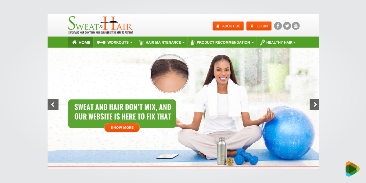
Sweat and Hair Turned Its Website Into A Trust Magnet
Problem: Outdated, inconsistent website reduced client trust and made accessibility difficult, especially on mobile.
Process: Launched a ZillionDesigns contest focused on professional UI, clear service structure, and simplified appointment CTAs.
Outcome: Increased consultation inquiries, longer time on service pages, and stronger first impressions.
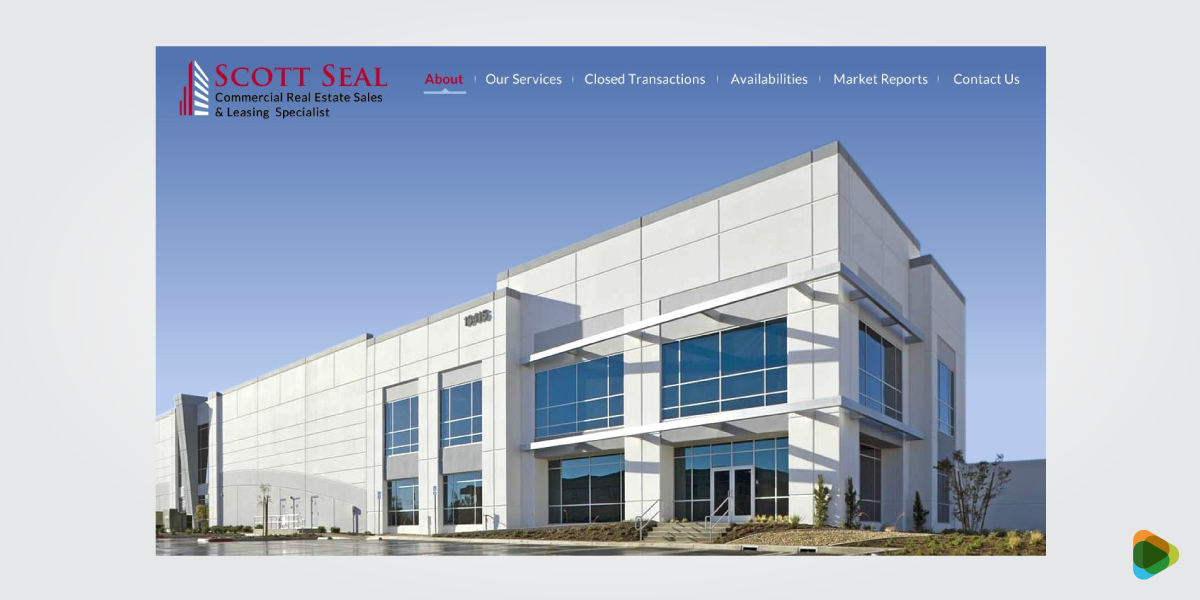
Scott Seal’s Listings Started Converting After A Website Revamp
Problem: Poor visual hierarchy and confusing filters led to low listing engagement and few inquiry submissions.
Process: Ran a UX-focused contest prioritizing property visuals, intuitive filters, and prominent inquiry forms.
Outcome: Higher listing engagement and increased property inquiry submissions.
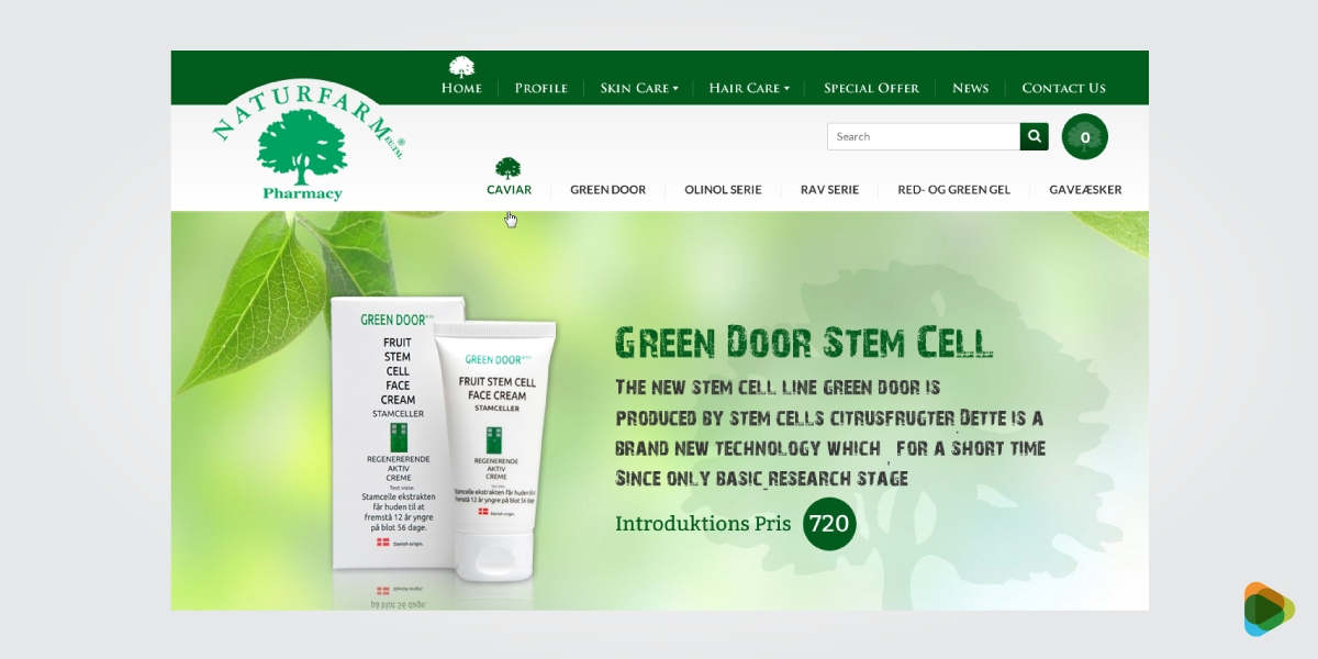
From Clunky to Clickable: NatureFarm’s Mobile Shopping Upgrade
Problem: Mobile shopping experience was cluttered, causing cart abandonment and low conversions.
Process: Hosted a mobile-first design contest emphasizing clean product pages and streamlined checkout flow.
Outcome: Improved mobile conversions, reduced cart abandonment, and stronger product engagement.
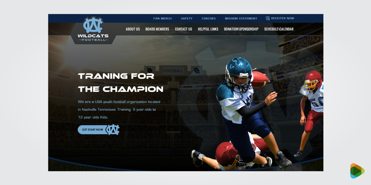
WildCats Football Made Its Mission Clear To Boost Signups
Problem: Unclear value proposition led to confusion and low trainee signups.
Process: Launched a user-focused contest to improve information hierarchy and clarify feature messaging.
Outcome: Increased information requests and trainee signups with clearer user journeys.
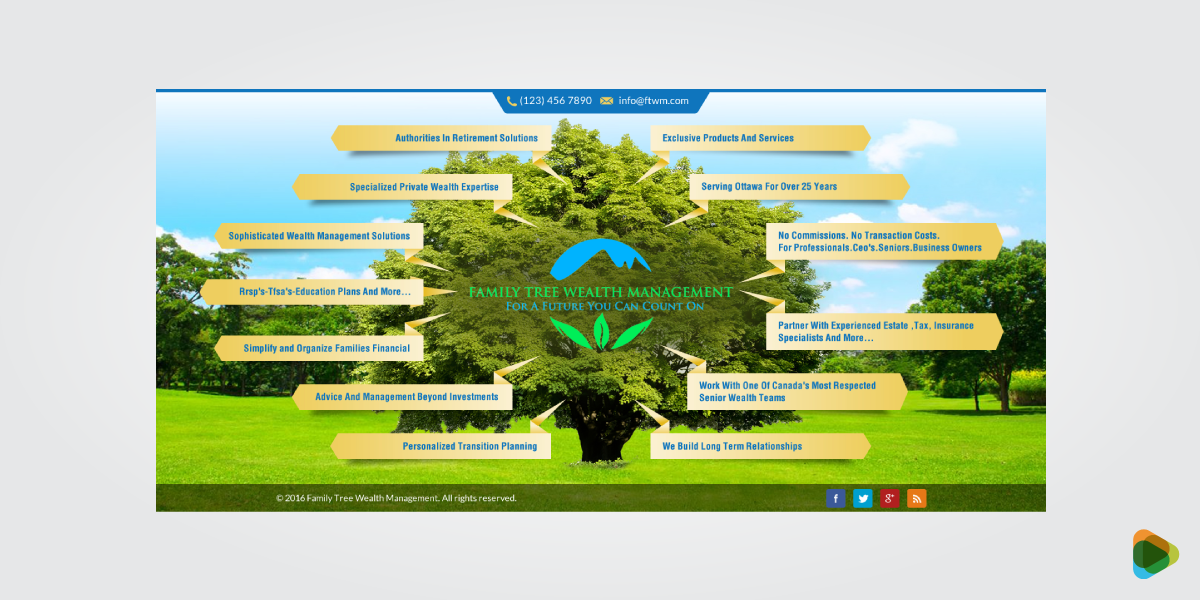
Family Tree Wealth Management Increased Authority with UI Redesign
Problem: Generic design weakened trust and limited client consultations.
Process: Conducted a design contest focused on structured layouts, refined typography, and trust signals.
Outcome: Growth in consultations and higher click-through rates on financial content.
Accessibility in Web Design
Accessibility is often treated as a technical requirement, but at its core, it is about making websites easier for everyone to use. People interact with websites in different ways, using different devices, screen sizes, and assistive technologies. An accessible website removes unnecessary barriers and helps more visitors access information, complete tasks, and engage with content.
Good contrast is especially important for buttons, links, forms, and navigation elements that users interact with regularly.
• Color Contrast and WCAG Standards
Text should be easy to read regardless of device or lighting conditions. The Web Content Accessibility Guidelines (WCAG) recommend minimum contrast ratios to improve readability and help users distinguish text from background elements.
• Readability and Typography
Clear typography makes content easier to consume. Font size, line spacing, paragraph length, and heading structure all contribute to readability.
A practical web accessibility guide typically recommends:
- Readable font sizes for body text
- Clear heading hierarchy
- Adequate spacing between elements
- Strong contrast between text and background
- Avoiding decorative fonts for important content
• Keyboard and Screen Reader Support
Not every visitor uses a mouse or touchscreen. Some rely on keyboards, screen readers, or other assistive technologies to navigate websites.
Supporting these users involves:
- Logical keyboard navigation
- Visible focus states
- Descriptive link text
- Alternative text for images
- Proper heading structures
- Semantic HTML markup
These improvements make websites easier to navigate for a wider audience.
• Inclusive Design Practices
Accessibility works best when it is considered from the beginning rather than added later. Inclusive design encourages teams to consider diverse user needs throughout the design and development process.
Examples include:
- Providing captions for video content
- Writing clear form instructions
- Using descriptive error messages
- Avoiding color as the sole way to communicate information
- Creating layouts that adapt to different devices and screen sizes
• A Simple Web Design Accessibility Checklist
Before launching a website, review the following:
- Text is easy to read and meets contrast requirements
- Headings follow a logical structure
- Images include descriptive alt text
- Forms provide clear labels and instructions
- Keyboard navigation works throughout the website
- Interactive elements are easy to identify
- Content remains usable across different devices and screen sizes
Prioritizing accessibility in web design helps create a better experience for all users while supporting long-term usability, compliance, and performance goals.

Global vs Local Web Design
A website that performs well in one market may not perform the same way in another. Language, cultural expectations, buying habits, and even design preferences can vary significantly from region to region. Businesses that serve multiple locations often need to decide whether a single website is enough or if localized experiences would better serve their audience.
The right approach depends on who you’re trying to reach. Some companies only need a local presence, while others require a broader strategy that supports multiple countries, languages, and customer expectations.
• Localization: More Than Translation
Localization goes beyond changing text from one language to another. It involves adapting content and experiences to match local expectations.
- Currency formats
- Date and time formats
- Units of measurement
- Local contact information
- Regional imagery
- Market-specific messaging
Small details like these can make a website feel more relevant and trustworthy to local audiences.
• Multilingual Website Support
For businesses serving customers in different countries, multilingual functionality can improve accessibility and engagement. Visitors should be able to switch languages easily without disrupting their experience.
Effective multilingual websites typically include:
- Professional translations
- Consistent navigation across languages
- Localized content where appropriate
- Language-specific SEO considerations
A translated website is only effective when the content feels natural to the audience it serves.
• Cultural Differences in User Experience
User expectations are not the same everywhere. Certain colors, imagery, layouts, and calls-to-action may perform differently depending on the market.
For example:
- Some regions prefer detailed information before making decisions.
- Others respond better to concise messaging and streamlined layouts.
- Trust signals may vary by industry and location.
Understanding these differences helps create experiences that feel familiar and comfortable to local users.
• Regional Content Relevance
People are more likely to engage with content that reflects their needs and environment. Local testimonials, region-specific case studies, and market-relevant examples often perform better than generic content.
Businesses targeting multiple locations should consider creating content tailored to each audience rather than relying on a one-size-fits-all approach.
• International SEO Considerations
Search behavior varies across countries and languages. Optimizing for international audiences often requires more than translating existing content.
Important considerations include:
- Country-specific keyword research
- Localized metadata
- Language targeting
- Proper hreflang implementation
- Region-specific landing pages
These elements help search engines deliver the right content to the right audience.
• Finding the Right Balance
Not every business needs a fully localized global website. For some companies, a single website with clear messaging is enough. Others may benefit from dedicated regional experiences that address local customer expectations.
The key is understanding your audience and building a website that feels relevant to the people you want to reach, whether they’re in one city, one country, or multiple markets around the world.
Legal, Privacy and Compliance
Building a website is not just about design and functionality. Businesses also have a responsibility to protect user data, respect privacy preferences, and provide a safe experience for visitors. Ignoring these areas can damage trust and, in some cases, lead to legal or financial consequences.
The specific requirements vary by industry and location, but most websites should address privacy, accessibility, security, and data collection practices from the start rather than treating them as afterthoughts.
• Cookie Consent and Transparency
Many websites use cookies to improve functionality, analyze traffic, and support marketing efforts. Visitors should be informed about what data is being collected and how it is being used.
Good practice includes:
- Displaying clear cookie notices
- Explaining cookie usage in plain language
- Allowing users to manage their preferences
- Providing access to privacy policies
Transparency helps users make informed decisions and can strengthen trust in your business.
• GDPR and Data Privacy
If your website collects personal information, privacy regulations may apply. Laws such as the General Data Protection Regulation (GDPR) require businesses to be transparent about how data is collected, stored, and processed.
Common requirements include:
- Obtaining consent before collecting certain types of data
- Explaining how information will be used
- Giving users access to their personal data
- Allowing users to request corrections or deletions
Even businesses outside Europe often follow these practices because they promote stronger data protection overall.
• Accessibility Requirements
Accessibility is increasingly becoming both a usability and compliance consideration. Following recognized web accessibility guidelines helps create experiences that are usable for a wider range of people while reducing potential legal risks.
Some organizations also use a formal web design accessibility checklist during audits and website reviews to identify barriers that may affect users with disabilities.
Areas commonly reviewed include:
- Color contrast
- Keyboard navigation
- Screen reader compatibility
- Form accessibility
- Alternative text for images
- Clear heading structures
• Website Security
Security plays a major role in protecting both businesses and their visitors. Even small websites can become targets for spam, malware, or unauthorized access if security measures are neglected.
Basic security practices include:
- Using SSL certificates
- Keeping software updated
- Implementing strong passwords
- Limiting unnecessary access permissions
- Maintaining regular backups
- Monitoring for vulnerabilities
A secure website helps protect sensitive information and supports long-term reliability.
• Building Trust Through Compliance
Compliance should not be viewed as a box-ticking exercise. Privacy, accessibility, and security measures all contribute to a better user experience and stronger customer confidence.
When visitors feel comfortable sharing information, making purchases, or interacting with your content, the website becomes more effective as a business asset. Addressing legal and compliance requirements early is often far easier than fixing problems after launch.
Resources and Tools for Web Design and Development
The right tools can make a significant difference throughout a website project. Designers use them to create layouts and prototypes, developers rely on them to build functionality, and business owners use them to manage content and monitor performance.
There is no single toolkit that works for every project. The best choice depends on your goals, budget, technical requirements, and the type of website you’re building. Whether you’re handling a simple brochure site or a large-scale platform, these web development tools and design resources can help streamline the process.
• Design and Prototyping Tools
Before a website is built, designers often create wireframes, mockups, and interactive prototypes to explore ideas and gather feedback.
Popular design tools include:
- Figma
- Adobe XD
- Sketch
These platforms help teams test layouts, refine user flows, and experiment with different approaches before development begins.
For businesses looking for inspiration, starting with a web design template can also provide a useful foundation before creating a more customized solution.
• Website Development Tools
Once the design is finalized, developers use a variety of website development tools to turn concepts into functional websites.
Common technologies include:
- HTML, CSS, and JavaScript
- Version control systems such as Git
- Front-end frameworks
- Content management systems
- Deployment and hosting platforms
These tools help developers build, test, and maintain websites more efficiently.
• Front-End Frameworks and Modern Development
Modern websites often rely on frameworks that simplify development and improve performance.
Popular options include:
- React
- Vue.js
- Next.js
These technologies are commonly used in projects that combine web design and software development, especially when websites require dynamic content, user accounts, or advanced functionality.
• Content Management Systems (CMS)
A CMS allows businesses to update content without editing code directly. Choosing the right platform depends on the type of website being built and the level of flexibility required.
Popular CMS platforms include:
- WordPress
- Shopify
- Webflow
These platforms make it easier to manage pages, publish content, and maintain websites over time.
• Performance and Testing Tools
Launching a website without testing is a bit like opening a store without checking whether the doors work. Performance and usability testing help identify issues before visitors encounter them.
Commonly used tools include:
- Google Lighthouse
- PageSpeed Insights
- GTmetrix
These tools provide insights into page speed, accessibility, SEO, and overall performance.
• Analytics and Optimization Tools
After launch, data becomes one of the most valuable resources available. Analytics tools help businesses understand how users interact with their websites and where improvements can be made.
Popular options include:
- Google Analytics
- Hotjar
By monitoring visitor behavior, conversion paths, and engagement metrics, businesses can continue improving their websites long after launch.
The tools you choose should support your goals, not complicate them. A well-planned workflow, combined with the right web development tools, often leads to a smoother project and a more effective website.
Ready to Build a Website That Supports Long-Term Growth?
A strong website brings together design, development, and strategy so each part supports a clear purpose. When these elements work in sync, the website becomes more than a digital presence and turns into a practical business tool.
Understanding the basics of web design and development helps you make better decisions, whether you’re planning a simple site or a larger platform. The goal is not just to launch something quickly, but to build something that can grow with your business.
If you’re exploring web development services, choose an approach that fits your current needs while leaving room for future expansion.
FAQs
1. What should I know before getting a website designed from scratch?
Before starting, it helps to be clear about what the website needs to achieve. Whether the focus is leads, sales, or brand awareness, those goals shape everything from structure to content. A solid plan for website design and development should also include your target audience, site structure, and the type of platform or CMS you want to use. Mobile responsiveness, speed, SEO, and security should be considered early rather than added later.
2. How much does it cost to design and develop a website?
Website costs vary widely depending on complexity, features, customization level, and who builds it. DIY website builders may cost $10–$50 per month, while freelance web designers typically charge between $1,000 and $10,000+. Agencies often start around $10,000 and can exceed $50,000 for complex projects.
The real cost depends on what the website needs to achieve. A simple informational site costs far less than an e-commerce store, SaaS platform, or enterprise-level website.
3. What makes a website high-performing?
A high-performing website aligns design decisions with clear business goals. It prioritizes user-centered thinking, intuitive navigation, fast load times, mobile responsiveness, and strong calls to action. Performance is measured by results, lead generation, sales conversions, engagement metrics, and retention.
Technical factors such as Core Web Vitals, SEO optimization, accessibility standards, and secure hosting also contribute significantly to performance.
4. How long does it take to design and develop a website?
Timelines vary based on size and complexity. A simple brochure site may take 2-4 weeks, while larger platforms can take several months. The process usually includes planning, design, development, testing, and revisions. Using structured web development services can help streamline the workflow and reduce delays, especially when multiple stakeholders are involved.
5. When should a website be redesigned?
A website should be redesigned when it no longer supports business goals or user expectations. Common indicators include declining performance metrics, outdated branding, slow load times, poor mobile usability, and low conversion rates. Major business changes such as new services, rebranding, expansion into new markets, or technological upgrades also signal the need for redesign.