14 Instances Green Logos Rule the World!

Feature Image Source: Hal Jordan, Green Lantern: The Animated Series
Post Updated (Dec 14 2016)
Recently Pantone color institute announced the color of the year 2017 greenery and the news has caught the internet by storm. The experts at this institute have been releasing the color of the year since 1999 and their word matters in home décor, fashion, packaging and various other industries. Logo design and brand color palettes are no exception. In this post, we will see how some tech industries would like to be associated with the color of nature.
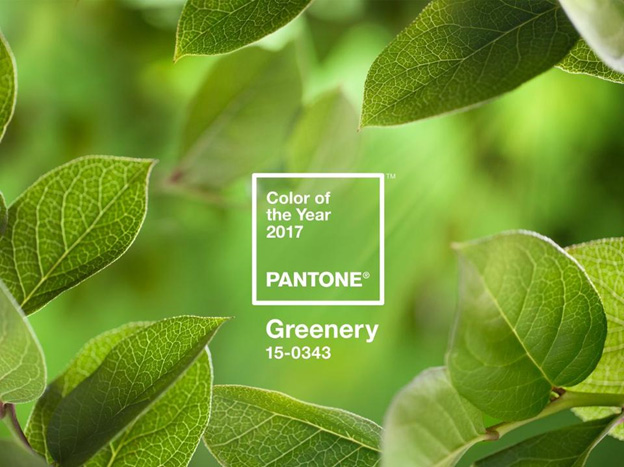
Image Source: Pantone
But if we go by Robert Frost’s logic, “Nature’s first green is gold”, then golden rod doesn’t seem too far-fetched either. Anyways, this life-affirming shade, greenery is here to stay. Or is it the other way round. Do you feel the hue is worth embracing? Share your thoughts in comments and enjoy a free roundup of completed logos.
Article
Green is famously known as the color of life. Do you see it that way? It is the most popular color after blue. Commonly used in expressions such as green with envy or the green-eyed monster will give an impression that the color is associated with jealousy. Universally, green is known as the color of life renewal, nature and energy. When the brands pick shades of green, they intend to display certain brand attributes such as growth, safety, harmony, fertility and natural. There are certain colors suitable for every industry. Usually you will notice green in the food industry, banking or finance sector, and sports, recreation and tourism.
When you are out to select the primary color to represent your brand identity, a random selection is never a good idea, for every color has its meaning. In order to represent your brand image correctly, you should know the meaning and used of colors in logo design. In this article, we will explore the effects and attributes of green taken up by the top brands.
The Psychology Of Green Color
The psychology of Green color when it is pale and muted by tinting or toning with white or gray, usually creates a very relaxing environment. These colors will work well in a spa or health clinic. Greens darkened with black to create shades can be very masculine and mysterious. These are often used in corporate offices and restaurants.
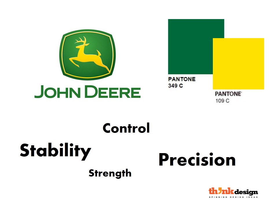
The color Green is the most relaxing color to the eye optically because of its spectral wavelength. However the range of different Greens is very broad. Check out how these top brands have applied the shades of green according to their brand attributes.


Entertainment Logos
Healthcare Logos
Painter Logos
Organic Farm Logos
Pet Store Logos
Childcare Service Logos
Agricultural Farm Logos
