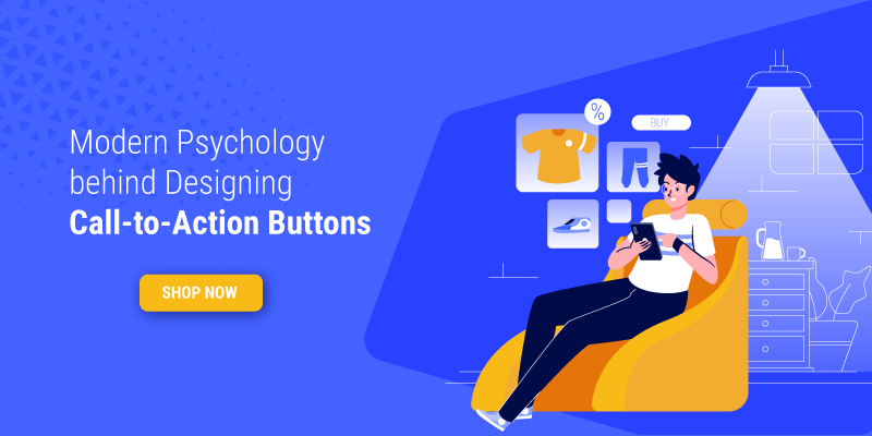
[Guide] Modern Psychology Behind Designing Call-to-Action Buttons for Contemporary Retail Websites
Featured Image: Freepik.com
With the looming pandemic, buying habits have inclined more towards the online world, where “physical” distancing isn’t a problem. In a span of just 6 to 8 months, some retail businesses have suffered heavy losses. Some brands shut many of their walk-in stores while others enjoyed sales from their websites and social media, but they too had to double their efforts.
And so it is now, more than ever, crucial to leverage your calls-to-action and pave the way for visitors to complete their buyer’s journey on your website.
Let us study the way modern website designs, retail stores, in particular, are attracting their buyers to click their meticulously designed and placed call-to-action buttons.
Contemporary Retail Websites
The rapid digital shift with online marketplace technologies has significantly influenced the way buyers buy and sellers sell. In this digital age, small to medium and large-sized businesses have reenergized and reinvented themselves in the swiftly transforming world with digital strategies for online storefronts.
A modern retail website design is about smooth navigation, attractive visuals, user-friendly catalogs, and a secure point of sale. However, the one thing that directs visitors to the right landing pages for subscription and purchase is the mighty call-to-action (CTA) button. One-click and voila, you have either a lead or a customer.
Modern Retail Website Trends
Along with this, modern retail website designers polish each web page with a rub of the latest web design trends. These trends influence the way a website design looks and feels, and they also determine how customized CTA buttons will fit in the layout of each page.
Some trends impact the visual aesthetics of a website while others focus on function and usability like mobile efficiency, anticipatory design, machine learning, chatbots, and voice integration.
Using trends just for the heck of it is not a bright idea. Whenever web designers plan to be trendy with CTA buttons, they must take into account: Where will they be placed? What purpose will they fulfill? And also, are they positively affecting subscription and sales?
So the trick to choosing from web design trends for navigation or homepage or the overall appearance is to figure out what do you want from it and keep track of how it is affecting your page visitors, bounce rate, and sales. At the end of the day, for a retail or e-commerce website, it all comes down to being able to sell the product or service.
Thus, to achieve online retail success, you must design a professional website that is dealt with care, and the hired web designer pays attention to all the aspects of the entire web design process that includes planning, designing, executing, and maintaining your retail website.
Explore: Bricks And Clicks Of Retail Business
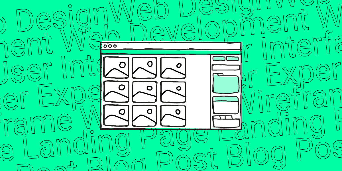
Web Design Process
Are you wondering, what is the point of mentioning the modern web design process in an article about call-to-action buttons? Well, you can’t just throw CTA buttons on your web pages expecting to get lucky.
Designers need to be strategic when deciding where to place what in a website. Everything in design, in this case, a website design, needs to have a reason for being that way, in that place.
Like other elements of design on a website, CTAs should go through the same process as the entire website does because it is a part of the whole.
All right, so let us begin understanding the process.
Step 1: The Brief
Before starting with a web design contest, the first thing designers must do is to thoroughly scrutinize the client’s creative brief so that later in the process there are no loopholes or surprises. You don’t want to spend all your effort and resources on something that was never asked of you.
What will happen if you don’t study the brief?
For instance, you designed a website with blue or green colored CTA buttons assuming that a company from the healthcare sector ought to have these colors. When you show the design idea to the client, he says that their brand color scheme does not include these two analogous colors, instead, they are a support group for breast cancer patients providing care products and pink is their primary and only color apart from white. At this point, you will want to bang your head on the wall for not making the effort earlier to read and comprehend the brief.
It will be an utter disaster if you skip the brief and move on thinking to yourself that you know what the client wants. The thing is, each client has different wants and needs that you need to address smartly making sure that their desires are met but don’t get in the way of usability.
The brief, basically, provides information regarding what the project is about and who the website is for. So not only does the web designer need to analyze the mindset of the client but also needs to think about the end-user.
While some clients will let you know their exact specifications, some may not even know what a website is. No matter the case, you need to make sure that each website is beautifully crafted the way it can be in the set budget.
The creative brief may or may not specify anything about call-to-action buttons and if there is nothing mentioned then you must ask clients questions regarding their products, point of sale, and their goals. With the goals in mind, you will get an idea about what kind of CTAs can go on the website. For example, if one of the goals is to gather emails from visitors so that the company can send discount offers then a ‘sign-up to email’ button will be great.
In the brief, clients might also mention their brand’s color palette that you can use to fill in the CTA buttons. Some brands have just one color that force designers to use just that because there is no other option and many times, with startups and small businesses, there is a choice of 3 to 5 colors to pick the best fit from.

The bottom line is that designers must read the client’s brief carefully to create a website design that wins the table. Without the brief, the website project will be nothing but a template based on your interpretation of what a business from an industry should look like.
Step 2: The Plan
Even if the brief has charted out all you need to design a responsive website, planning is a necessary step. You can’t jump into the deep ocean without knowing how to swim in it. You can’t wander on the streets in your car without knowing where to go. You can’t fly the plane if you don’t know how and where to steer. You see, you need the right tools, the correct skills, and a specific destination to make it all work.
The planning aspect of the website design process involves detailed research and creative brainstorming. As a web designer and developer, you must observe and analyze the following:
- Competitor’s website appearance and function
- Unique Selling Proposition (USP) of the website
- Visuals that will correspond with the brand image
- Ways to humanize and customize the website
- The best content management system for the website
- How will web pages synchronize and connect with one another
- How can the website be made great in the budget provided
- Sketching wireframes and mockups for web design drafts
- Way to define the structure of a website’s information architecture
- All this and more needs to be considered when designers are in the planning stage of retail website designing.
- The aim of having an online presence, for a retailer from any industry, is to make sales from their website. When designing a website for a retail company, it is crucial to guide visitors from the catalog to the cart and then finally to checkout.
Step 3: The Design & Development
The boring bit is done and now it’s time to start what you’re best at, designing and developing. This is the part where web designers mold the user interface (UI) and user experience (UX) of the website.
This step requires UI designers to think: Where the business logo will look the best on the website? Which side should the navigation bar be placed on? Should the website have a burger menu or not? What type of design style or trend will suit the company or the brand? How should the visual composition and layout of each web page be? What the hierarchy of the visual elements should look like on a given website? How many CTAs can go in one page? Where can the CTA buttons be placed so that they’re impactful?
If planning is the backbone of the website designing process then design and development are the flesh. Imagine if people had no skin and walked in their skeletons. For scary movie lovers, that’ll be awesome but for most of us, the sight will be horrifying. The same is with a website. You need to give the skeleton skin so that it has an appearance and then develop it by defining the functions of each part. For example, just like feet are for walking, a CTA button is for leading a person from one place to another.
The design and development stage of the website building process involves:
- Ensuring the website is built to comply with web standards
- Making sure that all necessary aspects of a website are accessible
- Using a great Content Management System to manage the website
- Defining functions of everything on the website: buttons, shopping carts, sliders
- Composing, integrating, and linking web content: titles, descriptions, visuals
- Optimizing content for search engines for ranking and link building
Step 4: The Launch & Maintenance
After creating the website, it is time to launch it online, and later the developer needs to maintain it by using the industry’s best practices. At least as best as he or she can in the budget.
For The Launch, Ensure That:
- Links on the website are not broken
- Funnel emails and auto-responders are working
- Forms are ready to capture emails and feedbacks
- Social sharing icons are functional
- CSS and HTML is validated
- Website loading speed in under 3 seconds
- SEO plugin configuration is spotless
- XML sitemap is created
For The Maintenance, Ensure That:
- CMS updates are installed
- Plugin and themes are updated
- Backup is upgraded
- Security is not compromised
- Data tracking and analytics are reported
- SEO new practices are used
- Existing content is updated
- Queries and purchases have been replied
- Spam comments are filtered
Depending on the structure of the retail website, the maintenance will vary. All the points may seem irrelevant for call-to-action buttons but remember that only the overall success of a website helps to enhance all its big and small features.
Types of CTA Buttons
A non-designer would think that buttons are buttons, and there is no distinction between two buttons on a page but we, as designers know that there are different kinds of call-to-action buttons. There may not yet be a large variety but it is enough for online businesses.
Website Page Buttons
Web buttons are ones that appear on each web page – on top of the hero image on the home page or under each body text on the landing pages.

Image Source: Nike
Popular retailers don’t need an ‘in the face’ call-to-action button. They have the luxury to put it under the hero image that requires visitors to scroll down. The trick to placing a button varies from brand to brand. Much research goes into analyzing and testing which type of CTA button will work for a particular company.
Pop-up Form Buttons
Form buttons are those that accompany popup campaign images that appear on retail websites for each new visitor. These usually contain discount offers or sign-up to email requests.
However, it is advised to only have one call-to-action button per image because then the customer gets confused as to where to click. In the example below, there are two call-to-action buttons: one is a tiny red button and the other is a hyperlink on a red bar. You should not put visitors under a dilemma as to where to click first.

Image Source: Macy’s
A better strategy is to only put one message and one call-to-action button on a single popup message for impact and emphasis.

Image Source: Best Buy

Image Source: Sarah Flint
However, in some situations, designers add more than one call-to-action button. For example, on a single product page, they can include an ‘add to bag’ button, an ‘add to wish list’ button, and ‘shop the look’ button. The intention behind doing this is to expect the potential buyer to click at least one button although it kind of looks absurd. They say the more is merrier, but only is some situations.
You should know that this is not a pop-up so it’s okay to have more buttons but in a pop-up window, the best idea is to have just one dedicated button.
Navigation Buttons
Menu buttons are the ones that are placed beside a menu bar on a website, making the experience seamless and easing the journey of buyers from the homepage to a landing page.
We are not a retail website although we do sell our services, but I thought this is a great example of placing a ‘start a contest’ button in the top navigation bar.

Image Source: ZillionDesigns
Here is another example of a CTA button alongside the main menu.

Image Source: Huawei
If you look at the top, the call-to-action button is next to the main menu of the two websites and this strategy can help retailers get more leads because when visitors stop on a website, they tend to always look for what’s in the menu.
Sectional CTA Buttons
Section-wise call-to-action buttons are divided between parts of information on a single page, so as the visitor scrolls down, there is more than just one button.

Image Source: 7Eleven
Each new topic content is paired with different ‘order now’ and ‘learn more’ buttons with the larger images and the small ones on the right. Whether or not this strategy works for them is something this retail store knows but perhaps retailers can deviate from the formula ‘simple is better’ because some of them have a lot to offer. It all boils down to where the visitors click and don’t click.
Psychology Of Call-To-Action Buttons
Selling products online requires designers and developers to pay attention to detail. Call-to-action buttons are one of the most vital parts of a website so it is important to not sprinkle them randomly but place them tactically like Yolanda Gampp puts condiments on her exquisite cakes.
In retail and ecommerce sector, call-to-action buttons play an integral role in sales growth. This is because each button leads the customer to a step forward in their destination on the website. Each button at every step of the buyer’s journey has a reason to be placed in a certain position, colored in a particular way, and embellished with a specific catch-phrase.
Let us focus on the crux of the article. I have divided the psychology of call-to-action buttons in chunks so it’s easier to chew and swallow.
Color Theory Of CTA Buttons
It’s critical designers learn about how to use colors, how to create a color palette, which color will look good on what background, and how to complement the color of CTA buttons with the overall website design or with a brand’s color theme.
The point is that a button should look like a part of the website rather than something hanging in the air aimlessly.
For this, designers must study color moods and the psychology behind using a specific color. Each color in the spectrum makes visitors feel and think in a certain way. It is important to note that the modern psychology of color usage differs from the conventional psychology of colors in graphic design. For example, red is no longer a color of ‘warning’ or ‘stop’ in fact contemporary retailers use this color for their ‘order now’ buttons to suggest urgency of action.
- Blue builds trust and security
- Green promotes growth
- Yellow catches attention
- Red energizes
- Orange is about instant action
Have Some Colors Become More Accepted?
When it comes to ‘buy now’ buttons, colors play an important role in the success of click-through rate. While some colors invite visitors in, other hues cause aversion and make potential customers run away. These aversive colors include brown, and at one point in time black was also not a popular choice. Even retail websites about gothic fashion or underground tattoos or a voodoo store preferred bright colors like a popping pink or fiery orange. Now, however, contemporary retail websites have black and brown call-to-action buttons that look simplistically stunning, to be honest if used in the right way.

Image Source: Jackie Smith

Image Source: BonBonBon
Is There A Right Or Wrong Color Shade Or Tone?
Another point to take into consideration is the shade and tone of the button. For example, a lighter pink on stark blue background will look better than a magenta button. There is a contrast but the edges hurt the eyes and instead of clicking the button, at least I feel like pressing the cross to escape. Thus, web designers must find the right color shade and tint that is attractive and clickable.
Some modern retail websites keep the color of the ‘order now’ button the same as the background but outline it with white to pull it out.
Shape Psychology In CTA Buttons
While most CTA buttons around the web have pointy corners, some contemporary web designers use rounded rectangles for sales buttons. The circular edges generate a more positive response than a squared edge. This is because a circle shape suggests community and friendship unlike angular shapes that propose rigidity, sharpness, and rigidity.

Image Source: The Beard Smith
Most call-to-action buttons are short or elongated rectangles. Till now, even contemporary websites haven’t freely experimented with the shape of the button. They stick with the traditional shapes instead of using a triangle or a hexagon. However, there a few web designers who like breaking conventions one step at a time.

Image Source: Anastasia
Placement Of CTA Buttons
Where to place your ‘shop now’ button is a million-dollar question. There are two things to consider when placing a call-to-action button on a web page.
- You need to make sure that every gateway to a point of sale is open with a unique button. It will be unprofessional to have an enticing key phrase without a button so designers and copywriters should list down where to add buttons. It’s a bummer when websites have an image of the product but no ‘order now’ button near it.
- Web designers must also remember to analyze the way users view a website i.e. the viewing patterns. Designers, with the help of data analytical team, should be able to recognize the F-Pattern, the Gutenberg Diagram, or the Z-pattern. Of course, these aren’t the only ways a website visitor’s eyes travel because as buying habits are changing so are viewing habits. Thus, sometimes sticking to standards is not a modern way of thinking.
Perfecting CTA Button Phrases
A text-less button is just a shape with no meaning. This is why, all call-to-action buttons have something written on them. The traditional catch-phrases found on retail websites include: buy now, order now, sign up.
Nevertheless, with terms like personalization and humanization surrounding the content and design industry, CTA button texts are also becoming more friendly and approachable. Examples include:
- Shop Clear Genius
- Give (dash) a Try
- Send Me Specials Now
- Let’s Start the Project Together
- Yes, Please Send Me the Coupon
- Yes, Take Me There
- Shop Dear
- Try Risk Free

Image Source: Ettitude

Nowadays, web content writers have started to add a humanistic sense to call-to-action phrases by adding words like me, dear, please, genius, together, and your. These words and the likes of them are more inviting than those that straight-away order visitors to do things. Humanization of design is the way to go!
Contemporary Retail Website CTA Button Trends 2020
Trends come and go, but while they are here, might as well use them and enjoy them. Thankfully, they can be adapted with time so don’t worry if you have a call-to-action button that later becomes obsolete because you can always transform it to something else. Here are a few current trends in the retail web design market.
Am In A Gradient Bliss

Image Source: BlissWorld
Outline That Button, Darlin’

Image Source: Zappos
The Hover Fill Magic

Image Source: Hat Shop
Dark and Light Color Trick

Image Source: Little Cigogne
Cool Hyperlink Heading Your Way

Image Source: Boffi
Get In The Line, Will You

Images Source: Jo Loves
Finishing Tips: Do’s And Don’ts Of CTA Buttons
When designing the UI and UX of call-to-action buttons, there are a few “do’s and don’ts” to keep in mind. Of course, no one is stopping you from being creative and experimental but there are a few basic rules to follow.
- Make sure that the CTA you design is attractive and readable
- Don’t overdo animation and effects on a single CTA button
- Try to maintain a design standard across all pages of a website
- Always try to make original CTA buttons for a website based on its image
- Don’t hide the CTA where it cannot be seen or clicked
- Avoid using contrasting colors that sting the viewer’s eyes
Okay now, it seems like you are good to get started.
Got unanswered questions? Share them in the comments below.