Graphic Design Terms Visualized – Glossary On The Go
Featured Image: Freepik.com
Getting on with practical graphic designing is the way to go when it comes to getting work done but you’ll find hurdles in your way if your design vocab is only half full or not at all.
Whether you’re a designer or a client, bookmark this graphic design glossary on the go so you have something to rely on in case you are stuck between kerning and tracking, for example.
Without stretching our intro, let’s start the engine and move on.
Logo Design & Branding
The world of logo designing and brand identity creation is full of jargons used especially for the purpose of referring to a design item, process, appearance, or type.
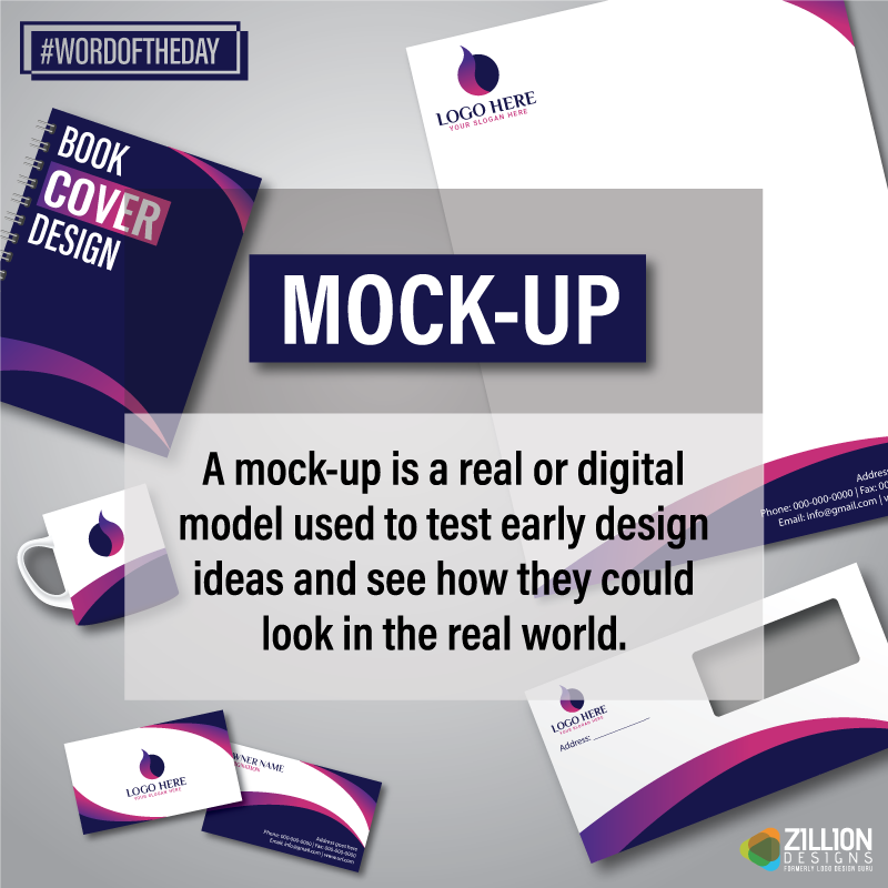
Mock-Up
Mockups are ready-made branding stationery items that showcase a client’s brand identity before finalization. But why do you need to make a mockup? This little activity helps both designers and business owners visualize a given visual identity.
Stationery Designing
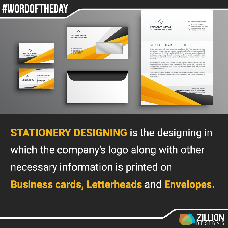
Unlike the typical pencil and paper, branding stationery design are all the necessary supplies needed for business to business communication essentially. A stationery designing project includes logo design, business card, letter head, and envelope.
Logotype
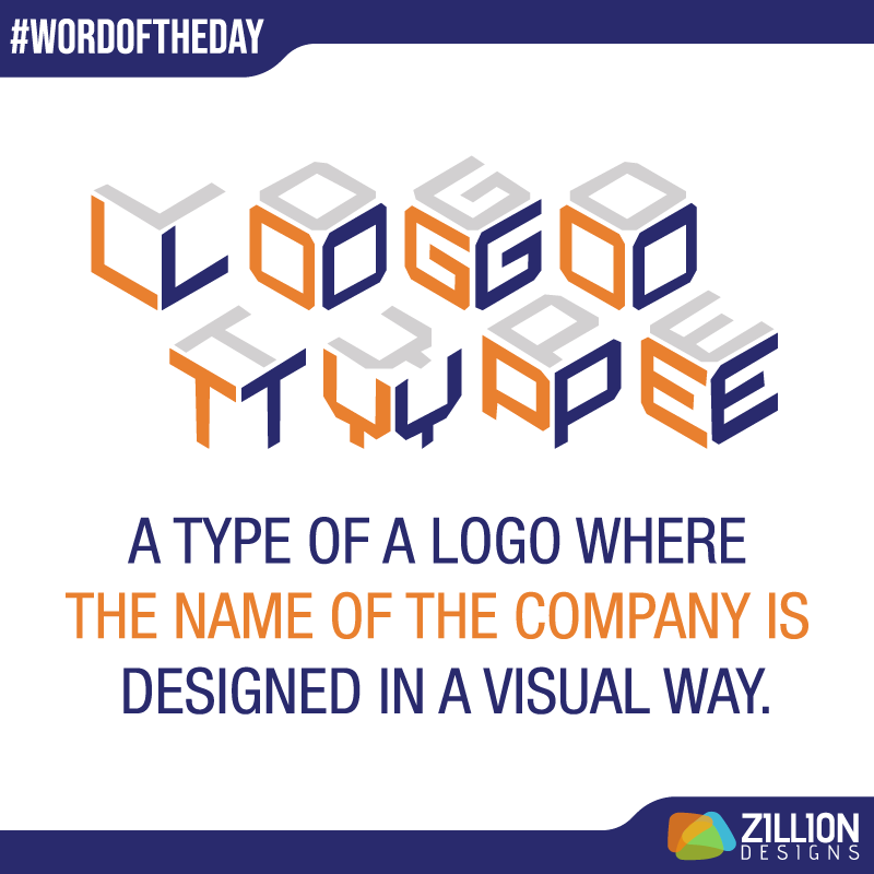
Technically wordmark logos and lettermark logos fall under this category. Unlike a logomark, logotype is based on word (alphabets or characters for pronunciation).
Graphic Design
Graphic design has it all. It is a vast field with many things to learn and practice. Basically, all the word in this list can come under this umbrella in one way or other.
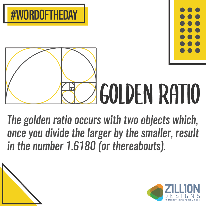
Golden Ratio
Golden ratio is a mathematical approach to design. Invisionapp explains it as “a naturally occurring sequence of numbers that can be found everywhere, from the number of leaves on a tree to the shape of a seashell.” The golden ratio is used by designers to create company logos or logo design tutorials.
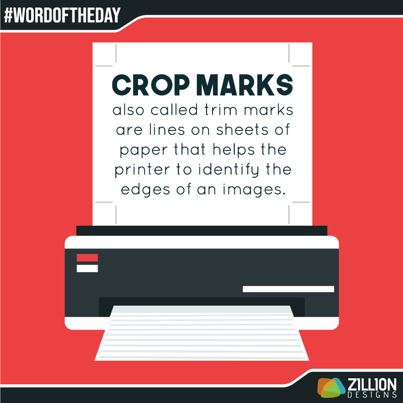
Crop Marks
Tech giant, Microsoft describes crop marks as the “lines printed in the corners of your publication’s sheet or sheets of paper to show the printer how to trim the paper.” For example, if you have made a business card on an A4 sheet then crop marks will have the printer when cutting off the unrequired bits.
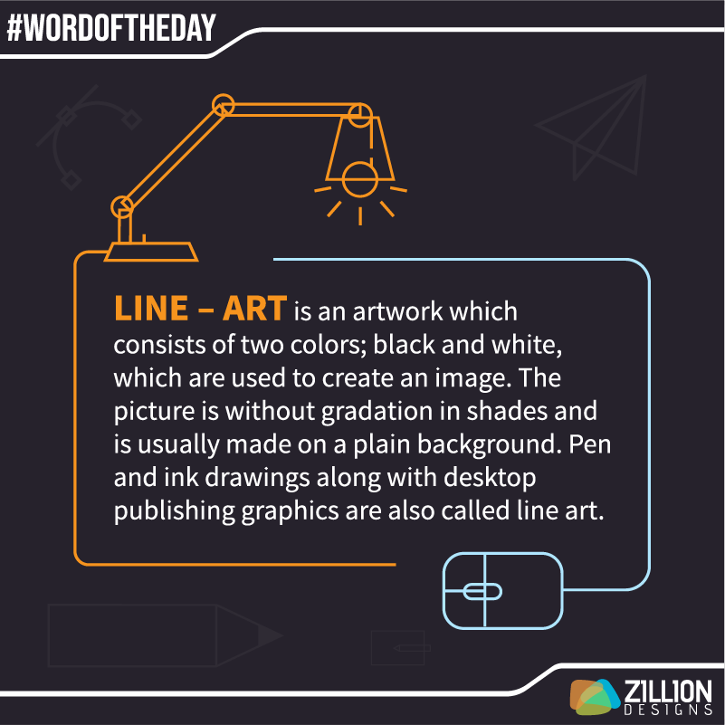
Line Art
Unlike the outlines on a drawing book, line art doesn’t require you to fill in the colors but the lines themselves can be of any hue you like. Creating unique logos in line art is the trend these days.
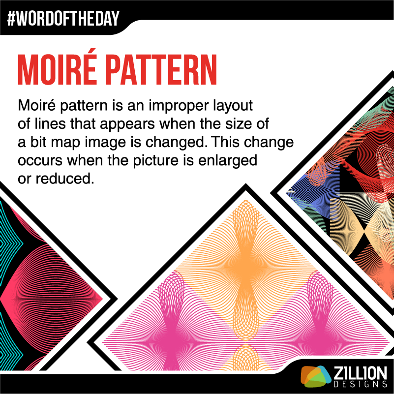
Moiré Pattern
Repeated parallel lines create a moiré pattern. The lines intersect at an angle making an interesting design composition. While they can be taken as a glitch, these patterns can be created on purpose too.
Landscape
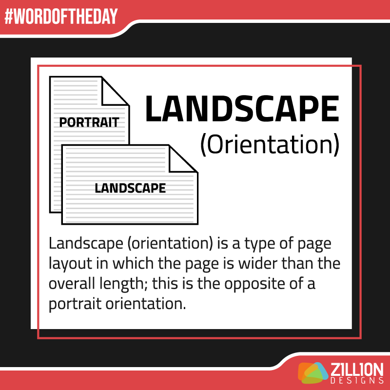
When designing on the computer, the software may ask you to define the orientation of the artboard or canvas. It gives you two options: landscape and portrait. While the paper for brochures is landscape, for posters and infographics designers prefer a vertically tall page.
Stroke Weight
The weight of a stroke determines the thickness and thinness of a character or alphabet. This technique helps to highlight words of importance in images and videos.
Radial
The word radial is usually used to refer to a design that goes 360 degrees round or to a gradient that looks circular.
Print Media
In today’s digital world, print media is considered traditional yet there are a few terms to note just in case you need to get something printed out.
Knockout
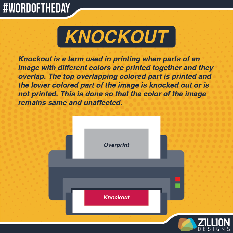
A knockout is when a designer removes color or portion of a shape from below another so that they don’t affect the hue or object on top.
Facing Pages
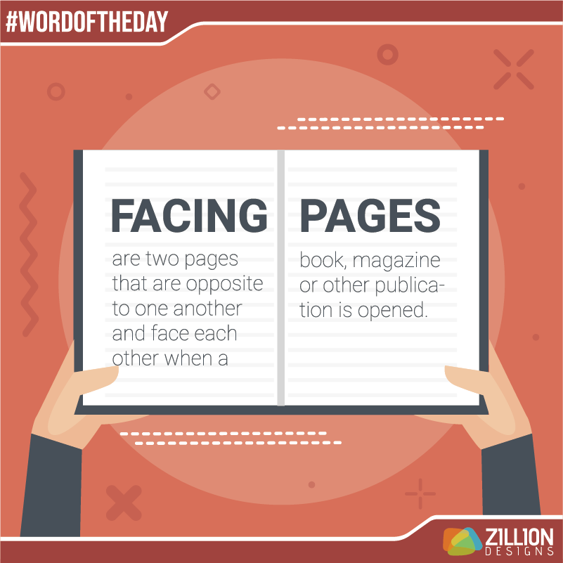
In magazine or book publication, two pages side by side are called facing pages. For a feature article on these pages, layout designers need to be careful how they place images and titles.
Typography
Typography is basically the art of placing text on any design. It not only determines the looks of a design but also how the logo design, web design, or print design functions.
Slab Serif
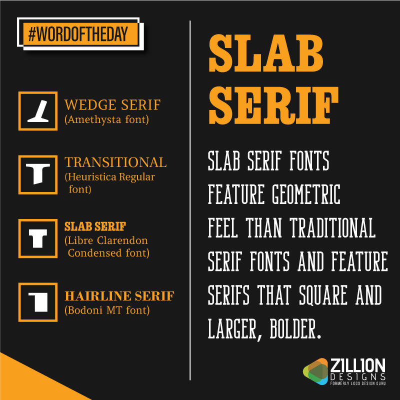
Serif fonts are those that have extensions, and slab serif is a sub-category n which the extended lines are squared and often heavy. They appear blocky and sturdy. What kind of graphic designs look nice in slab serif? You can use this font style to make music posters or logos for different industries.
Type Family
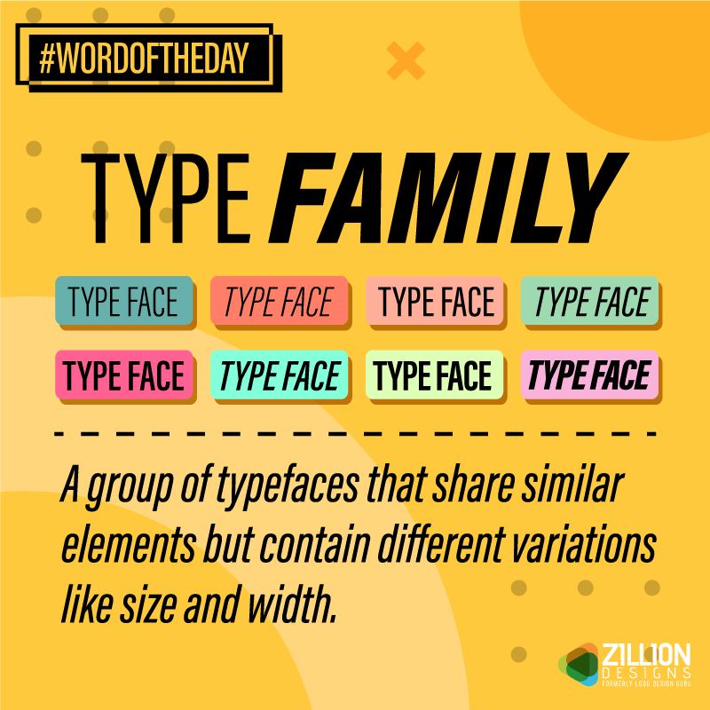
Type families are typefaces with a variety of attributes. For example, a popular typeface is Helvetica and its family include its different version like bold, oblique, light, and black among others.
Subscript
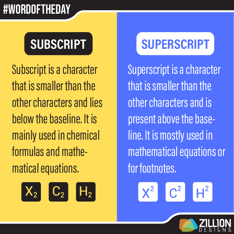
You remember the small number attached in the H2O? Well, this little two is called a subscript, which is a symbol written below the baseline.
Type Alignment
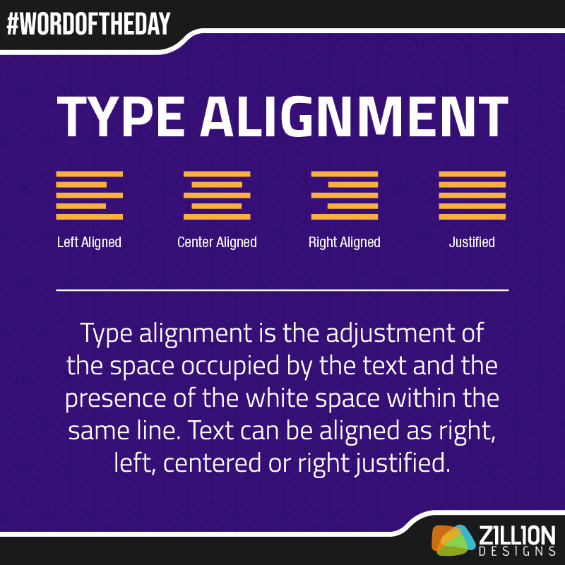
Alignment is about having a specific order in the way graphic elements are stacked or placed. When it comes to aligning type, the text is usually centered, right-aligned, left-aligned, or justified.
Arm
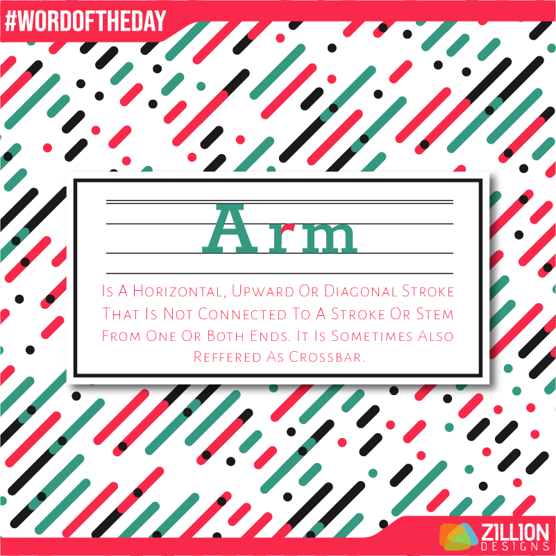
In type anatomy, an arm is an upward or horizontal sloping line (stroke) that is unattached to any other character. Examples of arm are in the capital letters “V”, “E”, and “T”. Arms are also in small letters.
Kern
Wondering what does it mean to kern? kerning is a process of adjusting space between letters and characters to achieve a visually pleasing effect.

Also Explore: New Rule-Book Of Kerning For Fashion Logotypes
Bilateral Serifs
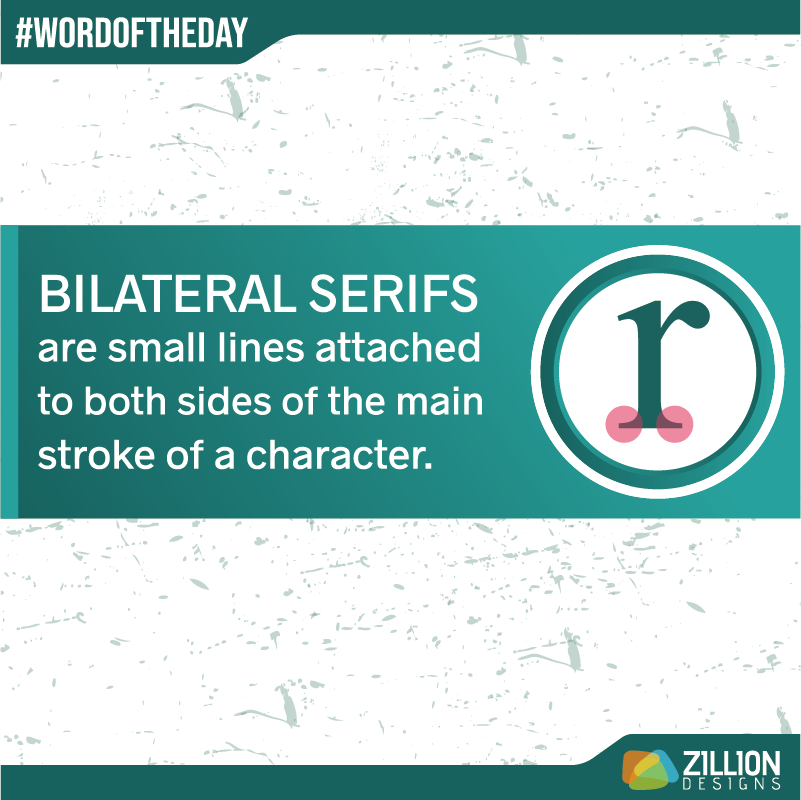
In a serif font, bilateral serifs are side to side extensions on a stroke. You will better understand this term with the diagram below.
Ear
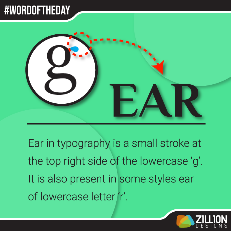
This isn’t a body part of a human being but of a letter. The letters “g” and “r” in small caps have an ear each.
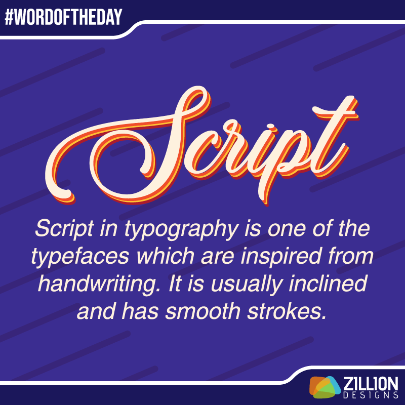
Script
The beauty of a script typeface is that is fluid and flow-y. It is perfect for wedding monograms or graphic designs for a spa and beauty salon.
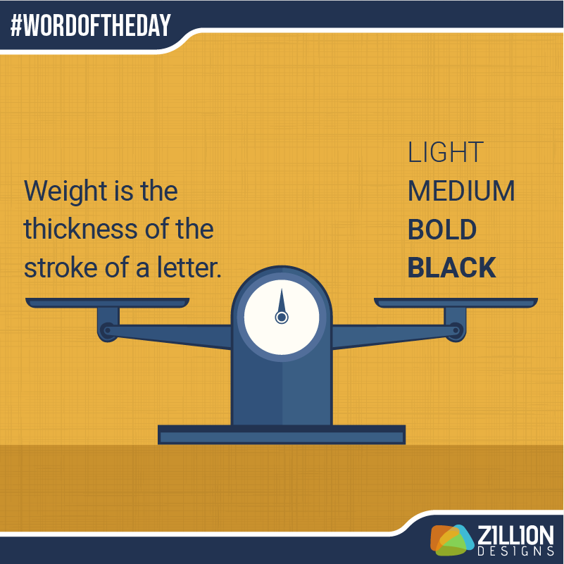
Weight
The weight of anything tells us how heavy or light an object is. When it comes to typefaces, there are a variety of weights for fonts from bold and black to light and ultra-thin.
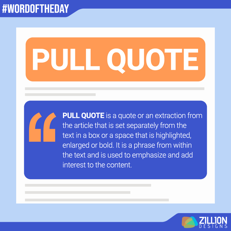
Pull Quote
Pulling out a quote from text is a common technique use by graphic designers in blog posts and tabloid articles. This trick comes handy when the page is full of text and less images.
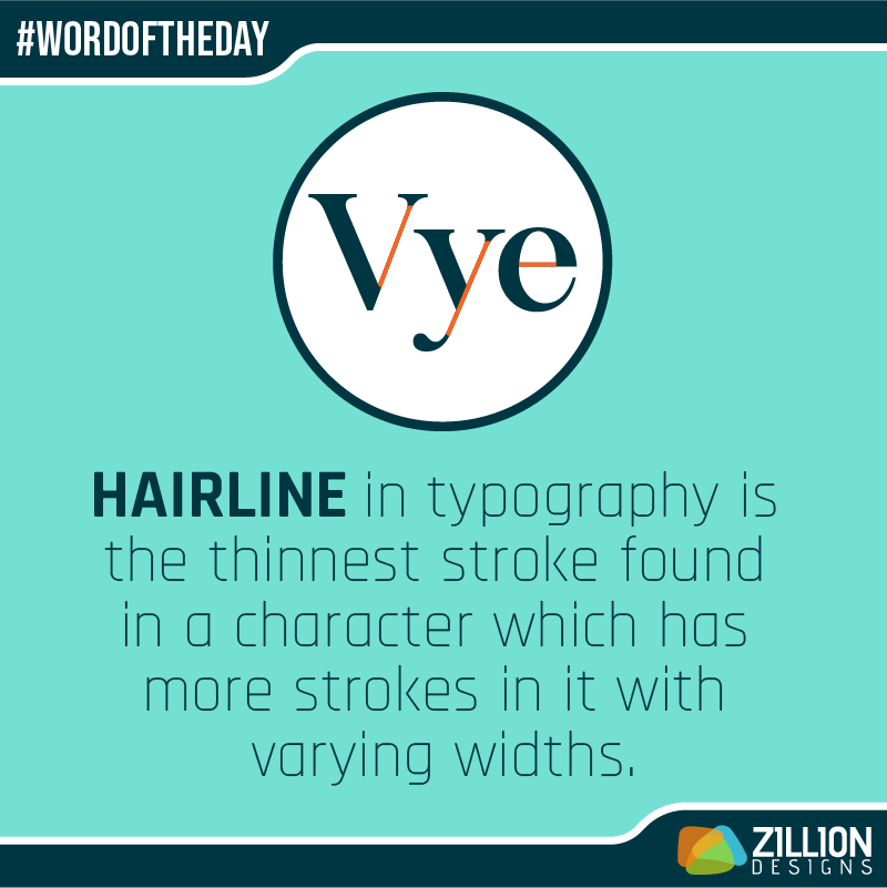
Hairline
This isn’t your hairline for the barber to fix but attribute of a letter. In a font of varying strokes for letters, a hairline is the thinnest one.
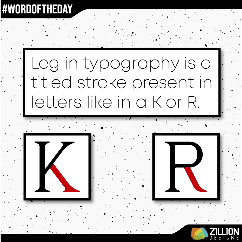
Leg
Font legs also known as tails are strokes at an angle, which you can see in capital letters like “Q”, “R”, and “K” – they can be straight or fluid depending on the typeface style.
Colors
A world without colors would definitely be boring! Colors are everywhere: in nature and in man-made things. Colors have types, mood, meanings, and personalities. There is an entire color psychology for designers to understand.
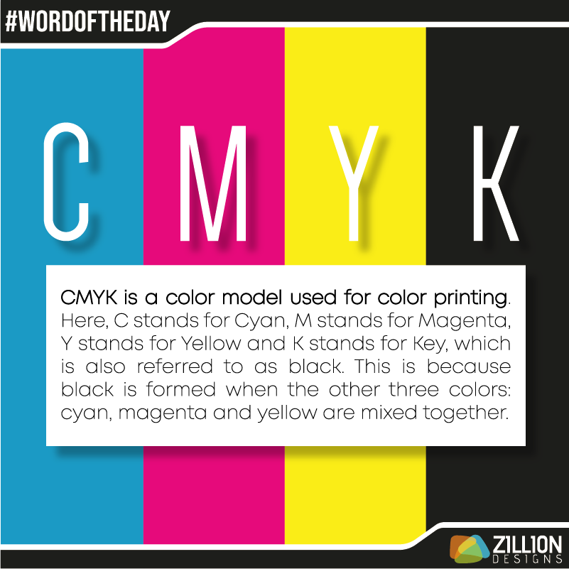
CMYK
This is an acronym for Cyan, Magenta, Yellow, and Black. These four colors are used to print anything from a bunch of brochures to professional business cards. CMYK colors are subtractive so their appearance is faded or subdued – the colors get darker as you start mixing them.
Also Explore: Color Standards In Graphic Design
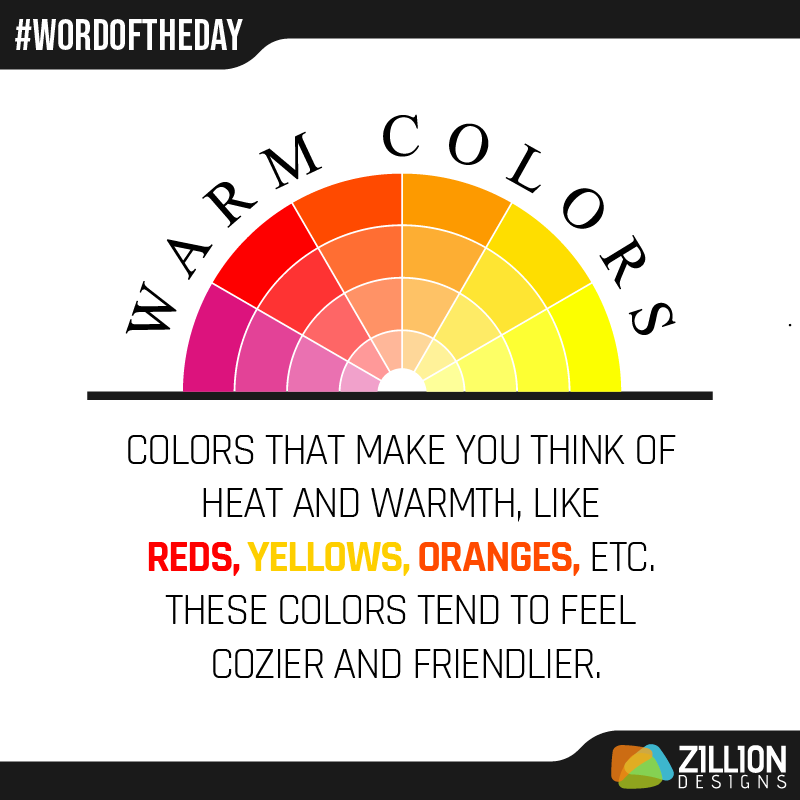
Warm Colors
The color wheel is divided into warm and cool colors. Warm colors are red, yellow, orange, and their variations but why are they warm colors? Colors have temperature and while blue appears cooler, red seems hotter.
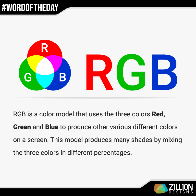
RGB
This color mode is for screens like televisions, mobiles, and monitors. RGB is the acronym for Red, Green, Blue light and when they’re mixed together, these three hues create a spectrum of colors.
Grayscale
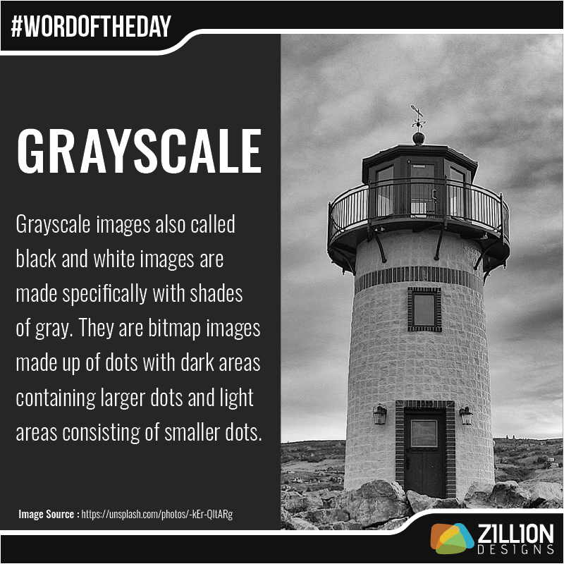
Monochromatic tones and shades of white and black make up a grayscale photograph or image. In essence, a grayscale contains just a range of grays instead of any color. In a design software, turning a visual to grayscale means that all the information regarding color is erased and only light and dark remains.
Hex
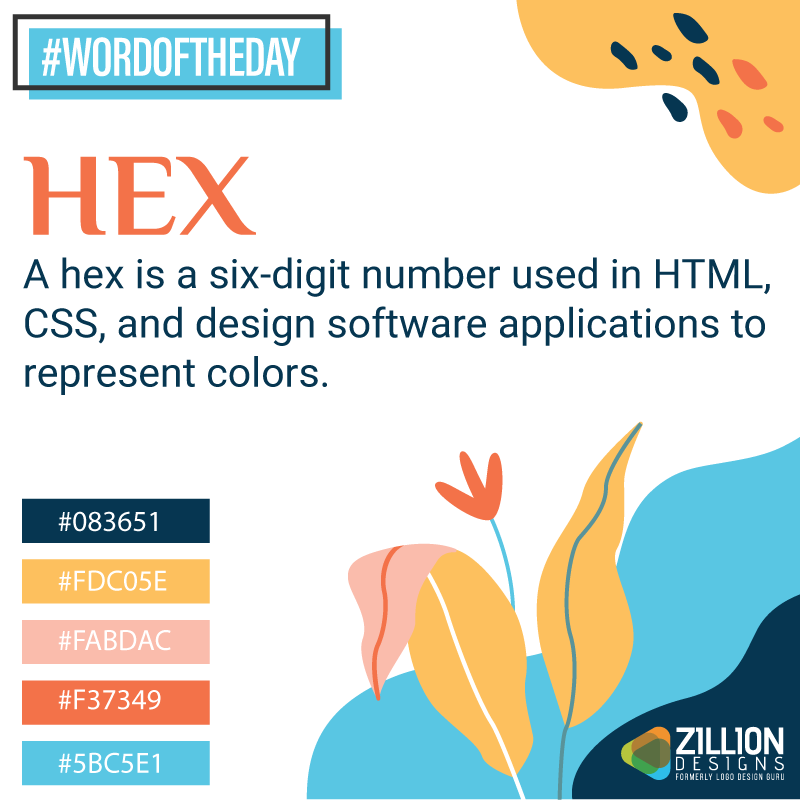
The hex code is used to refer to color, particularly in web design. Hexadecimal numbers consist of six digits starting with a hash symbol. Each byte or character represents the intensity of RGB (red, green, blue) in color.
Opacity
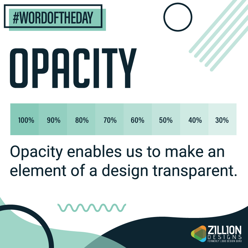
In design, transparency is applied to make elements like images, backgrounds, and colors opaque. In general, opacity is the extent to which anything blocks light. Designers use it to add depth in layers of design.
Palette
The term palette is usually connected with colors: color palette. A palette is ideally made up of odd numbers of colors that follow a certain theme for a brand’s identity or an advertising campaign. Why do we need to make a color palette? A paletter helps to standardize the main colors of the brand and makes it easier for graphic designers to design.

Photography
An image is worth a thousand words and it’s true. Photography is a popular form of artistic expression that is used in art, design, branding, and marketing.
Blur
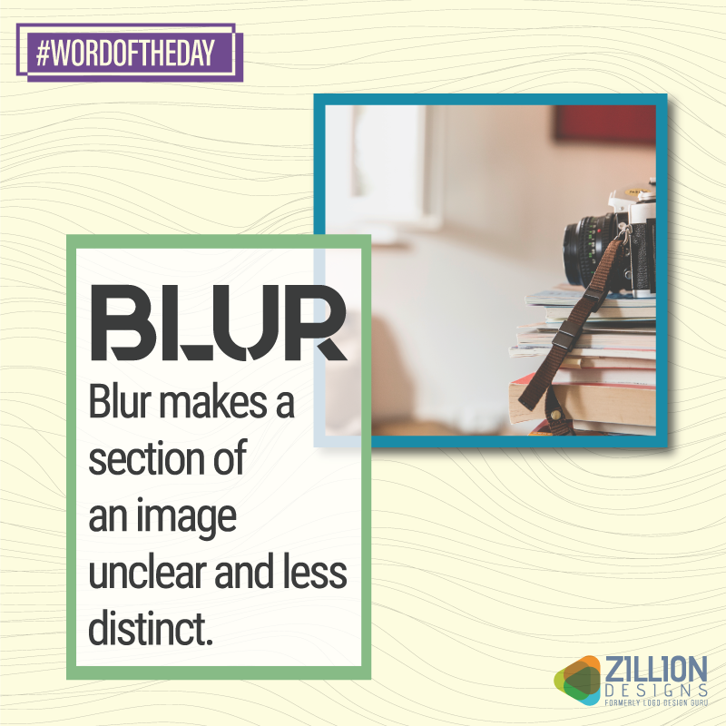
Blurring is a photography technique that obscures a section of a picture. It can be done with the camera or afterwards using a design software. This trick helps to de-emphasize and emphasize elements of the over-all design.
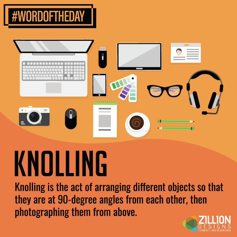
Knolling
Knolling photography is quite popular on social media. It includes overhead photos where objects are laid in a pleasing and harmonious symmetry.
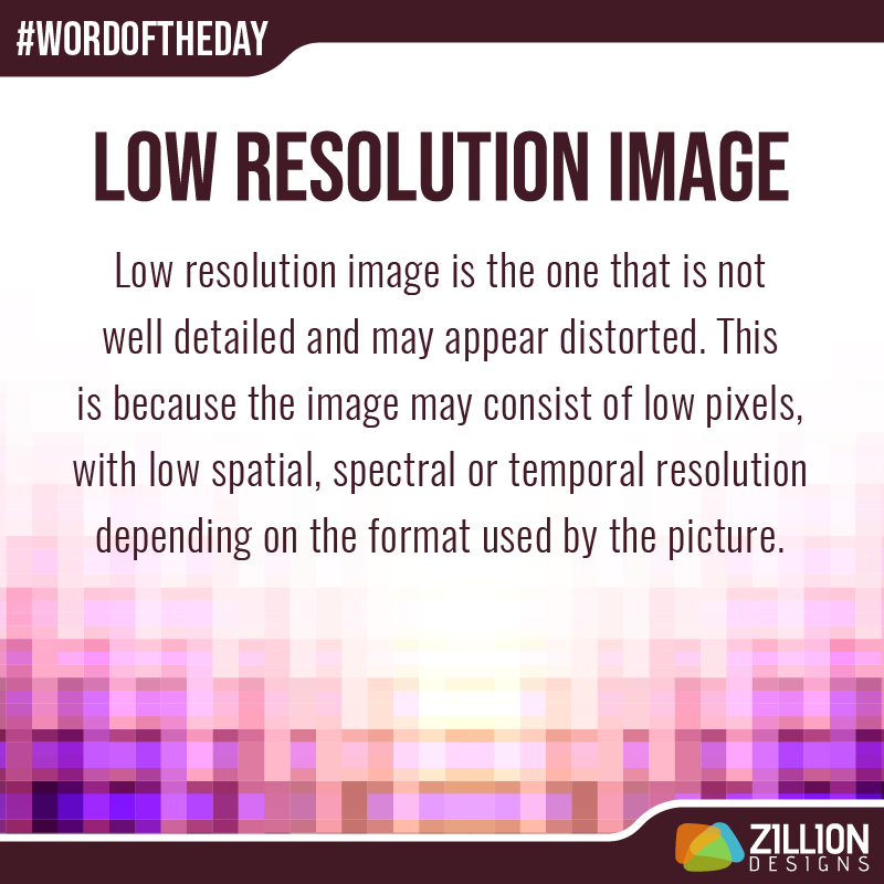
Low Resolution Image
Images that have fewer pixels are considered as low quality. When printed or rescaled for design, these images distort and pixelate. When designing your brand identity, make sure to use high quality images.
Well, this is it for now. Stay tuned for another spectacular list of design terms visualized.


