How Clients Decide Winners In Logo Design Contests (And How You Can Craft Your Logo Entries Accordingly)

Featured Image: iStock/Love Employee
Design contests aren’t won by the most talented designer. They’re won by the designer who best understands how clients think under pressure.
In logo design contests or for any other design, clients may not always be thinking from a certain perspective. They could be overwhelmed, emotionally invested, and afraid of making the wrong choice. It might be difficult for them to assess what they’re seeing. This psychological reality shapes every decision they make. And takes over the design quality.
Let’s explore how clients choose winners in design contests and the way you can craft entries that drive real human decision-making.
How Do Clients Experience a Design Contest?
When a client launches a logo or branding contest, they are not approaching it like a design critic. For many clients, this may be the first time they’ve commissioned professional design or put together a brand logo system. So they could be experiencing different emotions like happiness or even anxiety.
At the start, excitement is usually high. Clients are eager for a new brand, a refreshed interface, or a visual identity that captures their vision and makes the brand identity stick. They imagine growth, recognition, and credibility. But that excitement can become overwhelming very quickly as submissions begin to pile up and the responsibility of choosing one direction becomes real.
There are quite a few emotional drivers in this process.
- Excitement about a new brand or product
- Anxiety about public perception
- Fear of choosing something that ‘won’t age well’
- Pressure from stakeholders or internal teams
A logo, for instance, is a symbol that customers recognize and competitors react to. And people may also worry about the right logo type if they have to explain it internally or defend the design. Reviewing dozens or hundreds of entries forces clients to make fast judgments under cognitive strain. Instead of asking, ‘Is this the most innovative design?’ they start asking, ‘Does this feel safe, clear, and defensible?’
So a client might consider work that reduces uncertainty and feels immediately understandable. Designers who recognize this mental state and participate in a logo design contest with it in mind gain a significant advantage in competitive contests.
• Decision Fatigue: Why Clients Stop Thinking Clearly
When looking through all the entries, people compare concepts, read explanations, and try to imagine how each design might perform in the real world. But as the number increases, that careful evaluation becomes difficult to maintain.
For instance, in this logo contest for a neurotechnology center, there are dozens of entries, each offering a distinct perspective on a neurotechnological brand. With so many options, it’s easy for the careful evaluation described above to become overwhelming—every design could be a strong candidate for a biomedical brand logo, which adds to the mental load and design fatigue.
As decision fatigue sets in, clients can manage it by focusing on clear criteria and key brand priorities. Comparing designs against these principles helps reduce stress and ensures the final logo resonates without being chosen out of exhaustion.
• First Impressions Impact Decision-Making
In design contests, clients react first. Before they read a description or go into details, their brain makes a snap judgment about how an entry feels trustworthy or aligned with the requirements. This reaction is emotional and once it forms, it’s surprisingly hard to reverse. That’s why many technically strong designs fail to win, as they never pass the first impression.
For example, this business card design contest for DBL Telecom illustrates the point. The first few designs make an immediate impression, acting as gatekeepers—subtle differences in clarity and confidence determine which entries move forward. Even technically strong and cohesive business card options that don’t resonate emotionally at first often get overlooked.
To handle this, clients can prioritize initial impressions alongside technical merits. Creating a shortlist based on which designs feel instantly clear and aligned with the brand helps ensure strong concepts aren’t accidentally dismissed, while reducing decision fatigue in later stages.
• The 3-Second Rule
Clients form a gut reaction within three seconds. Logo contests are mostly assessed on factors like shape, balance, and recognizability. And other contests for flyer designs or brochures require designers to focus on tone, confidence, as well as coherence.
Take a look at the winning logo design from this Wear The Outfit contest. The design connects instantly: it’s recognizable, visually balanced, and clearly communicates the brand’s fashion-forward personality within seconds. This shows how critical that first gut reaction is—if the fashion logo doesn’t feel right immediately, it rarely recovers, no matter how strong it is technically.
Shortlisting designs that feel instantly clear, confident, and aligned with the brand ensures the best concepts aren’t overlooked, while also making the selection process faster and more strategic.
• Halo Effect in Design Contests
This means that one strong positive signal shapes how everything else is perceived. In contests, presentation quality can be that.
As seen in this logo contest for the luxury retail wellness store, the cursive font immediately creates a strong positive signal. The solid color theme and monogram “M” add elegance and memorability, giving the logo a premium, soothing feel that perfectly aligns with a wellness logo template. Every detail—the flow of the typography, the spacing, and the presentation—reinforces the brand’s identity before the client even reads a description.
For instance,
- A clean mockup makes a logo feel more premium
- Good spacing makes a UI feel more usable, even without testing
- Professional presentation increases perceived expertise
Designers judge their work by the logo or layout alone. Clients judge it as a complete impression. Once that positive impression is formed, minor flaws are overlooked. The design might feel just right, so the brain fills in the gaps.
Understanding Client Biases to Consider in Logo Design Contests
Humans rely on mental shortcuts, especially under pressure, uncertainty, and information overload, and these are known as cognitive biases. They influence which designs are familiar, safe, or professional, sometimes even without the client realizing it.
Understanding these helps explain why clean, familiar, and well-presented designs might be preferred over innovative or creative ones.
• Familiarity Bias
Familiar logos, readable typography, and recognizable patterns reduce cognitive effort and spark an immediate reaction. Winning designs often combine a timeless wordmark, a balanced icon, and a common layout with subtle twists to feel both familiar and unique.
The most successful contest entries balance originality with recognition. Clients respond to designs that feel fresh yet rooted in forms they already understand, helping the logo resonate immediately.
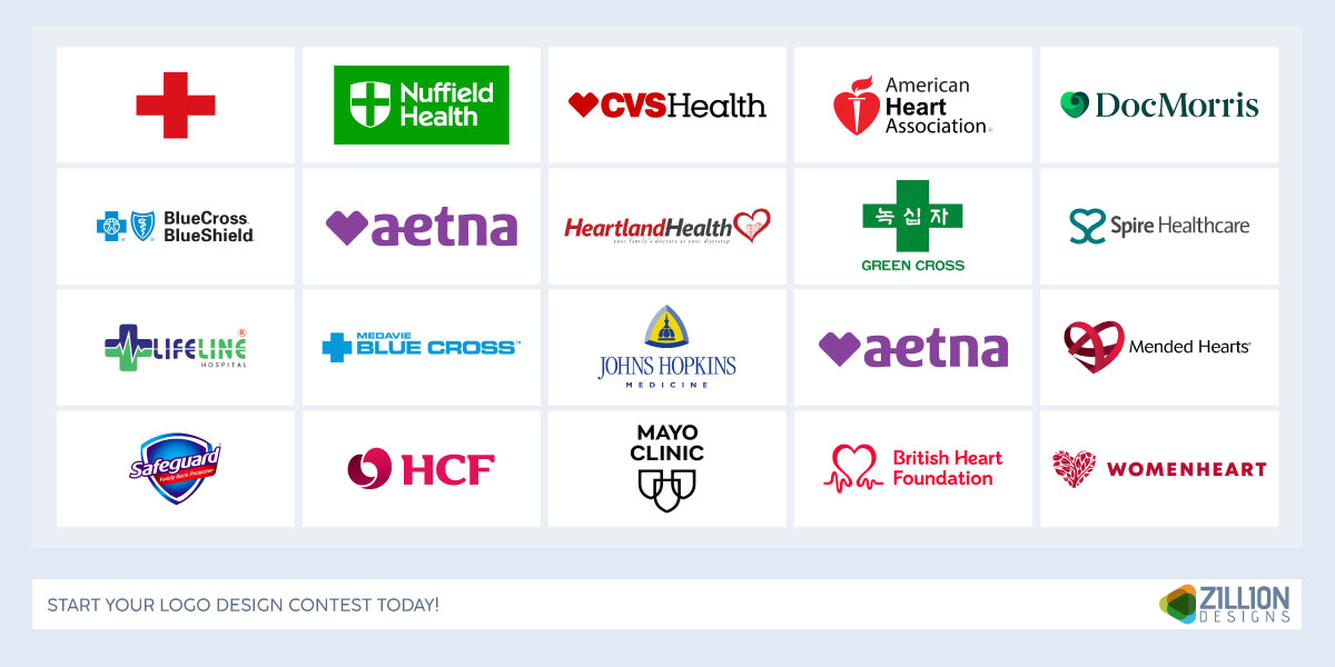
For instance, healthcare brands use visual cues people already recognize—like shields, hearts, and crosses paired with clean typography—to signal trust and clarity. A healthcare logo, health insurance logo, or cardiology logo – all benefit from these familiar cues while still standing out.
Designers creating logos for contests should focus on clarity and trustworthiness. Logos that feel recognizable and confident at a glance are far more likely to resonate with clients and audiences.
• Anchoring Bias
The first strong design a client sees often becomes the benchmark for everything that follows—an anchoring effect that’s hard to shake. Even objectively better designs can feel “off” if they stray too far from that initial reference point. This makes early impressions critical. Standing out through subtle contrast in color, structure, or visual presentation helps a logo design feel unique without losing familiarity. Being different without feeling risky is key.
Clients also worry about scalability, usability, and long-term fit. Designs are often rejected not because they’re poor, but because they introduce uncertainty. Winning entries minimize perceived risk while still feeling confident and intentional.
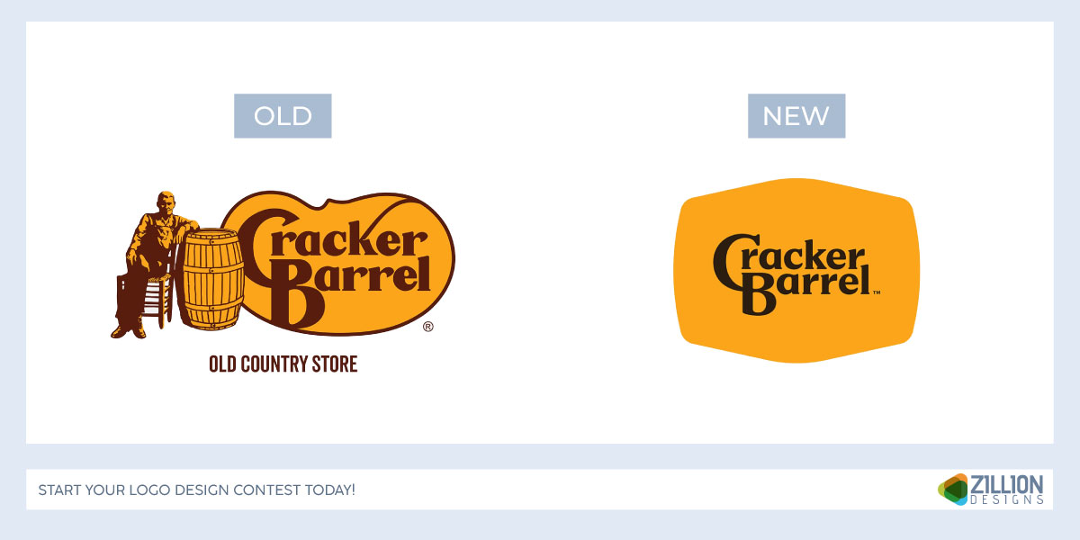
The Cracker Barrel logo debacle highlights the power of anchoring in innovative restaurant branding. In 2025, the brand introduced a simplified restaurant logo that removed its iconic “Old Timer” character and cabin imagery. While the redesign was clean and modern, it broke too far from what customers expected, triggering backlash. The brand ultimately reverted to its original logo to preserve trust, familiarity, and heritage.
• Confirmation Bias
Clients come into contests with preferences and assumptions shaped by the creative design brief, often reinforced by reference examples from similar businesses. This creates a form of confirmation bias, where designs aligned with familiar practices feel safer and more appealing.
Smart designers learn to read between the lines. The language used in the brief—words like “modern,” “trustworthy,” or “premium”—along with referenced industries and styles, should guide priorities during the creativity in the design process.
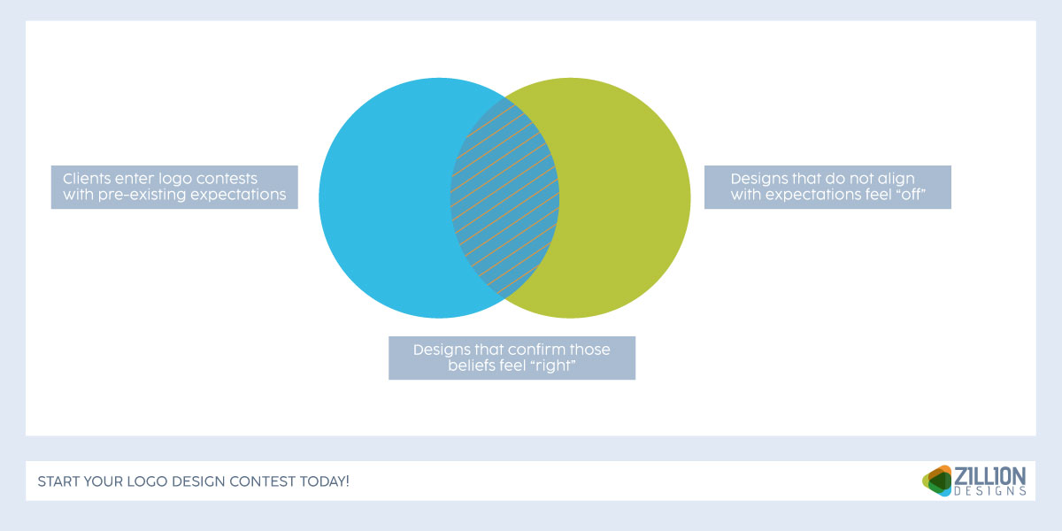
Entries that respect these signals tend to gain traction, while those that ignore them face resistance. The goal isn’t to limit creativity, but to apply it within the client’s psychological comfort zone rather than working against it.
Emotional Triggers Behind Winning Designs
Clients may talk about grids, colors, or usability, but what they’re really responding to is how a design makes them feel or believe. The strongest entries by professional graphic designers include emotional triggers that showcase safety, competence, and self-expression.
Let’s discuss some of the key ones behind winning submissions.
• Emotional Fluency
Designs that are easy to process create a sense of comfort. When the brain doesn’t have to work hard to understand a visual, it interprets that ease as correctness and reliability. This is emotional fluency and explains why simple, well-structured designs win over complex or concept-heavy entries in contests.
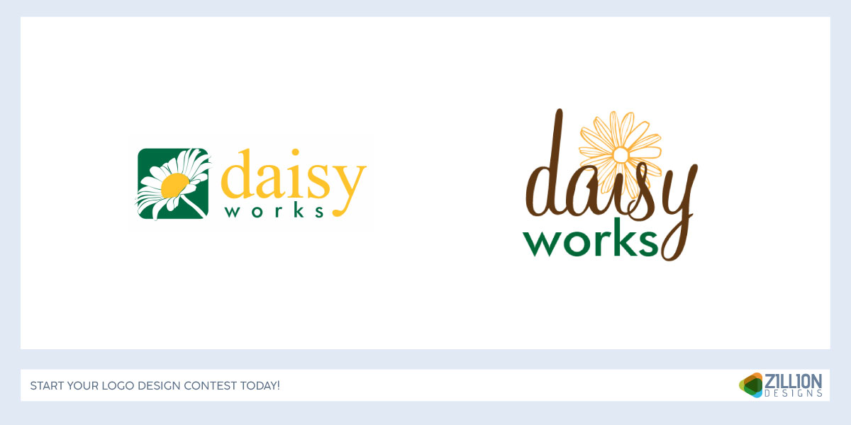
This effect is easy to see in entries from the logo contest for the garden supply company on ZillionDesigns. While both gardening logos are well designed, the simpler option stands out immediately. Its clarity makes it easier to process, which creates a stronger emotional connection and a sense of confidence at first glance.
Entries that are easy to process feel more trustworthy and professional. So think of logos with clear silhouettes, UIs with obvious hierarchy, along with consistent brand systems.
• Visual cues in Logos and Branding
Clients look for subtle visual hints that tell them they’re in safe hands. These cues help them make an informed decision, especially when someone does not have design expertise themselves.
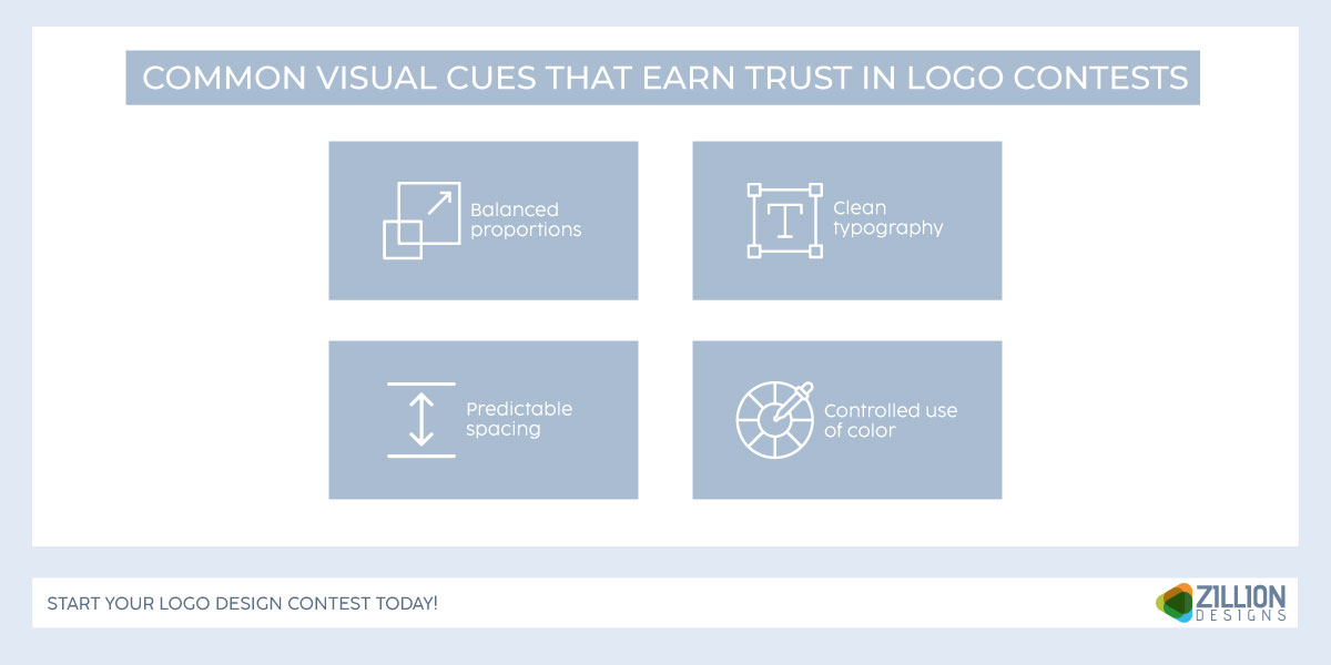
Clients interpret them as a designer’s expertise. They believe that a designer knows what they’re doing or something feels reliable and polished.
• Identity Projection
Business and startup owners can project their own identity, aspirations, and biases onto the work. So they might be looking for a design that shows their perception.
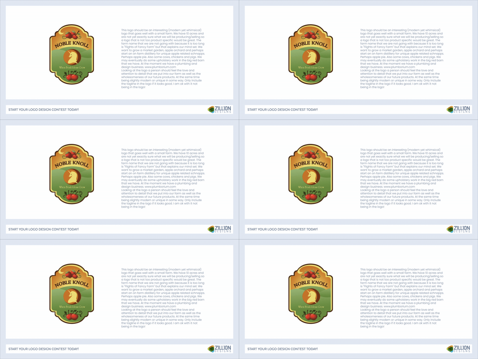
This dynamic is clear in the design brief for the Noble Knoll small family farm logo contest. The owner describes the brand using words such as whimsical, imaginative, and rooted in small-farm life, with references to an apple orchard. The winning family farm logo design reflects those same traits, showing how closely it aligns with the owner’s self-image rather than introducing an unfamiliar interpretation.
When crafting a winning entry, assume the client’s point of view. Think of key questions such as, ‘does this represent who they are? Will this make them look serious? Can they defend this choice internally?’ They’ll mostly go with well-crafted entries that support their own identity and credibility.
4 Ways Clients Assess Contest Entries
A solid design can feel weak if it follows a stronger one, and an average design can feel impressive if it appears after cluttered or confusing entries.
Here are some ways that contest entries are compared.
1. Immediate Elimination
Elimination in logo contests is fast and often emotional. Most entries never reach serious consideration, not because they’re bad, but because they introduce confusion or doubt and fail to align clearly with the brief. Designs are commonly rejected due to weak presentation, mismatched tone, visual clutter, or over-explanation.
Winning designs pass the elimination stage first. They feel relevant, clean, and intuitive, using the right elements to create iconic logo designs so clients can process them without resistance.
This is clear in the above seafood logo design contest, where the first seafood logo concept closely mirrors the winning entry. That early design made such a strong, clear impression that it survived elimination and effectively set the standard for what followed—showing how crucial it is for seafood logo concepts to communicate instantly before deeper evaluation even begins.
2. Comparison Psychology
Clients don’t evaluate designs in isolation. They compare them relatively so your design needs to look different from others and avoid blending into the ‘average pile’. In contests, your design is the product and the presentation is the sales pitch.
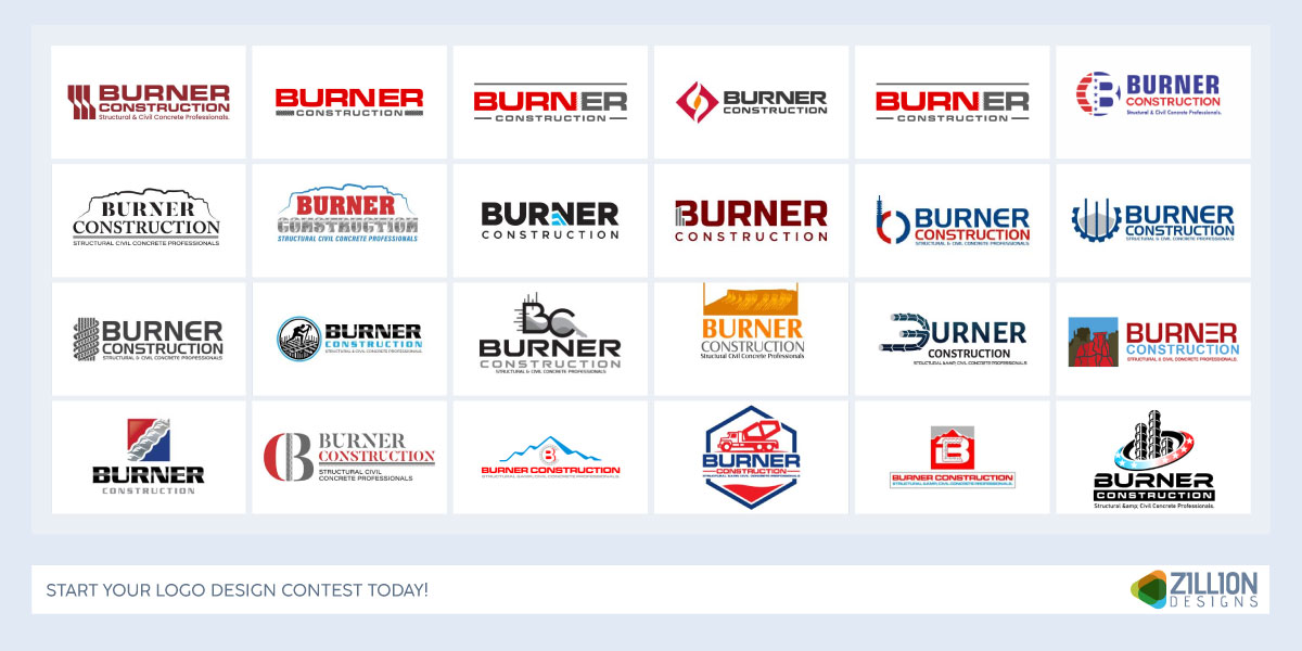
For example, in this concrete construction contractor logo contest, the client is presented with dozens of options side by side. Rather than evaluating each construction logo entry on its own merits, the client compares how each one looks and feels relative to the rest. Designs with clearer presentation, stronger contrast, and a more confident visual story stand out, while others fade into the average pile—even if they’re technically solid.
This makes differentiation and presentation just as important as the logo itself in contest settings.
3. Mockups as Psychological Anchors
Mockups reduce uncertainty by showing scale, context as well as real-world usage. Good ones make logos feel ‘real’ and help clients imagine success.
A poor mockup will distract from the design, add unnecessary noise or create doubt. And you want to avoid that before getting started on a winning entry.
For example, in the logo contest for a company offering administrative solutions, the winning design uses mockups across multiple backgrounds to show how the office admin logo works in real-world contexts. This presentation reduces uncertainty by clearly demonstrating scale, flexibility, and everyday usage, making the design feel credible and ready for deployment rather than just an abstract concept.
4. Explanation Text for Confidence
Winning explanations are quite short and do not go into unnecessary details. They focus on intent and address unspoken concerns rather than over-justifying decisions or relying on complicated terms from a design glossary. It’s also important to remove any defensive language from the beginning as that could impact client perception.
Step-by-Step Guide for Crafting Winning Entries
Here’s a complete guide to how you can create a winning entry to make sure your design is just what a client is looking for.
Step 1: Read the Brief Like a Psychologist
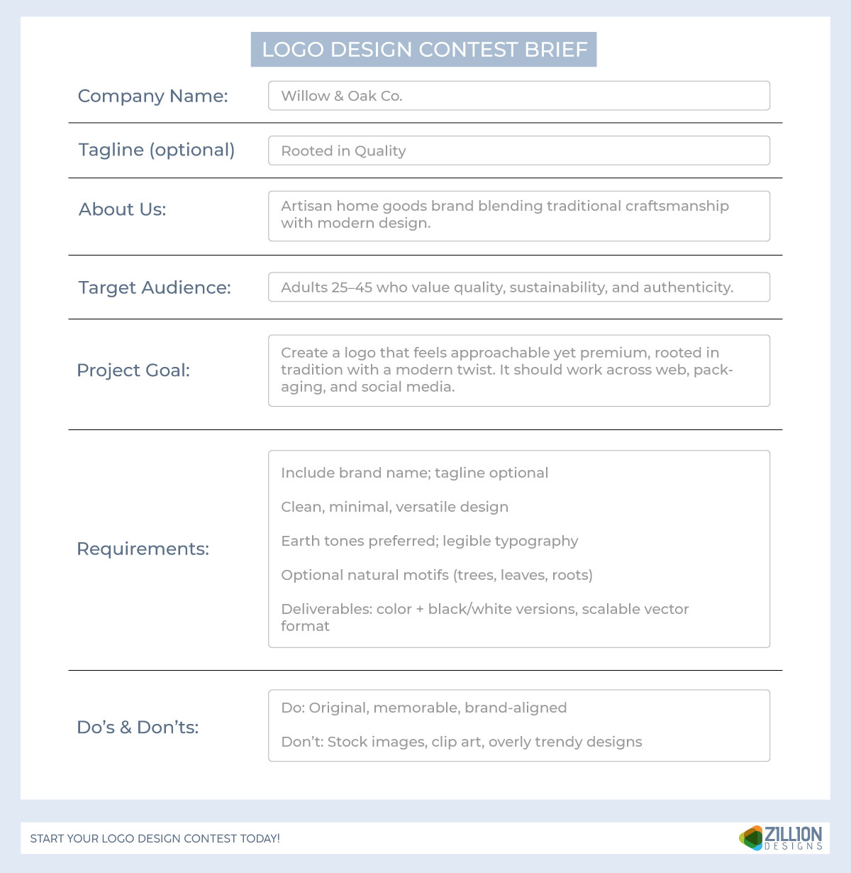
Most designers read briefs for requirements and winners read briefs for emotional signals. Look beyond what the client says they want and focus on why they want it.
Look for psychological cues such as emotional language, which includes words that signal personality traits. Get an insight into the risk tolerance from the creative brief or brand style guide. It will give you an understanding of what the client is asking for. Are they looking for something unique and disruptive, clean and professional, or even a retro logo design that leans into nostalgia?
It is also important to address unspoken fears like looking unprofessional, outdated, or embarrassing internally. Make sure your winning entry in a design contest also focuses on business priorities such as growth, credibility, and differentiation. A brief is not a design document, it’s a risk profile. Your job is to reduce that risk visually.
Step 2: Identify the Client’s ‘Default Safe Choice’
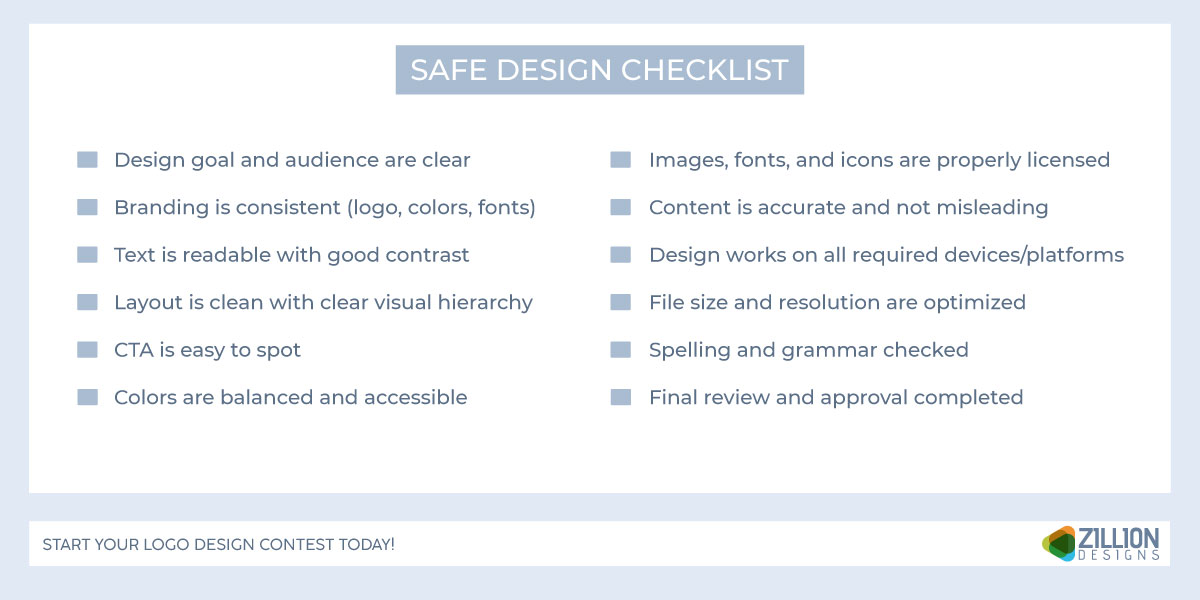
Before designing anything, think if the client panics, what kind of design will they choose? Usually, it’s a design with clean typography, balanced layouts, neutral or on-brand colors, familiar UI patterns, and icons or symbols that won’t offend anyone—often aligned with a professional brand identity for small businesses. Your entry must either match this or stay away from it very deliberately.
Step 3: Design for Cognitive Ease (Mental Comfort Wins)
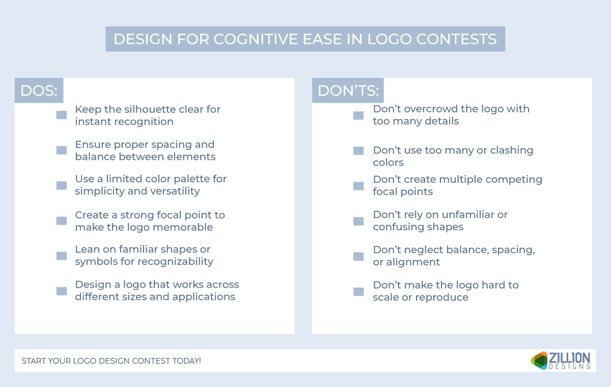
Designs that feel effortless to process feel more professional and ‘just right’. Apply cognitive ease through various elements including:
- Clear visual hierarchy → obvious reading order at a glance
- Limited brand color palette → fewer decisions for the brain
- Strong focal point → one place the eye lands first
- Familiar structures → known logo shapes or UI patterns
For logo contests, work on silhouette clarity, spacing, and balance before anything else. Then start working on bringing your design together. When it comes to web design contests, focus on straightforward navigation and adding imagery that tells people what the website is about as soon as they land. It also applies to landing pages and blog design contests where cohesion should be prioritized.
Step 4: Balance Safe and Bold (The ‘1×5 Rule’)
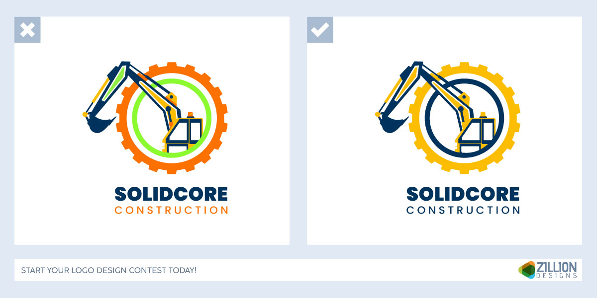
Winning designs rarely take multiple risks. An effective formula would be keeping one central idea that incorporates everything in the brief. For example, you can opt for a bold symbol paired with personalized typography.
At the end, clients can explain the safe parts and feel proud of approving the bold one.
Step 5: Evaluate for Rejection
Clients reject far more designs than they select. Most entries are quickly eliminated because they are generic or rely more on the designer’s input than on design elements from the brief. At first glance, you want someone to be assured that their directions are understood and implemented across entries, too. Ask yourself, ‘Would this still feel confident next to 20 other entries? ’
Step 6: Design for Cohesion
Clients never see your design on its own. They compare every aspect, like contrast, simplicity, and the overall appearance. To grab attention within seconds, your design must follow the style guide and be more direct rather than being too creative.
Step 7: Follow a Presentation Checklist
To craft a winning entry, your presentation must follow a checklist. This covers factors such as scale, context, real-world application, professional intent, and logos that feel real on brand signage or marketing collateral. It’s essential to remove anything distracting, such as clashing backgrounds and stock images that overpower the design.
Step 8: Respond Like a Reliable Partner
Responsiveness is a trust signal. Quick, thoughtful revisions showcase your professionalism, reliability, and collaborative efforts. Clients mostly choose designers they feel comfortable working with, not just the best visual.
Step 9: Create Psychological Commitment Through Feedback
When a client comments on your entry, asks a question or requests a tweak, they are becoming emotionally invested and each interaction increases familiarity, ownership as well as likelihood of selection. So acknowledge feedback clearly and reflect it visually fast.
How to Submit a Winning Entry on ZillionDesigns
For launching a logo or web design contest, your success largely depends on how well you structure the contest. From setting the prize money to guiding designers effectively, these are a few aspects to keep in mind.
Step 1 — Complete Your Designer Verification
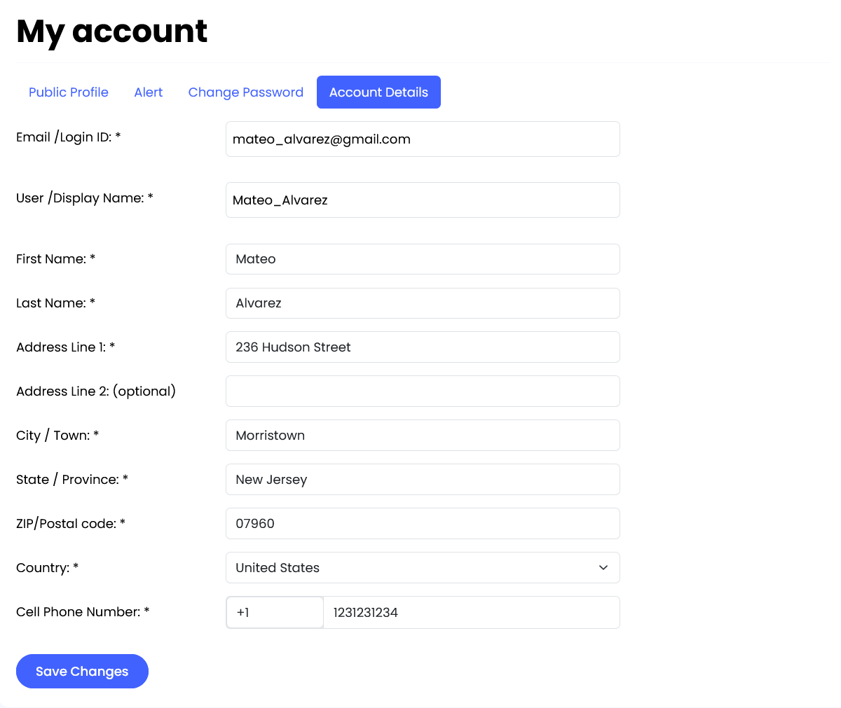
Before you send out your entry for any contest, you must complete the designer verification process:
Step 2 — Understand the Contest and Creative Brief
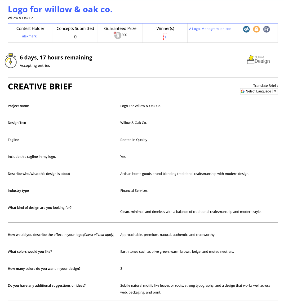
Every contest has a creative brief as that is the foundation of your success. Read the brief carefully. Understand the client’s goals, brand message, and specific requirements. Check client comments since feedback can be used to refine your designs. Ask questions if needed because sometimes the brief can lack clarity. So use the contest messaging to ask for clarification. The better you interpret and respond to the brief, the higher your chances of winning.
Step 3 – Create Multiple Strong Concepts
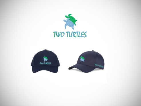
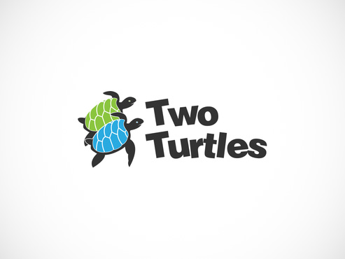
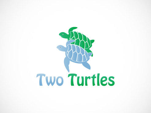
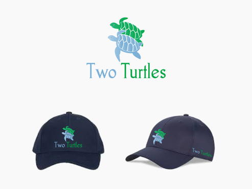
Don’t rely on a single concept, multiple submissions increase your chances. Stay on brief so the colors, typography, and layout are according to the client’s industry and needs. Designers may submit as many drafts as they like before the contest ends.
Step 4 – Communicate/ Respond to Feedback
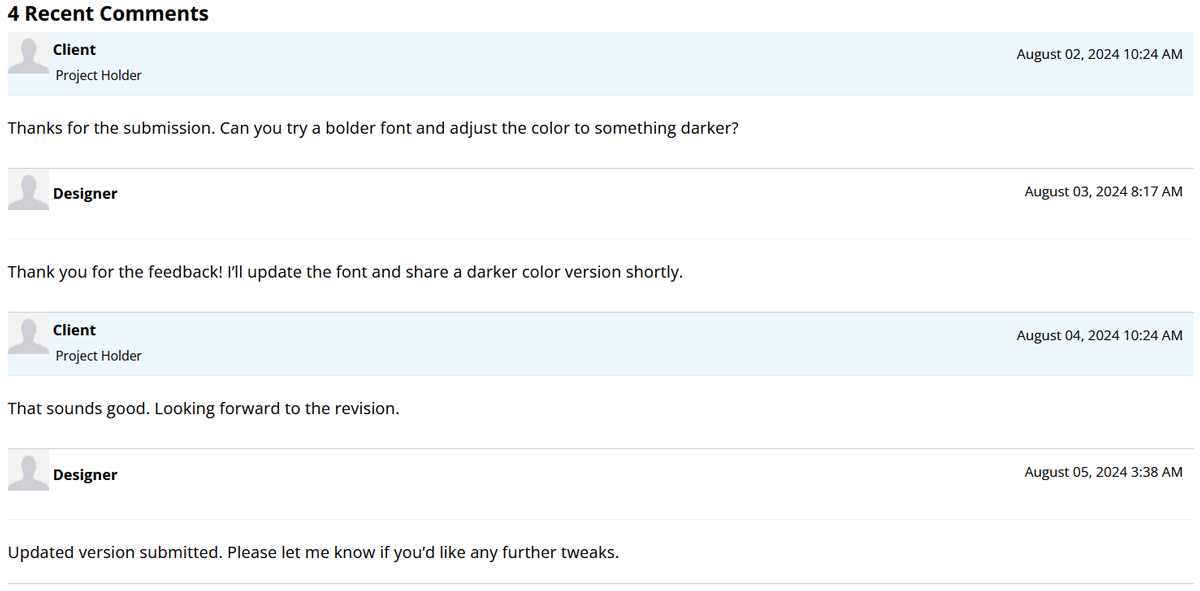
Clients provide feedback, ratings, and comments as design entries are submitted. You need to respond quickly to show openness to tweaks and improvements.
Step 5 – Submit Final Files Correctly (If Selected as Winner)
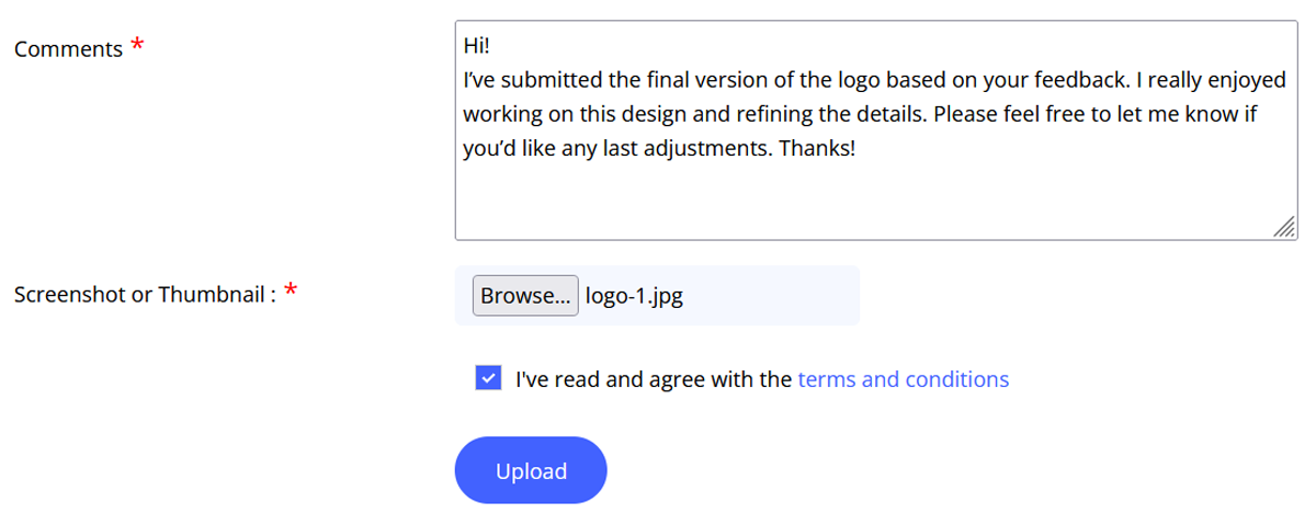
If your design wins, follow these steps to make sure that the collaboration goes smoothly and there are no complaints at the end.
The bottom line: Craft a winning entry
Clients enter contests excited but anxious, overloaded with options, and deeply motivated to avoid risk. Designers who win consistently are those who design for human psychology. They reduce cognitive effort, create strong first impressions, balance familiarity with originality, and present their work in a way that feels finished and defensible. People who understand that elimination happens before selection and respond beforehand win.
