Seven Attention Grabbing Sales Page Design Techniques Modern UI Designers Bet On
Featured Image: Freepik
If you’re looking to up the ante when it comes to conversions, a sales page could be your best bet! Sales pages are standalone landing pages, specifically designed to convert your visitor to a buyer. The difference from other landing pages is that your sales page will be just a click away from purchase: call to action buttons often include words like “Purchase now!”
Since the purpose of the sales page is to usher the audience further down the buyer’s journey, knowing what works (and what doesn’t) is vital.
Designer and usability expert Steve Krug said, “Nothing important should ever be more than two clicks away.” With sales pages, the idea is to lessen the gap: one simple click should make your visitor into a buyer.
The Role Of UI Designers In Creating Sales Pages
- Make it work: The sales page, like any other landing page design on a site, needs to be user-friendly and ultra-functional. This means fewer options, since the purpose should be to funnel the visitor towards purchasing.
- Make it pretty: The sales page should be eye-catching, not off-putting, and draw the user in, while at the same time not distracting from the goal: conversion.
- Make it convert: Everything in the sales page contributes toward encouraging the visitor to the next point in the buyer’s journey: from copy, to CTAs, to graphics, and more.)
Whether you’re new to designing sales pages or just looking to make yours pop, it’s a great idea to start with some of the techniques that are designed to catch the eye — and make the sale. Let’s take a look at seven different sales page design techniques that are purpose-driven to catch and keep the attention of your visitor.
Explore: UI And UX Designers Rocking The Web Design Industry
Create Urgency With Headlines And Copy
What urgency does: We’ve all seen ads that start out with “Act now!” and “Limited time offer!” There’s a reason why those old chestnuts keep getting used: they work. Especially when you want to motivate your visitor to become a buyer, letting them know that they have only a short window to take advantage of what you offer can light a fire under them. That’s urgency.
You want your visitors to act now, and creating your sales page with a time-based or space-based CTA is a great way to push them in that direction.
Page structure tip: Headlines typically belong at the top of the page (hence the name), but bolded subheadings to echo the CTA and break up the text are a good idea. Keep in mind that people often have an “F shape” viewing pattern, meaning they look first across the top of the page horizontally, and then down the left side. Catch their eye with your headline, and then direct the attention to the next step on the sales page.
How to do it:
- Include a countdown clock or timer. Having the visual telling them how much time is left is a great motivator.
- Communicate scarcity. “Only two tickets left at this price!” works well for the airlines, and can do the same for you.
- Use phrases along the lines of “Limited time offer!” or “Special promo!” Let the visitor know that they’re missing out if they don’t act now.
Non-Generic, Real Person Testimonials — With Visual Backup
What testimonials do: Testimonials are one of the best ways to get a visitor to become a buyer because they create a link between the visitor and previous buyers. Testimonials get your potential purchaser to identify with someone who is already a few steps ahead of them on the buyer’s journey.
Seeing what you have to offer in action is that much more likely to lead to conversion. It can get your visitor from the top of the sales funnel — their basic awareness of your product — all the way to the purchasing stage. You can also use the right sales funnel design tools such as ClickFunnels to design an effective sales funnel.
Page structure tip: Framing or presenting your testimonials in an easily accessible way is also an important aesthetic consideration. You want clear photos, easy-to-read fonts, and brief, to-the-point presentations. You want them to stand out, too, so don’t jumble them together.
Testimonials can be one of the focal points of your sales page. Include a standout testimonial above the fold and then supplemental ones below it.
How to do it:
- Use personal testimonials, including photos, names, and other information. The more information you can give about your satisfied customers (obviously with permission and without overstepping confidentiality in any way) the better. Photos especially make a mark in the minds of visitors. This doesn’t just mean a headshot next to a written tutorial — does the nature of your product or service lend itself to candid photos of your clients using the product or service?
- Curate your testimonials for ones that are engaging, easy to relate to, and which clearly state the benefits to the buyer as an individual.
- Include testimonials by industry experts and official reviews.
- Case studies showing the benefits of your product or service over time can work well in longform sales pages.
- Video testimonials are a good way to keep the visitor’s attention.
Innovative, Unique Calls To Action
Why you should use unique CTAs: When it comes to your call to action, or CTA, it might be easy to slip into the cookie-cutter style. “Click here to buy!” “Learn more!”
But there’s a problem with that, and it’s that we as an internet-weary public are so used to seeing those types of CTAs that we basically ignore them. They’ve been used by every ad company, spammer, and scammer alike over the years. It’s almost a safety precaution that our brain tends to overlook them automatically.
So explore unique and different ways to write and present your CTAs. To get results, it’s time to up your copywriting game. Your goal is to convert your visitor into a buyer. Your visitor’s goal is to see if and how your product will benefit them, and then purchase it. The benefits should be seen through testimonials and other content, while the CTA empowers them to follow through. Don’t stand in their way with generic, uninspiring CTA copy!
Page structure tip: CTAs can be used in multiple places, but make sure that you include the opportunity to convert early on. Don’t make your visitor scroll all the way through a longform sales page to finally find the “purchase” button. You can use CTA buttons in conjunction with CTAs within the copy itself, with hyperlinks. Give your visitor multiple opportunities to convert into a buyer, not just one.
How to do it:
- Write it in first person, appealing directly to “you” the visitor.
- Use multiple CTAs, but make sure they cooperate. Don’t try to get your visitor to download your e-book, sign up for a newsletter, leave a comment on your forums, tweet their friends about your site, and buy your personal empowerment audio book all at the same time. Pick a focus for your sales page, and stick to it.
- Don’t use too many CTAs. There has to be enough content for the visitor to keep reading, not just an endless string of Buy Nows.
- Use a “pop” color for your CTA button to make it stand out. This depends on your color palette, but across the internet, warm colors such as orange and red are common for CTAs. They communicate urgency to the visitor.
Badges And Recognition
What badges do: If your product or service has been awarded any recognition, including this information reinforces the other testimonials. This could mean outside reviews, such as star ratings, or industry awards. You can also get name recognition by including mentions of any big-name companies you’ve worked with, in a “clients include” section.
Page structure tip: Badges can be included at top of the site, perhaps towards the left corner, appended to the headline, attached to photos, or included near the CTA button. They draw the eye, so they can really be included anywhere that’s appropriate and that you want to direct attention.
How to do it:
- Include valid awards or badges, usually outside of the main body of copy.
- Within the main copy, mention of the award or recognition can be made (ie, “Winner of the West Coast Farmer’s Choice Award 2016”).
- Badges are often used to draw attention to features of services, such as “30 Day Guarantee,” but if used in conjunction with actual awards, this can detract from them.
No Navigation
What “no navigation” does: You don’t want your visitor to stay too long on your landing page; you want them to be motivated to explore further in. “No navigation” doesn’t mean “nowhere to go” or “no options.” It means clickable links, clickable buttons, clickable images — anything that will draw them further into the sale, rather than giving them the option to back out.
Remember the focus of your sales page: sales! Design and UX expert Scott Belsky said, the “rule of thumb for UX: more options, more problems.” Keep it simple, and keep your visitor funneling down towards the end goal on the buyer’s journey.
Page structure tip: With no navigation, your visitor has either the option to click on a link or to back out of the page entirely. So don’t make them search for the link or button. Your CTA buttons, etc., should be clearly seen, not hidden. Including at least one or two above the fold is a good idea.
How to do it:
- Use clickable CTAs. Be they buttons, bolded links within the content, or otherwise, your viewer should be looking for the next step in the journey. CTAs are an easy way to flag them down and go, “Hey, over here!”
- Use embedded “more information” content. This can include drop down menus, scrolling options, more pictures and images, and anything along those lines. The point is to move them along in the buyer’s journey, keeping them on-task.
Explore: Nifty Quotes From Top Web Design And Development YouTubers On UXD
Social Proof
What social proof does: If you’re unfamiliar with the term, a quick way to explain social proof is to point to any site that has the number of Facebook likes listed at the top of the page. Social proof is basically a way of cataloguing and showing the reaction of others. It gives your viewer a chance to see what others thought of your site.
In more specific terms, when it comes to sales page design, that means including a counter for page views, downloads, likes, or anything else along those lines. The ability to indicate to your visitor that they’re not the first to come across your site has a very valuable impact in motivating them to convert; as much as people love to be able to comment, “First!” on a YouTube video, when it comes to actually putting money down on something, people want to see that others have done it before them. It sets their mind at ease to know they’re not alone.
Let your visitor in on that information. Giving them a glance into some of your social media statistics (re-tweets, followers, likes, etc.) builds confidence in you and your brand, as well as giving them a feeling of, “Well, all of those people can’t be wrong!”
Branding expert Bernard Kelvin Clive said, “Man is a social being. It’s not surprising we love social proof; it sells brands fast.” It plays into the same territory as testimonials: it helps your visitor to identify with others who have purchased your product, making them that much more likely to convert and join the ranks.
Page structure tip: Social proof can be included early on in the sales page, such as at the top left corner, where it is likely to be seen right off the bat. It can also be used in “high friction” areas, such as near the CTA buttons or alongside badges.
How to do it:
- Give numbers, statistics, and details: how many have liked your site, how many follow you on FaceBook, how many have visited the site, how many downloads of your e-book, how many subscribers.
- Include social media buttons. Make it easy for your visitor to share your offer or site on their own social media accounts.
Interactive Forms
What interactive forms do: On sales pages, the focus is less on generating leads and more on generating sales. But that doesn’t mean that you can’t use lead-generating tactics to funnel your visitors further into the buyer’s journey. Information-gathering forms are often static, but making them interactive and unusual is going to keep the interest of the visitor.
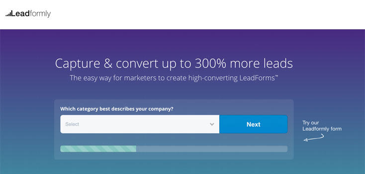
Image: Leadformly.com
Ideas like interactive “chat” windows can help you to learn more about your visitor, deliver perceived benefits to them, and encourage them to buy. Use icons and graphics instead of copy. Include as many interactive elements as possible: clickable graphics, toggle sliders, and checkboxes. Basically, try to avoid making your input form look like an input form.

Image: Brokernotes.co
Engaging their interest with a multiple choice or viewpoint question or even a brief puzzle or test can also lead to further involvement.
Page structure tip: The placement of the input form on a sales page depends a lot on what type of service or product you’re selling. The form can easily be made multiple-choice, the focus of a short-form sales page, placed up front and center above the fold.
How to do it:
- The form should address the visitor as an individual.
- Avoid being too intrusive, obnoxious, or complicated — keep questions simple and task-oriented.
- Don’t put too much pressure on the visitor.
- Encourage the visitor to engage and follow through.

Communication Company Logos
Blog Logos
Media Service Logos
Personal Logos
Marketing Firm Logo
Entertainment Logos
