Flooring Material Design Principles To Design Your Next Business Card
Featured Image: Freepik
Material design principles and business card design, both strive for simplicity, minimalism, and have definitive design boundaries to work in. Although business card designs provide a very limited canvas, they still showcase creativity. Since material design principles already work in restrictive settings, it becomes a fitting choice for business card designing.
The great thing about material design is that it looks as fabulous in print form as it does on the screen.
In today’s post, we are going to talk about the major material design principles that can be used for the next business card order, and have fun creating modern, cleaner, and sophisticated business card designs.
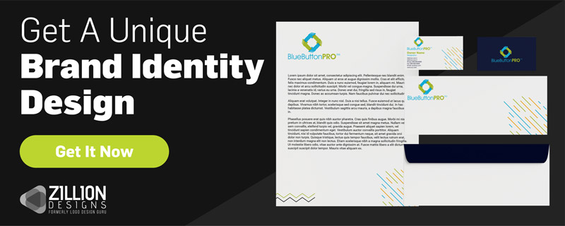
1. Paste The Logo
Any business card is incomplete without its brand logo. Material design concepts welcome the use of images, so use the company logo concept to design unique business card layouts. A logo can be used instead of an image or detailed graphic with solid coloring, or it could work as part of the card layout.
Here are a few other examples to use a logo in creative ways. Use the logo as a background, a watermark or a pattern. Notice how the logo is used in different ways to make business cards attractive.

Image Source: ZillionDesigns

Image Source: ZillionDesigns

Image Source: ZillionDesigns

Image Source: ZillionDesigns
2. Add Blocks of Color
The mantra of material design is bold, graphic, and intentional.
In material design, color is not a part of any design element, it is an element. So use colors to make a statement. Bright reds, blocks of green, and big splashes of orange to wow clients. With these confident color choices, grab the viewer’s attention and retain it.
Be sure to make yourself aware of the psychology behind colors to understand what each color means and how a hue will affect your design. With this activity, you’ll be able to pick the right color for your design. Also, make sure you don’t pick random colors just because you like what they mean – use the best color palette tools to create a befitting color scheme.
Take a look at this red and gray business card design. The large block of red is splashed there to make a statement, while the accompanying gray gives the design much depth.
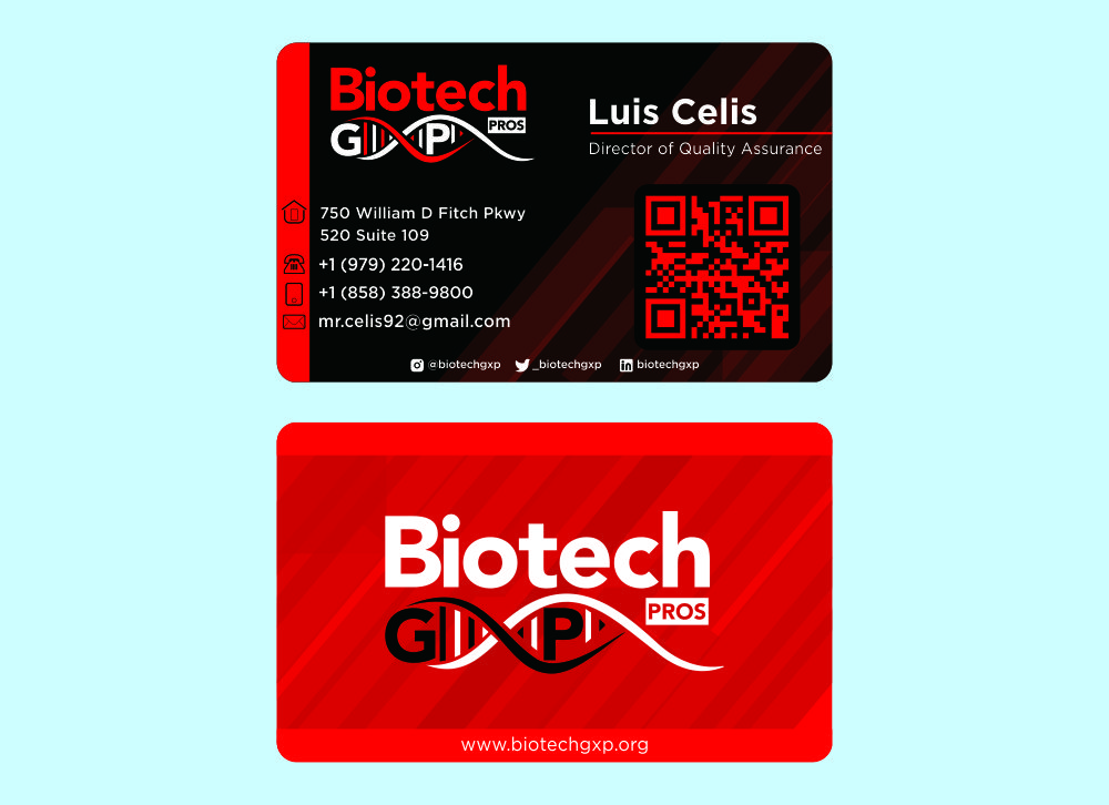
Image Source: ZillionDesigns
Or how about this? A business card design urging viewers to take note of the big block of bright red. The wave pattern in front gives the design a playful texture, making the design even more exciting.
Using colors in this bold fashion works extremely well with business card designs. It brings the user’s focus right where it’s needed: on the text.
Which brings us to our next point.
3. Paint Some White On
A meaningful and creative use of white space is as critical in a business card design as in any other type of design. In a business card, one has to remember that the focus needs to stay on the information printed on the card.
Material design fully embraces the concept of white space to not only bind the design but to bring the message into focus and to provide a clean background for the typography.
White space can also be used to break a color monotony. Look at the examples below, a completely blue card suddenly pops out with a bit of white to one side. The next example of the red business card also looks striking because it use white space to break a solid color.

Image Source: ZillionDesigns

Image Source: ZillionDesigns
Simple, yet impactful use of white space. This makes the typography and the logo look even more prominent.
Understanding different concepts of material design helps to figure out that there’s a lot of room for creativity even within its confines.
4. Tile The Typography
Material Design encourages designers to use typography to the maximum effect. For this, it’s crucial to use a befitting font that’s compatible with both print and digital. Deliberate use of bolder colors and font styles makes the type noticeable and readable.

Image Source: ZillionDesigns
Since business cards are printed products, be careful in your font choices. Most popular ones are serif and sans serif. But feel free to experiment, of course, making sure that your creativity doesn’t mess up the hierarchy of the design.
Explore: How Typeface Anatomy Can Help Designers With Font Pairing
5. Decorate With Hierarchy
It is another material design principle that’s handy when applied to printable designs.
Hierarchy is organizing the different elements of the design in such a way that the user’s attention travels from the most important to the less important areas of the design.
It provides order to the elements in the design and can be achieved in many different ways, including size, color, shape, positioning, and contrast, etc.
Use blocks of colors to segregate information and use the technique of background and foreground to give an illusion of one on top of the other. Add some lines to divide information into sections.

Image Source: ZillionDesigns
Image Source: wbhd

Image Source: ZillionDesigns
That’s how one can achieve hierarchy when focusing on text. Think about different ways in which certain information can be highlighted. Can designers increase the thickness, use a different font, experiment with font color, or the background color?
Slowly, an order will start to emerge, followed by true design hierarchy.
6. Plan With Grid Layout
Hierarchy is also achieved by using grid layouts in business cards. The grid layout fits perfectly to the conceptual sense of the business card: the card has a very utilitarian purpose, and the grid layout fulfills that purpose.
Therefore, it makes complete sense that material design once again will be a natural design inspiration for business card templates.
This card by Easil provides enough room for texts to display on the card efficiently. The vertical design also helps with this feat. By keeping the design simple, the text becomes the epicenter of action.
Let’s have a look at a few more.

Image Source: ZillionDesigns
Grids, bright splashes of colors, continuous merging of the design, all the while keeping the font color constant.
7. Furnish With Simplicity
If this doesn’t say everything about designing a business card template, we don’t know what does. Creating a simple design is far more difficult than creating a complicated design. A design novice or an expert in the field, you’ll know it’s true.
The following collection of simple card designs are classic examples of material design at work on business cards. Let’s see how many principles of material design principles you can spot!

Image Source: ZillionDesigns

Image Source: ZillionDesigns
Material Design is a highly coveted design technique in today’s technological environment because it works both for print and digital designs. This makes it worth exploring and finding out how it will suit the design needs.