Fitness Logos Collection Fit As Outstanding Brand Identities

Featured Image: iStock/biscotto87
Who doesn’t want their fitness brand to be as fit as fiddle? Well, everyone wants their fitness logo to be alive and well. It has to be attractive and memorable plus strong and impactful.
To make fitness logos stand out, professional logo designers use tips and tricks that help them create a distinguished brand identity for workout gear brands, personal trainers, fitness gyms and spas, fitness mobile applications, or fitness consultation agencies.
How To Design A Fitness Logo
Designing a successful fitness logo becomes easier once you have all the tips and tricks up your sleeves. Then it is only the matter of portraying the brand image in the logo design without compromising on the looks.
Let’s kick in.
The Kinds Of Fitness Logos
The first step to designing a fitness brand logo is to figure out what kind it will be. Essentially there are four kinds of logos, including word mark, letter mark, combination mark, and brand mark.
Each kind of logo design has its pros and cons, and it depends on the client what they want their logo to include. If they want just the initials of their business then a letter mark is sufficient but if they want an icon/illustration with their brand name and slogan then a combination mark will do. So the kind of logo depends on the number of elements one wants to add in their business logo.
For example the following logo is a word mark but the designer used color, grunge effect, and negative space to make it unique.
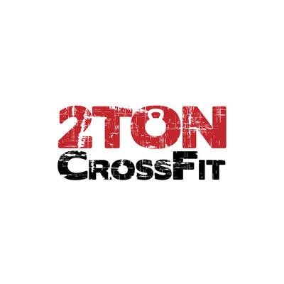
Image Source

Image Source
In contrast, here is a fitness logo with the full name of the business and colored silhouette icons to support the overall visual look.
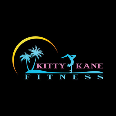
Image Source
Apart from the usual types of logos, there is a mascot logo and emblems. Below is an example of an emblem logo.
Image Source
Image Source
The Styles Of Fitness Logos
Once the designer has decided the kind of logo he/she will make for the client, the next step is to pick a style for it. The style can be minimal or it can be elaborate. The fitness logo can be modern or it can be vintage. There are ways to make a logo look a certain style, but first it is important to select a style for it. This is much like styling yourself with different fashion looks.
In your search to pick a style option, look at logo design trends for ideas. Trends are styles that are popular in a particular period of time. For example, the art nouveau movement was in fact a trend that styled many brands.
Here is an example of a logo with an excessive number of lines that form details like muscles on a human figure.
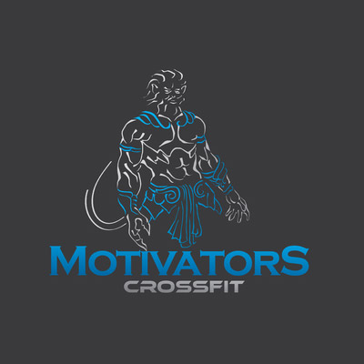
Image Source
Here is another logo style that separates itself from the example above. This one seems more enlightening.

Image Source
As compared to the two logos above, the following example is super simple and falls under the minimalism movement of design.
Image Source
Image Source
The next logo looks slightly vintage not only because of the choice of colors but also because of the stars and shield shape.
Image Source
And this one looks more retro than vintage because of the shape of the banner that says brand name, the texture on the logo, the color choice, and the stars.
Image Source
Fitness Logo Tricks
Now the process to design a kickass gym and fitness logo doesn’t end in picking the right type of logo or the befitting style for the logo. Once the two choices are made, designers need to focus on what can make the logo distinctive. There are a number of ways to do that.
1) Use negative space to create an interesting dimension in the logo.
2) Turn letters to icons and objects for an intriguing appearance.
3) Combine words’ meanings into simple visuals for a smart look.
4) Use textures to add different visual effects in the fitness logo.
5) Add a silver, golden or bronze gradient for metallic shine or polished look.
6) To humanize fitness logos, use human body shapes.
Befitting Design Elements For Fitness Logos
When designing fitness logo designs, it is essential to pick the right elements of design such as lines, colors, fonts, and shapes. Designers need to be selective when doing this part of the logo design process.
Color Choice
A large part of designing attractive fitness logos is about choosing the right colors for the design. The rule is to not pick random colors that don’t match your fitness brand vision, colors that don’t sum up the industry, and colors that say the opposite of what you have in mind.
Following are some colors that are a right fit for a fitness brand.
- Red is a powerful color that suggests vigor, courage, and anger. When used in design, it brings a vibrancy and radiance to the look. For a fitness logo, red works best because it is energetic, exciting, and impulsive.
- Orange is another warm color that blends well with red. It signifies enthusiasm, excitement, and energy. On top of this, orange color also represents motivation and a positive attitude. These are a few qualities that help people belonging to the fitness industry.
- Green is an invigorating color that is closer to nature than any other color. It gives exudes a natural and refreshing feeling, which is essential for good health. For fitness logos, this color can bring a sense of natural outdoor ambiance.
- Pink shades and tones determine the meaning they share. A vibrant pink is aggravating and stimulating, while a lighter pink promotes relaxation and relief. This is why yoga logos use pink.
Along with these colors, others that can be used include silver, gold, bronze, and black, white, blue. Remember to keep your brand image in mind when deciding on colors for the logo. It is essential to use colors that correctly define the business you are running.
Designers need to keep the business in mind when picking colors for let’s say a wellness center logo that assists in physical and mental fitness.
Font Type
The typeface you choose for a personal trainer logo, for example, can make or break the design. For example, if you use a script font for a CrossFit logo for men’s gym, the impact of the logo will be nil. This is why designers need to be extra careful when searching the correct font for a fitness business logo.
- Serif fonts are more formal and they give a vintage or a more traditional look. It can either make the logo look trustworthy or old-fashioned. There are dainty serifs and there are slab serifs. Each kind of serif font has a different psychological effect.

Image Source
Image Source
- Sans serif fonts are modern and simple. They look more upbeat and updated versions. While Helvetica is a famous sans serif font, it is not the only one. For fitness logos, bold sans serif fonts are used for impact and thin ones for a slimming effect. Sans serif fonts are also good for logos that want to focus on the illustration or the icon more.
Image Source
Image Source
- Script fonts have swirls and they give a more feminine feel to the appearance of the logo. Script typefaces can be simple or elaborate but most fitness logos use the simpler script fonts that may or may not have calligraphic features.
Image Source
Image Source
Although you need to pick a font type, it is not necessary to use just one type of font. Designers can mix and match typefaces, which is known as font pairing. A serif font can look good with a sans serif font or a sans serif font logo can have script or handwriting font too.
Image Source

Image Source
Select Shape
In fitness logo designing, one has to be careful about picking shapes. Designers need to select shapes that help them deliver meaning to the audience. There are many types of shapes but basic categories are geometric shapes and organic shapes.
- Geometric shapes are those that have mathematically measured sides and angles. In fitness logos, the kinds of geometric shapes that can be used include circles, squares and rectangles, triangles, and shields.
Image Source
Image Source
- Organic shapes are inspired by nature and thus, they have curves. These shapes are not abstract. They represent or resemble something like plants, rocks, water, animals, and people that can be found in natural habitats.
Image Source
Image Source
Image Source
More Fitness Logos For You!

Image Source

Image Source
Image Source

Image Source
Image Source

Image Source
Image Source
Image Source
Image Source
Image Source
Image Source
Image Source
So how did you find these fitness logo inspirations and tips? Comment below to let us know which idea you liked the best. If you want to create a professional logo for your fitness brand then start now so you have it ready in time.
