How to Design a Modern Logo: Adobe Illustrator vs. Corel Draw
You have only one opportunity to make a good first impression! Every day new businesses are emerging from different industries and thus, each startup and small business must stand out from the rest.
Each brand has to be unique.
Imagine a person with no feature that proves her identity. Now, that will surely be a bummer. The same goes for a brand without a logo. Without a professional logo design, it will become very hard for customers to recognize and memorize the different businesses and brands. Thus, your business logo must be designed perfectly.
In this article, we will share a few creative design tips. Also, we will cover the following important points:
- - Things you want from your logo
- - Trends in designing modern logos
- - Famous logo examples
- - Using design software to make a logo
The Basics: What You Want From Your Logo
Are you ready to introduce your business to the world?
Unless you have all the important parts settled, the answer is going to be no. One of those vital parts includes a logo design your company can live with - and thrive with.
A winning logo can send the right message to your potential clients.
According to the Logo Design Workbook: A Hands-On Guide to Creating Logos, "Our task, as designers, is to take the commonplace - letterforms, geometric shapes, and images - and make them distinctive and meaningful." By doing that, a logo can truly become "a vital component in a company's success."
Of course, creating a logo design can mean a great deal of work and an even greater amount of thought. Fortunately, there are tons of tools out there to make it easier to put together a modern logo.
We're going to explore two of them today: Adobe Illustrator and Corel Draw. This article aims to explore how these two programs can help you to design the logo of your dreams.
Some things you want to have in mind before you fire up your Adobe Illustrator or Corel Draw - or both, if you want to do a comparison trial on your own - include the type of logo you're looking for, the color palette you want, and what you want your logo to say about your company.
It's always a good idea to do some rough sketches beforehand, and maybe even turn to some logo ideas to see what works, why it works, and why you like it. Or even if you like it.
Just because a logo is successful doesn't mean it's something you would choose for yourself or your company. Design is in the eye of the beholder.
But never mind that. What you want is something that truly speaks to your aesthetic. A logo that defines and refines your brand image. One that instantly explains to the viewer what your business is about or what your organization stands for.
Modern Design Trends
Of course, people's ideas of what "aesthetic" differs widely. Part of what contributes to logo design trends — which also differs widely.
Are you looking for a logo that's truly "modern," something on-trend but not overdone? That doesn't necessarily mean that you're going to end up with something slick and shiny.
It doesn't necessarily mean you won't, either.
According to an article on mashable.com some of the most popular logo design trends include the following: 1) mash-up of modern and vintage logos, 2) unique wordmarks and letter marks, 3) glitched lettering, 4) using patterns within logos, 5) cutting fonts for a futuristic look, and many more.
Not only are many new logos being created to be as minimal as possible but some companies get their logos redesigned or broken down into simpler versions of themselves while keeping the core.
This makes sense, since the fewer elements contained in a logo, the easier it is to reproduce, and the easier it is to remember. What companies are focusing on these are logo design principles like simplicity, coherence, and versatility.
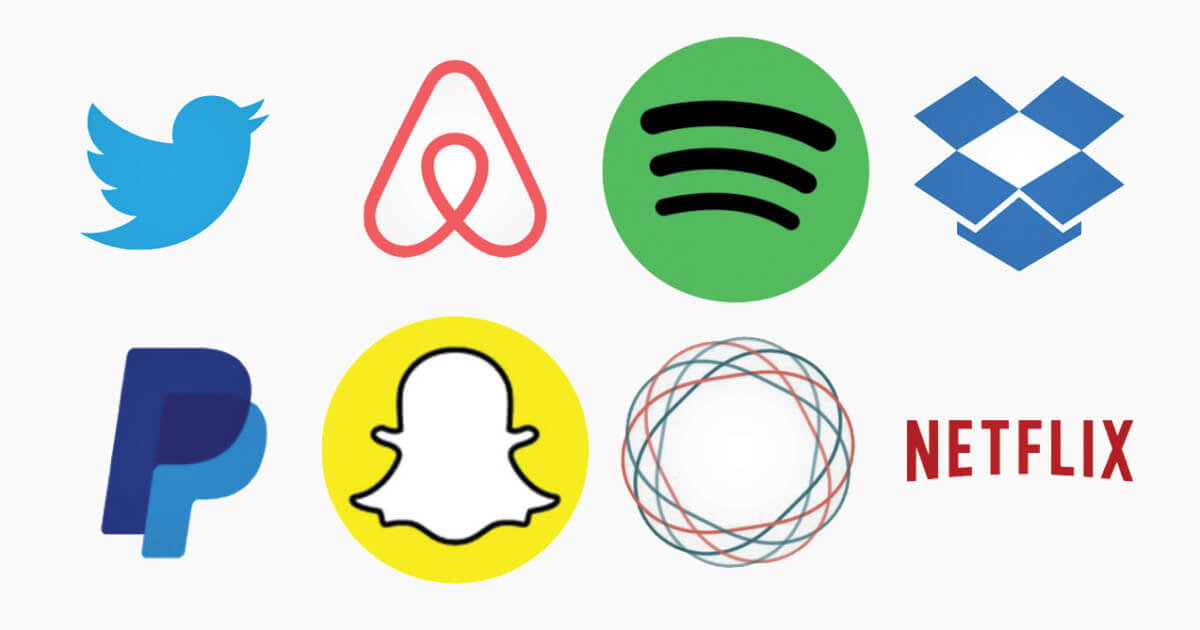
Also called font-based logos such as in the fashion industry, wordmark, or lettermark, depending on what elements the logo uses, this type of logo keeps it as simple as possible: make the name of the business the actual logo.
A great deal of thought goes into choosing the right font for a typographic logo since that particular font often becomes instantly recognizable as being associated with a company - think Disney logo, for example.
But don't let the mention of Disney throw you. Just because this logo design has been around for a while doesn't mean that it isn't still on-trend for today. It's easy to find examples of wordmark logos and lettermark logos, especially for internet-based company logos.
Famous Typographic Logos


An on-trend aesthetic choice not only for logos but also for use throughout branding such as for customizable badges, business card design, brochure design, or website design is easy to create and endlessly customizable.
They run the gamut from vintage to extremely sleek and modern, depending on the type and quantity of features you add to them. The term "badges" can apply both to button-like images and to a more "classic" badge shape that evokes Boy Scouts.
Can a classic design be counted as modern?
According to an article in medium.com, our "appreciation for vintage style logo design is at the peak." This style is a perennial favorite and can be found in a wide variety of venues, both online and off. Even though these designs are created as vector images, they can often have a nice letterpress feel to them that gives them a unique aesthetic advantage.
Badge Logos
So, to start our comparison of Adobe Illustrator and Corel Draw and how they can be used to create a modern logo, let's look at some of the possibilities. We're going to use a badge logo as an example.
Using Adobe Illustrator
There are tons of articles and videos on using Adobe Illustrator to its full potential. There are many easy-to-follow tutorial videos available online by Lynda.com and DesignTuts on YouTube, and they walk you through the process of creating a logo.
Let's take a look at a brief breakdown of a step by step process for creating a badge logo for your company, using Adobe Illustrator.
Badge Logo Process
Open up a blank file. You will want to use tools to decide a good color palette for the logo first. You can keep those close to hand for ease of access as you go through the process.
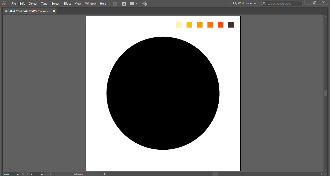
Create a shape, using the tools on the left-hand side toolbar. Remember that you aren't limited to the ones that are available in Illustrator.
You can combine multiple options and flatten them to make one, giving you a smooth, unique silhouette logo. Or you can rotate or off-set them.
Hexagons and circles are popular base shapes for badges. Keep the lines sharp, or smooth the edges. Take a few minutes to play around with the different options, until you find something that you like
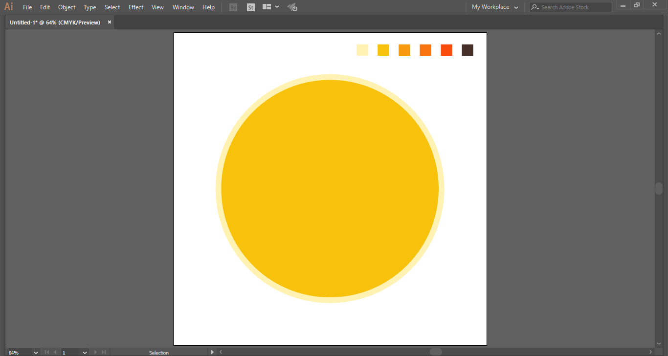
For a layered badge, you can add another of the same shape or a different one. Whatever your choice, make it slightly smaller, and overlay it on top of your original shape.
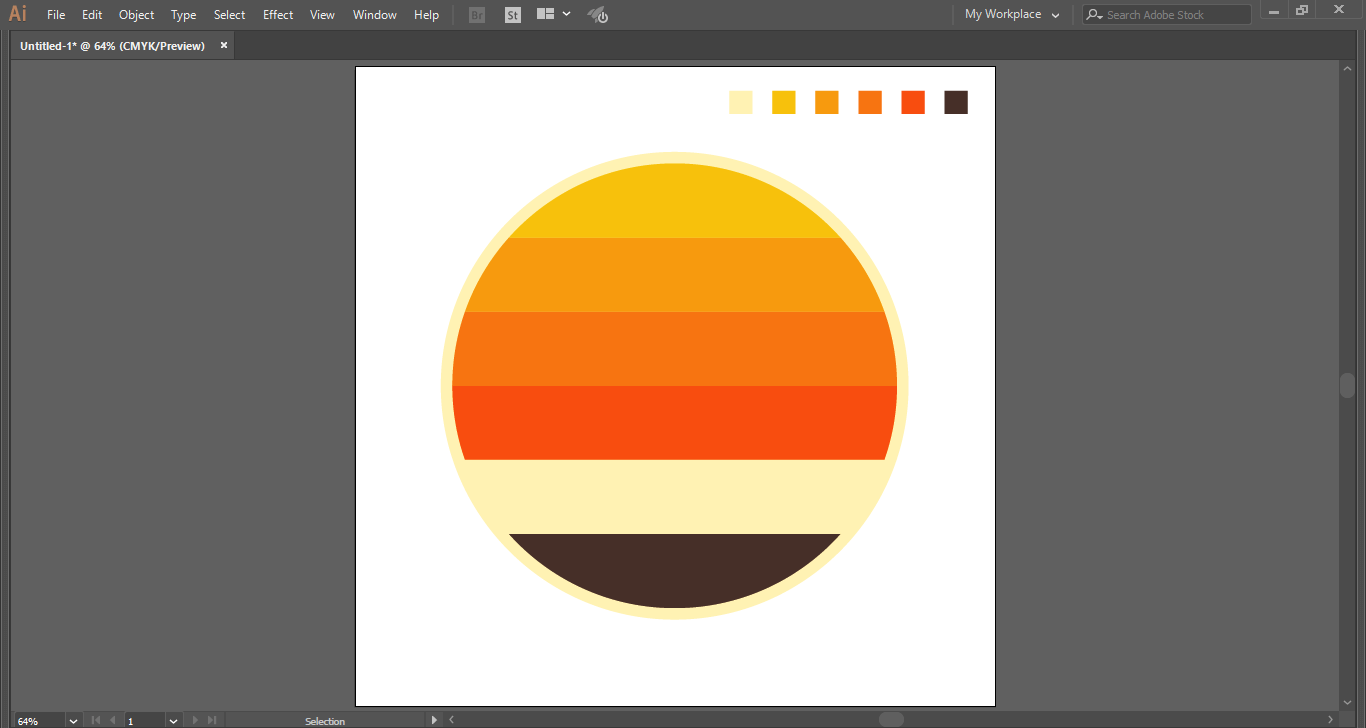
To create a border, use the path tool and "offset path," then color the outside border differently so it stands out. You can also bisect or intersect your basic shape by using secondary shapes of the same color as your border. This gives you a nice background area for your typography. Secondary shapes can also be layered and cloned and used to give a gradient to the logo.
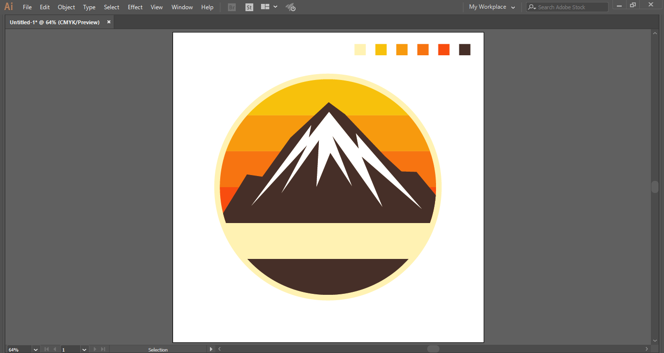
You may choose to use another, simplified image layered on top of the badge, or just text. If you want to create your simple shape on top of the badge, the "draw" tool can help you with that, or you can turn to resources such as vector images found in online graphic design marketplaces.
Since these shapes are easy to work with and can be changed around quickly, save several different versions along the way so you can go back to an older design in case you take a turn you don't like.
When you've finished with that version, make sure you group all the elements of your logo, so they don't separate when you want to move or reposition it.
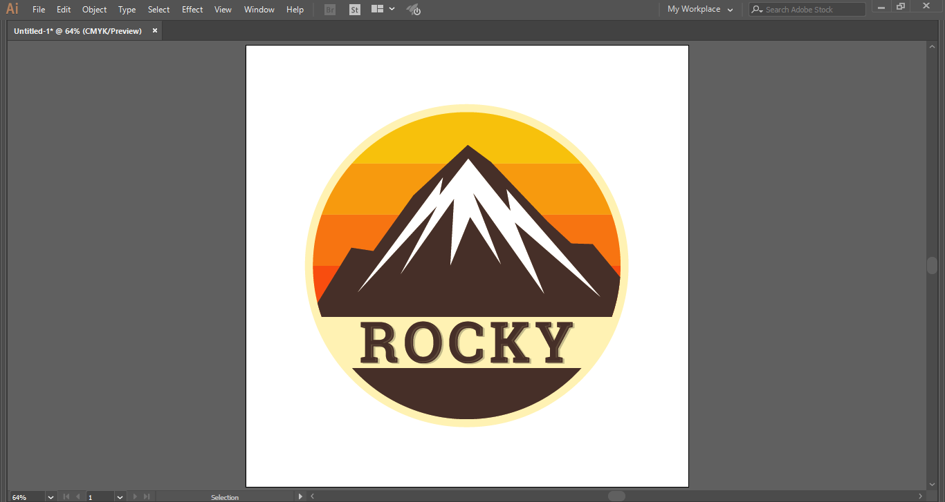
Ultimately, here's how this one turned out:
Using Corel Draw
There are, of course, a number of tutorials for using Corel Draw, as well as Adobe Illustrator. There do seem to be more for Illustrator, though an accurate count is difficult to get. This video is on top of the "vintage-modern" trend, giving a breakdown of creating a retro badge.
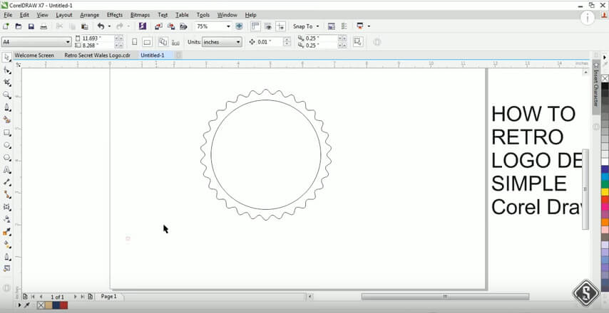
The same basics apply for setting up your workspace in Corel Draw. Start with a new file, and select the shape of your choice from the "shape" tool found in the left-hand toolbar.
The angles and curves of the lines can be adjusted with the path tool at the top of the toolbar. Depending on how much customization of the shape you want, you can take some time with the options this presents.

Again, secondary shapes can be overlaid as desired, depending on what you want your design to look like.
Using multiple secondary shapes, one nested into the other can give you a nice outline to your inner layer. You can also play around with the lines, making them thicker or thinner, dotted, or dashed.
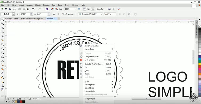
When overlapping the text, if you want a curved look, you can use "fit text to path" to make the text follow along the inner lines.
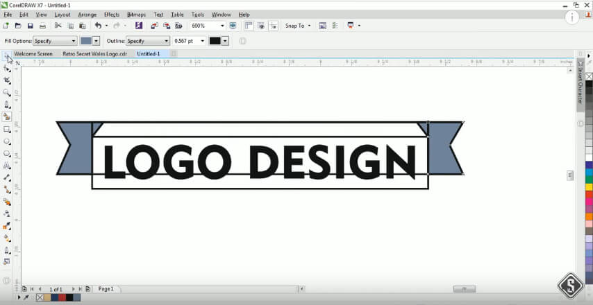
Simple banners overlaid on the badges are also a classic look that is a modern trend.
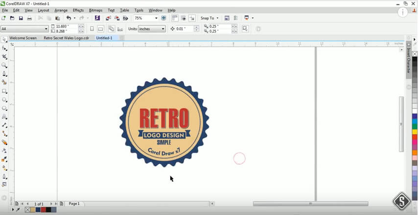
All in all, Corel Draw offers a lot of the same features for this type of graphic design that Adobe Illustrator does, just with a variety in the buttons.
Conclusion
As demonstrated by the processes discussed, and as evidenced by the vast number of tutorials for both Adobe Illustrator and Corel Draw, both programs can be very simple to use in creating a modern logo you've been dreaming of.
The logos discussed here are very basic, but there are always more options. The more you step up your design game, the more the programs have to offer. The point is to remember what message you want your logo to send potential customers and clients.
Corel Draw tends to be a little faster when it comes to loading options and images, but many designers prefer Adobe Illustrator for the more user-friendly interface it offers, as well as being an industry standard.
However, ultimately, which program you use for designing your logo may very well depend only on which one you are more comfortable with.
*This post was originally published on Logo Design Guru.
Written by Raquel Addams